Tag Archives: Mini Assignments
Mini Assignment: Three
Infographic- Mini Assignment #5

Mini Assignment #5

Mini Assignment #5
Mini Assignment 5: Create an Infographic

This infographic summarizes the most important aspects related to Spilling the Royaltea. These include the site’s tagline, navigation, community guidelines, and goals. At the beginning of the semester, I created a diagram explaining the site’s navigation, but a lot has changed since then. Therefore, using this infographic, I was able to reflect on these changes and create a more representative navigation scheme showing where I am now. In creating this infographic, I also reflected on some of the community guidelines I would like to enforce on my site, including respect, tolerance, openness, and connectedness. Finally, I set out three goals for my site, which includes the more measurable, numerical goal of posting 2-3 times each week, and the more ideological goals of challenging readers and fostering open conversation.
Reference:
Wong, O. (2023, January 28). Blog design part 2: Mapping it out. Spilling the Royaltea. http://spilling-the-royaltea.com/process-posts/blog-design-part-2-mapping-it-out/
Mini Assignment #5: An Infographic of My Online Self

Mini Assignment #5 – Infographic
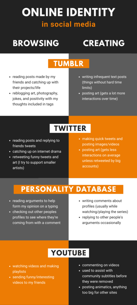
For our final mini assignment, we have to make an infographic describing our online identity. I chose to focus on the main 4 social media sites I currently use, divided into how I browse and create content on each.
I find the contrast between Tumblr and Twitter to be especially interesting, since they have only gotten more different over the years I’ve been active. Tumblr is by far my favourite social media site for posting art and other photos, since the quality isn’t ruined by compression like Twitter.
You can also add as many tags as you want to a post, which doubles as a more relaxed form for both the creator and other users to make comments. There are also more options for arranging images, and the overall culture allows art pieces posted years ago to suddenly gain traction again in a way that Twitter directly discourages.
I’ll definitely miss making these mini assignments now that this course is ending, but I appreciate the prompts for giving me an excuse to get creative!
☆.
Mini Assignment #5: Create an infographic that summarizes your online self
For week 5’s mini assignment, we were asked to summarize our online selves by using an infographic. I searched how to make an infographic and canva came up. Canva is really proving to be one handy tool when creating imagery for my website. I had a lot of fun creating the infographic and chose a gardening tip theme and just remixed it with garden and publication jargon. I called it “7 easy ways to grow a digital identity.” I threw in what I wanted my online self to come across as in Little Feather Adventures. In the infographic, I included my love for the outdoors, adventuring, gardening, animals, and photography. I also wanted my true self to come out within some of my humour as part of my online self.
Mini Assignment #5: Presenting Myself Online
For this assignment, my task was to create an infographic that summarizes myself online. I have included characteristics that I believe I am, what I try to portray, what I hope I provide to viewers of The Fashion Daily, and something that I would like to improve on. Below, you can view the infographic I have created using Canva!

mini assignment #5

Mini Assignment #5
This week I was asked to create an infographic that summarizes my online self…

mini assignment #4


Mini Assignment #4 – Remix
For this mini assignment, I chose to make a video edit of all my Splatoon 3 clips I’ve taken since the game’s release last September (minus my embarrassing failures; if you really want to see them check my media tab on Twitter LOL).
I used music made by the synth-pop artist GUM, who you might know as Jay Watson of Tame Impala; his work overlays vocals and creates remixes with itself in really interesting ways! Another reason I chose this song in particular was for the lyrics near the end, which is a sample of Herbie Hancock where he talks about how “[a machine] doesn’t program itself…Yet”. I feel like this entire line of thinking was ahead of its time, especially as the limits of technology are now being pushed past what anyone was ever imagining back then.
☆.
Mini Assignment #4 – Make a Remix
Purple Stain
Purple stain, purple stain
Purple stain, purple stain
Purple stain, purple stain
I only wanted to see you bathing in the purple stain
Purple Stain was created for educational purposes only. All original song lyrics before this terrible remix was inspired by Prince and his original song Purple Rain.
Mini Assignment #3


𝖬𝗂𝗇𝗂 𝖠𝗌𝗌𝗂𝗀𝗇𝗆𝖾𝗇𝗍 #1

Mini Assignment #1

Mini-Assignment #5: An Infographic About Me
[Original Post Date: 11/15/22]
For this mini-assignment, we were tasked to design an infographic that summarizes one’s online self. Therefore, I decided to visualize my levels of stress throughout the entire Fall semester of 2022 in the form of a bar graph.
As you can see, the amount of stress sky-rocketed above 100% from mid-November to early December due to the number of assignments, projects, and deadlines. And I think it’s still going up. 

Mini Assignment: Gif

The post Mini Assignment: Gif first appeared on Astrometrics.
Mini Assignment #6
Create a GIF

6.

I am using this gif that I found. I tried to find a photo in my camera roll that would make into a gif but nothing appropriate or funny did I find. But, the pig is exactly how I am feeling since school is almost done and it is winter break soon!!!!