This is my final post on the course, and I’m sad it’s ending. That’s why it’s lengthy, as I don’t want to finish it unconsciously. The course has been a great source of enlightenment for me, both in real-life situations and online. I’ve learned many new and practical skills, which has made me enthusiastic about pursuing my minor in publishing. I’ve found something that I’m passionate about, and I want to continue with it.
The most valuable thing I’m taking away from this course is the motivation to start my small business, which I plan to launch in the summer. My buisiness will specialize in creating texture canvas art. And I’m so excited to apply all I’ve learned from this course to this and my future UX/UI designer career. I want to thank you Suzanne, Mickey, and my amazing classmates, for making this experience so impressive and memorable!!
So, let’s dive into online hate topic as my very last process post topic, using a recent case study to illustrate its prevalence!
The prevalence of online hate has become an infamous problem, but why has it become so normal? The power of social media can make or break a person’s life in a matter of hours. The Justine Sacco case is one such example where a tweet intended to be a joke caused an uproar on social media, and she became the target of intense online shaming.
Likewise, Iraj Tahmasb, a well-known TV presenter in Iran, faced backlash on social media after cracking a joke about the detention of girls protesting during the 2022 Woman Life Freedom protests in Iran. The joke was seen as insensitive and offensive, causing a lot of outrage among people who demanded that he be held accountable for his words.

The episode of the Mehmooni series- which takes place in a fictional wedding hall located next to Tahmasb’s newly acquired home, introduces a variety of new puppet characters who are primarily workers at the wedding hall-features a conversation between Sirus, played by Sohail Rahbar Zare, and Tahmasab.
When Tahmasab inquired if the upcoming year would be better than the previous one, Sirus replied that the last year was much better since they took his sister. Tahmasab was taken aback and asked if his sister had been caught or had gone missing. Sirus revealed that she had gone to work on the streets and that a boy had seen her, meaning she had married. Sirus then asked Tahmasab if he was happy, to which he replied. Finally, Sirus urged Tahmasab to wish his sister happiness. The word “caught” resonated with many people as a reference to the government’s arrest of young girls during the 2022 protests in Iran.
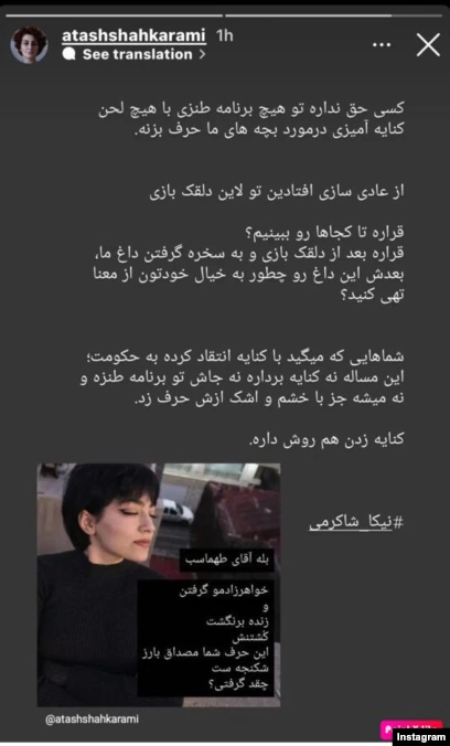
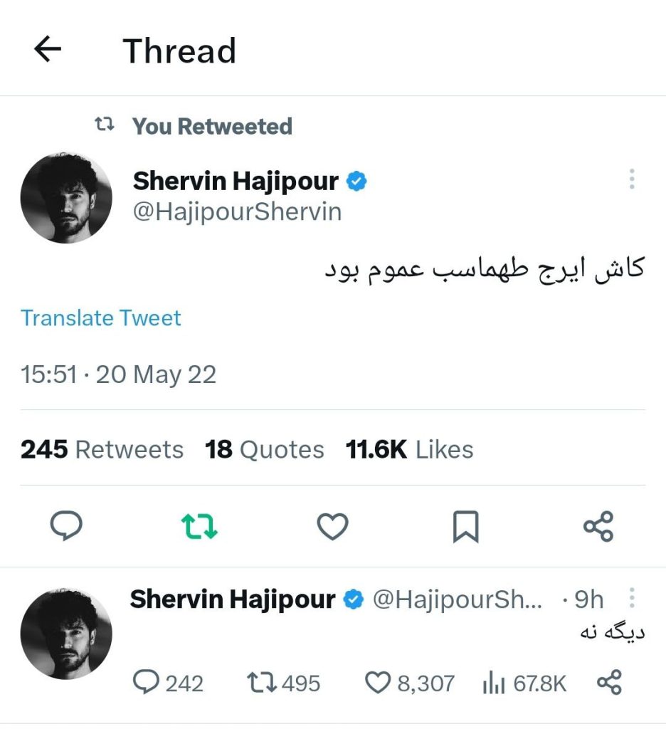
In response to what happened on his TV show, Shervin Hajipour, the popular grammy-winner singer which I previously mentioned him in my third content post, , expressed his thoughts on Twitter as well. In 20 May 2022, he tweeted, “I wish Iraj Tahmasab was my uncle,” but in a recent response to the same tweet, he said, “Not anymore.”. Atash Shakarami, Nika Shakarami’s aunt- a victim of the uprising-noted that the joke was akin to torture. Azadeh Samadi, an Iranian actress, critiqued Tahmasb’s anti-woman speeches and views, urging him to reconsider and not ruin her childhood memories. Samadi also questioned Tahmasab about his limited use of women, to which he replied that women aren’t funny. According to Stein J. in the secrect life of internet trolls, this statement represents a clear example of misogyny towards women.

The situation that followed could be described as an example of cancel culture. Tahmasb faced much criticism and backlash on social media, with many demanding his dismissal and boycotting him. This incident caused a ripple effect, with many social media users expressing disappointment and anger towards Tahmasb’s actions. Some individuals even went as far as to label his comments as misogynistic and disrespectful towards women. However, many others believed the situation was a misunderstanding and was blown out of proportion. This occurrence sparked a lively debate about the responsibility of comedians to be sensitive to social issues and the role of humour in society.
The problem with cancel culture is that it often leads to a rush to judgment, with little regard for due process or the facts of the case. In the case of Tahmasb, I believe many people jumped to conclusions without actually watching the segment in question. Instead, they reacted to the outrage on different websites and platforms comment sections with a biased mind-set and joined the condemnation bandwagon.
This is not to say that Tahmasb’s allusion was in good taste. It clearly was not. But the rush to judgment and the intensity of online shaming is a worrying trend that is becoming all too common in our digital age. We have to be careful to keep the power of social media from leading us to a place where we lose sight of the value of free speech and the need for open dialogue.
Another frequent critique of online commentary is the potential mismatch between a commenter’s stated views and their actual identity. This reminds me of the “online disinhibition effect,” a phrase coined by John Suler, which I find particularly relatable.
I believe when people are online, they may act differently than they would in person because they can remain anonymous and have no real consequences for their actions. This can sometimes result in them expressing themselves hostilely or disrespectfully. Additionally, factors like group dynamics, their emotional state, and their desire to fit in with others may influence how they behave.
Konnikova, in the Psychology of Online Comments, suggests that negative behaviour in comment sections is complex and influenced by psychological and social factors while also pointing out that the way comments are displayed or moderated can impact behaviour. To promote respectful interactions, online platforms and individuals have a role.
No matter where you stand on the issue, I think it’s pretty evident that online bullying and harassment are happening more often than ever. Guidelines are set up for commenting to ensure everyone is having kind and respectful discussions online. But let’s face it, and not only some people follow these rules. So it’s up to us to be careful with what we say and do online.
I’m not trying to defend Tahmasb, but it bothers me how trolls and cancel culture have taken over in this digital age. Even if someone has an excellent track record and is highly respected, one mistake can lead to them being cancelled without considering everything they’ve accomplished. It’s essential to address online abuse and harassment; treating others with respect and kindness online is just as crucial as in person. The case study I mentioned highlights that we all have a part to play in creating a positive online community.
Based on the discussion of the dangers of cancel culture and the power of social media in the case of Iraj Tahmasb, online communities need guidelines to ensure that they are safe and inclusive spaces for all. To achieve this, it is essential to develop community guidelines that balance free speech and social justice while promoting open dialogue and constructive criticism.

The proper guidelines will vary depending on the specific site and its goals. Still, some key considerations might include rules against hate speech, harassment, and bullying, as well as guidelines for respectful disagreement and constructive criticism. Additionally, it may be essential to have clear policies around anonymity and pseudonyms and procedures for reporting and responding to guidelines violations.
As mentioned by Ball in the Dark Sides of Guardian Comments, implementing these guidelines will require combining technology, moderation, and community engagement. This might involve using automated filters to detect and remove abusive content and human moderators who can review and address reported violations. It will also be essential to involve the community in the moderation process through mechanisms such as user reporting and feedback and community-led initiatives to promote positive and inclusive discourse.
Developing and implementing community guidelines is crucial to creating safe, inclusive, and constructive online communities. By balancing the need for free speech with the importance of social justice and open dialogue, we can create spaces where everyone feels welcome and valued and work towards building a better and more tolerant society.
In onclusion, the case of Iraj Tahmasb is a cautionary tale about the dangers of cancel culture and the power of social media to influence public opinion. We must learn to balance the need for social justice with the value of free speech and the importance of open dialogue. We need to create a culture where people feel safe to make mistakes without fear of being cancelled or ostracized. Only then can we hope to build a truly inclusive and tolerant society?
Bibliography:
Ball, J. (2016, April 12). The dark side of Guardian comments. The Guardian. https://www.theguardian.com/technology/2016/apr/12/the-dark-side-of-guardian-comments
Konnikova, M. (2013, October 28). The psychology of online comments. The New Yorker. https://www.newyorker.com/tech/annals-of-technology/the-psychology-of-online-comments
Ronson, J. (2015, March). When online shaming goes too far [Video]. TED Conferences. https://www.ted.com/talks/jon_ronson_when_online_shaming_goes_too_far?language=en
Suler, J. (2004). The online disinhibition effect. CyberPsychology & Behavior, 7(3), 321-326. https://doi.org/10.1089/1094931041291295
Stein, J. (2016, August 18). The secret life of internet trolls. TIME. https://time.com/4457110/internet-trolls/