Above is an infographic I made that should reflect what melatonin gone missing is all about!
Tag Archives: Assignments
mini assignments#5
This week I was asked to create an infographic that summarizes my online self.

seven keys to my brand identity
seven keys to my brand identity
– ammarah siddiqui
The post seven keys to my brand identity appeared first on ammarah.
Mini assignment#4
This assignment was to remix something, I used a photo of my dog sleeping and a photo of a rock I took at the beach, mixed the two images together and I used Canva to make a sticker picture.
Mini-Assignment 4 (remixes)
Remixing is my bread and butter as a designer. I learnt how to use photoshop while making photo compositions and love to utilize those skills to this day.
Here are three posters I have designed which utilize the concept of remix. All these posters feature their source images from the covers of 1950s golden age comic books. I have doctored the images, manipulated, transformed, recoloured, and gave them extensive typographic treatment.
All three images are a series of advertisements for my philosophy undergraduate journal: Jove’s Bodega.
I hope you enjoy!


Peer Review 2: Traveling to Planet Vannesa
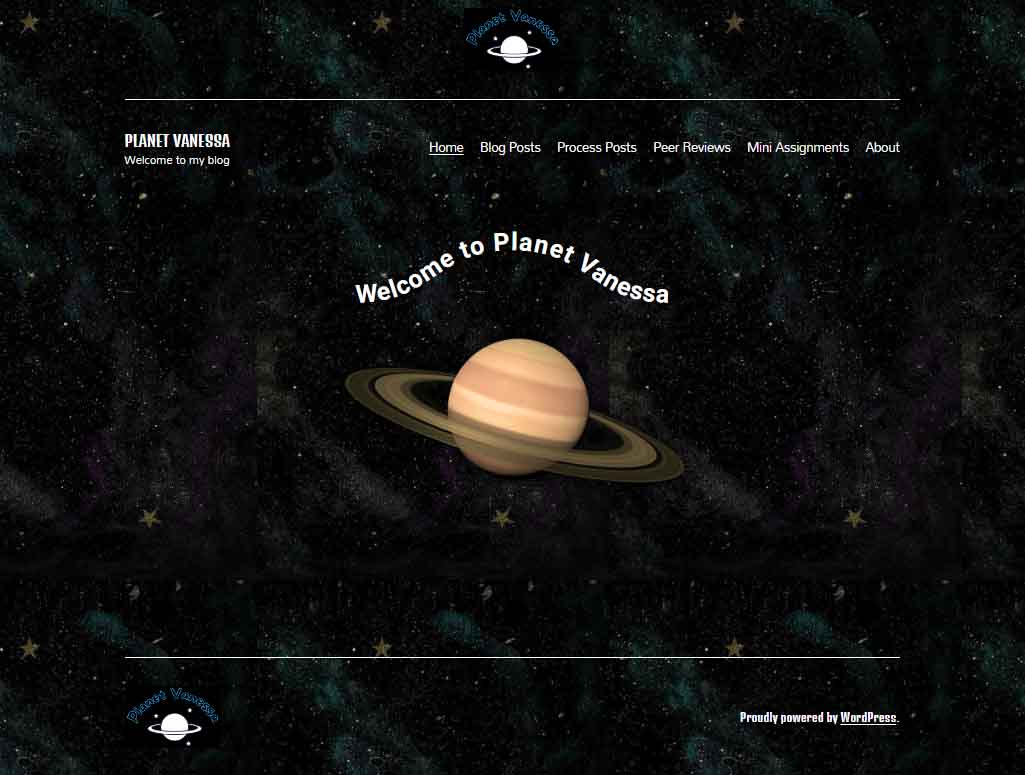
Today it is my great pleasure to introduce Vanessa Nipp, the webmaster, creative director and content creator, over at Planet Vanessa. Join me as I review her cyberinfrastructure with particular attention to design processes and how her design choices emphasize the cultivation of her digital self. I will also dig into her code via “inspect mode” (F12) to better understand what’s going on. http://planetvanessa.com/
If you’ve never been to space before, I recommend packing a light snack because Planet Vanessa orbits a far-out system of Groove-ulon 6.
Lift-Off & Landing Page
It’s cold and lonely out in space. Away from our tiny blue marble, the vast recesses of nothingness overwhelm and stretch into the infinite. Soon the mind begins to play tricks on us.
Are those far-off stars repeating themselves? As a matter of fact, yes! Looking closely at Planet Vanessa’s landing page, we see that the background image is tiled.
The image of space she utilizes is 564 px wide and 1002 px tall. The tiling will vary depending on the screen’s resolution and whether visitors use desktops, laptops or mobile devices.
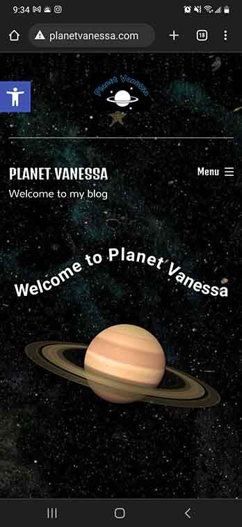
As you can see on my phone, we get one iteration of the tile.
On my desktop at 1920 x 1080, her background image iterates ≈ 4 times horizontally.
Repeating a background image is very pragmatic because it reduces load times. The computer only needs to interpret one much smaller image and duplicates it.
Had she chosen a large HD image (1920×1080), this would have potentially increased her load times—potentially slowing down the user experience. I think that was a good decision on Vanessa’s part. Yet, there could be more attention to detail in choosing the perfect tile. A perfect tile gives the illusion of seamlessness. The trick is to obfuscate that line where one tile ends and another begins. This means we have to be conscious of the details of the picture.
As we can see from this tile, a few places break the fantasy of deep endless space. We can see some prominent splashes of purple and blue to signify nebulae and a few gold stars. However, these nebulae don’t match up when placed side-by-side, and the stars are so unique compared to the other elements of the picture it creates multiple seams that the eye naturally follows. The result is that the background image perhaps stands out more than it should—a minor detail, to be sure, but something that stood out for me.
Display Font & Logo.
Vanessa’s logo is fun and playful. A line drawing of a Saturn-like planet upon a backdrop of stars. A black background and the name of her site are written above, transformed with a curve.
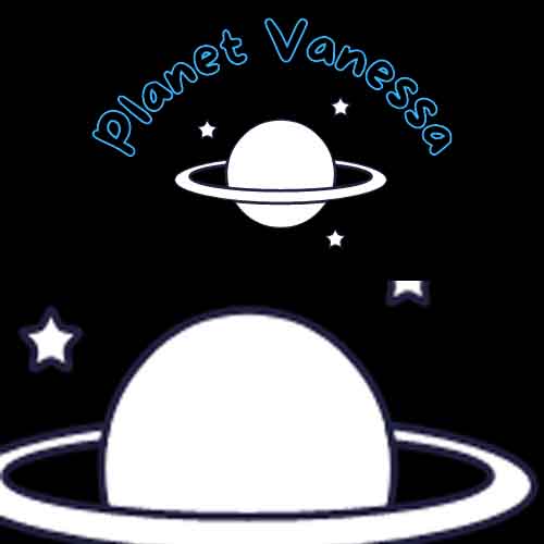
Looking closely, we see that the planet and star’s fill is white, while their stroke is blue-black. This stroke stands out against the black background of her logo, making me wonder about Vanessa’s thought process for this decision. It would be interesting to see the stroke match the background, creating a transparent effect in the intersecting lines of the rings and the planet.
The font choice for her logo was interesting; she had chosen a display font from the comic family. This font features varying widths throughout the anatomy of the font, and fat rounded serifs give an overall bubbly feeling. She has chosen a transparent (or) black fill and a blue stroke. I like Vanessa’s type choice because it captures the mood she is expressing with her digital identity; however, the choice to make the fill transparent severely reduces the legibility of the text.
The Golden rule of typography is that it must be legible. As it stands, there isn’t great enough contrast between the blue and the black; in addition, the stroke is too thin to stand out from its background. I recommend Vanessa play around with the typography and discover alternative design choices to increase the contrast between the type and its background.
Planet Vanessa, featuring Planet Vannesa
The anatomy of her landing page is as follows: A <Header> containing Logo, <H1> text, a divider line, and her <Nav>. Following this is the <Body>, featuring some fun text on a curved baseline above an image of Saturn. Finally, the <Footer> is signified by another division line, the logo aligned to the left, and a shout-out to WordPress aligned right.
It would be interesting if the planet logo and image had more similarities. For example, in the picture, we’re looking at the planet from a different perspective which gives depth to the image, whereas we see the logo planet head-on, without a sense of depth. If they shared a sense of perspective, it would build cohesion between the different elements of your page. In addition, it would also be interesting to see how Vanessa could utilize the principle of similarity in her typography.
I love the curved baseline of “Welcome to Vanessa Planet,” I love it even more that it’s a piece of CSS, not an image. But the dissimilarity between the four different fonts being utilized feels disharmonious. On the one hand, the logo paints a picture of something kinda fun and out-there, whereas the ‘welcome to’ and the <H1> text don’t seem to share that feeling. I think this could be easily fixed by choosing two fonts, maybe three, if she were very set on her logo typography.
The easiest solution I would experiment with is eliminating the <H1> in the <header> altogether. I think this would be a strong move because the name of the site, “Planet Vanessa,” is well captured throughout the landing page, and since the <h1> is a completely different font from the logo, nav and welcome, removing this <H1> text would do several things. It would increase the cohesion of the typographic choices by limiting the amount used, eliminating redundant information, and making Vanessa’s <nav> more prominent, no longer having to share the line with the <H1> text.
Let’s look at the content.
Vanessa utilizes a similar layout for her posts as I do on Burrito reProduction. It’s a single-column, aligned center. It’s simple, sweet—100% endorsement from my non-bias position! Planet Vanessa utilizes plenty of header tags to break her content into digestible pieces, which also increases the accessibility of the website. She also employs lots of photographs that raise the engagement in her content.
The content design on Planet Vanessa is very cohesive with one another, and it matches the landing page and about page. As my page layout is very similar, an observation that is as much for Vanessa as it is for myself, we find dynamic ways to utilize all the white space we leave on our pages. Since Vanessa’s site appears to be built with mobile phones in mind, this isn’t as much of an issue for her as it is for me.
Final Thoughts.
Planet Vanessa has a strong sense of identity. It stands out from the run-of-the-mill blog spaces because of its design choices, giving the reader the impression that they have been invited into the depths of space to a planet unlike ours. A place that does not follow the standard conventions of simplistic, clean, or minimal design choices. It unapologetically expresses Vanessa Nipp through its space theme and bold typographic decisions, and the original logo all contribute to conveying the digital persona that Vanessa has cultivated.
Excellent work, Vanessa Nipp; I look forward to seeing what you do next with your site!
Mini-Assignment 3 (Story)

I present an original story written by Devin Bates titled “The Fools Who Found Middleway.”
I hope you enjoy it.
Mini-Assignment #6: Transform Your Live Photos into GIFs
Preface
As part of the class that I am taking which has resulted in the creation of the website you are viewing, I must complete some mini-assignments.
This post is one of those mini-assignments.
The instructions for this mini-assignment were “make a GIF.”
Recalling a GIF From Grade Nine
I am in my fourth year of university now, which means that grade nine was over six years ago, but I distinctly recall a GIF that I made in my grade nine information technology class.
The GIF was a cartoon character running and unfortunately, I no longer have access to it.
I mention this because it is the only other time I have been required to create a GIF as part of a class.
The GIF I Made Today
GIF is really not a term that comes to mind often. So when I saw the term the first item that came to my mind was Apple’s live photos.
I recognized that these two types of media were very similar and wondered if there was a way to turn a live photo into a GIF, so I googled it and learned that there indeed is! (Here is a link to the resource I used to turn one of my live photos into a GIF).
So, here is the GIF that I ended up making:
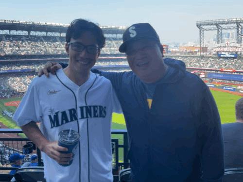
This GIF was made from a photo of my dad and me at the Seattle Mariner’s first playoff game in Seattle since 2001.
I really cherish this photo, as one of the ushers at the game saw us and asked us if we wanted him to take a photo for us. It was an excellent example of generosity and the photo itself ended up being really nice.
I will always remember this game and if you want to learn more about my experience at the game, here is a link to a video where I reflect on it.
An Additional Note
It should also be noted that turning your live photos into GIFs certainly does sacrifice quality. However, there is a certain aesthetic to the graininess that makes the GIF appealing to look at.
Peer Review #3: Examining Abysmal Guides
Peer Review #3: Examining Abysmal Guides
Context
This website was created for a class at Simon Fraser University titled Publication of Self in Everyday Life. In this class, we are developing our own digital identities and assisting our classmates in doing the same. This is the third and final of these reviews.
In this review, I will provide my evaluation of the site AbysmalGuides.com in regard to its intended target audience.
The Target Audience and Content Strategy of Abysmal Guides
The author of Absymal Guides provides a description of their target audience and content strategy in their post titled My Ideal Audience.
In this post, they describe their ideal audience and the content they are creating targeted at this audience. Their ideal audience is beginners or new players of the game Genshin Impact. They then go on to explain that they will be creating posts that help introduce players to the game, as well as some posts describing some deeper nuances which will require the basic information knowledge they provide in their other posts.
Abysmal Guides has developed a clear and concise target audience and an appropriate content strategy to approach this audience.
While this target audience is concise, I do believe that it would be worthwhile for the author to further empathize with their target audience. With this information, they could further explore the demographics, psychographics, and behaviours they believe this group has to better create content suited to this audience. It is worth noting, that this is an analysis they may have done but not published on their site.
Examining the Content of Abysmal Guides
Abysmal Guides’ Landing Page
When an individual arrives at Abysmal Guides, they are greeted by text explaining the site’s purpose and a background image from the game Genshin Impact.
The text that immediately grabs the audience’s attention is a large “Welcome to Abysmal Guides”, after viewing this text the audience likely then goes on to view a caption saying “Just another blog about Genshin Impact guides”. I love the large welcome as it does make me feel welcome, but am a bit thrown off by the caption as it does not assert that this site is the place I need to be. I believe that using stronger language and saying something like “The Genshin Impact Blog for Beginners”, would confirm for the audience that they are on the correct website would improve the site.
The landing page then goes on to explain the two purposes of the site, the fact that it exists as a guide for Genshin Impact beginners and that it was created for a class. This context is something I am sure the audience appreciates as it depicts transparency and lends credibility to the site’s information.
Following this, the audience can then see a few recent posts on the site with clear categories above titles ensuring the audience viewing the site can get to the posts they need to see.
Posts
In examining the content of AbysmalGuides.com, I began by viewing the post Things to Know Before Starting Genshin Impact. This post is well-structured and easy to read, very appropriate for this site’s target audience. Reading it gave me a good overview of the game and has enabled me to an understanding that I did not previously have.
Next, I wanted to view a character page as the author described these types of posts as ones that could be viewed and understood only after gaining a basic understanding of the game, so I viewed the post Venti Character Build. This post is again well structured, providing an overview of the character then diving in to specific attributes of the character.
Conclusion Regarding Content
Abysmal Guides is well written. The content fits the audience very well, and the author has accomplished what they set out to do in their initial post. I am greatly appreciative of this and enjoyed viewing the site.
Affordances on Abysmal Guides
Affordances are defined as action possibilities provided to the actor by the environment. They are critical to making the uses of an item immediately obvious (Kaptelinin, n.d.). In evaluating Abysmal Guides’ design I examined the site through the lens of affordances.
Affordances That Make Sense
- The menu bar on the top, provides an immediate easy way for users who know what they are looking for on the site to find what they are looking for.
- The sidebar on the side of the screen has many good elements which make navigation of the site much easier.
- The headers found on public posts make Abysmal Guides, guides easy to navigate. This is greatly appreciated and useful for the users as it minimizes the amount of time they need to spend on the page to find what they are looking for.
Affordances That Could Be Improved
- Author title – Currently, all the posts are authored by “Admin”, changing the name of this poster might be worth exploring, though the title Admin does lend the posts some credibility.
- Category colours – The categories above the post titles are coloured which makes the site much more visually intriguing, but these colours do not mean anything as they are randomly assigned which makes them confusing. If different colours went with different types of categories, it would be useful and intuitive.
Affordances That Could Be Added
- An easy way to access the post Things to Know Before Starting Genshin Impact, immediately after arriving on the site would be a nice touch and fitting for the site’s target audience.
- Headers could be added to the posts created for the course. They are currently on the posts for Genshin Impact which makes them easily navigable and it would be nice if the author carried these ideas over to their other posts.
Conclusion – Abysmal Guides Successfully Targets a Niche
Abysmal Guides does a fantastic job targeting their content at a niche. The site is functional and easy to use, providing users with a positive experience.
In the article Embracing the Power of Niches, Steve Pratt (2020) explains that targeting a niche can allow a content creator to reach audiences that others have not yet realized, and I believe that this site has done a fantastic job implementing this principle. This is evident in the fact that several of the posts on the site have comments from users thanking the author for the information they provide (for example, on the post Things to Know Before Starting Genshin Impact).
I greatly look forward to seeing what Abysmal Guide develops into in the future and thoroughly enjoyed evaluating the site.
References
Kaptelinin, V. (n.d.). Affordances. The Encyclopedia of Human-Computer Interaction, Chapter 44. Interaction Design Foundation. https://www.interaction-design.org/literature/book/the-encyclopedia-of-human-computer-interaction-2nd-ed/affordances
Pratt, S. (2022). Embracing the power of niches. The Creativity Business. https://creativitybusiness.substack.com/p/embracing-the-power-of-niches
Reflecting on my Time Spent as an Online Publisher
PUB101 has been an enriching experience to say the least, upon initial enrolment I was unsure as to what this particular field of study would ensue. After attending just one class, it was clear that the skills developed in this program would prove quite relevant to the demands of the current information and knowledge society. The article “Content Creation and Flipped Learning: a necessary pairing for education in the new millennium” offers insightful critique as to how flipped learning has revolutionized education practices for newer generations. Publishing 101 has played a crucial role in relation to flip learning through the curriculum requirement of having students create their own cyberinfrastructure. It has been during this experience that I as a student have become more digitally competent through the influence of this innovative methodology of teaching.
Moreover, the publication I have created is in the form of a personalized blog that acts as a self served journal to address my experiences with mental health struggles as both a student and part time labourer; in addition to how I cope with moments of mental distress through bonding moments with my pet cat. Initially, I contemplated playing it safe and building a lifestyle blog that showcases my passions for music, fashion, and healthy living. Upon further reflection, I did not want to conform to the safety of stability. Erving Goffman conceptualized how individuals perform in order to project a desirable image (Bullingham & Vasconcelos, 2013). This is indeed the case with various social media accounts of mine. While there are facets of embellishment portrayed on my socials, I do believe these accounts are an accurate representation of who I am for the most part. That being said, there is the subconscious part which wishes to post only the thriving moments in order to project a given identity (Bullingham & Vasconcelos, 2013). With that in mind, I decided to go a different route. Inspired by female artist Doja Cat who fully projects both her glamorized and authentic self all over social media; I found comfort in the decision to document the more intimate and unraveled parts of my life.
Considering I had been bestowed the power to maintain control over my own cyberinfrastructure it felt safe to shatter that distance between the performer and audience (Bullingham & Vasconcelos, 2013) as it no longer felt necessary to conceal the offline-self. With the use of Google Analytics and WordPress stats it does not seem that my site has taken off, which is what I anticipated for such an entry level project. That being said, the imagined public are fellow students struggling with the same stress inducers as myself, in hopes to offer a space of unity and safety. Students are often pressured by many dimensions of responsibility as they approach young adult life, especially those who live extremely independent lives in all aspects. The persona employed is meant to purely be human. Oftentimes, social structures require people to never falter and continue pushing forward. As much as I encourage proactivity, it is also important to embrace moments of weakness in order to find a balance. Which is where pleasantpawws.com has allowed me to embrace my moments of weakness while finding healthy ways of coping. The design and structure of this web space is meant to be simple yet inviting with the use of neutral tones and wholesome imagery. The content itself follows a pattern of addressing a weekly challenge I faced as a student, and how various moments were spent with my cat Luka, who induced peace of mind and kept me moving forward. An overall theme I liked to reinforce is taking a step back when life becomes overwhelming by finding sanity in simplicity.
Ultimately, the most compelling part of creating one’s own web space has been its role as a space for independents (Noorda, 2019). The independent ability to facilitate, design, and construe content offered a real sense of liberation. Especially considering how monitored, framed, and socially structured public cyberinfrastructures’ are. Ironic how the public space is so heavily manipulated by the ruling class, whoever that may be, as it is constantly subject to change in this day and age. Prior to the educational experience of PUB 101 my knowledge of publication practices was limited. Having gained the knowledge and experience I have now, I feel more equipped to live amidst this highly digitized era. While I do still stand by my newly found goals of representing a more authentic online-self, it seems that a reform in content is necessary. I would like to continue blogging but as a personal hobby to elaborate all my interests. Coming up with weekly content for such a personal blog has been tiresome, as it was often hard to determine what was appropriate and inappropriate to share in such an open space. Even with the goal of authenticity, one must not stretch too far as unfortunate as it is, what is posted publicly can cause more harm than good if taken out of context. Which is why if I continue to pursue blogging, I would reevaluate the theme and content of what I post.
A special thank you to my TA and Professor for an illuminating semester.
References
Bullingham, L., Vasconcelos, A. (2013). ‘The presentation of self in the … – journals.sagepub.com. (n.d.). Retrieved April 6, 2022, from https://journals.sagepub.com/doi/full/10.1177/0165551512470051?casa_token=G_ZxwRBoHT0AAAAA%3AcCfotdn2Uy_smbZpmnaXKB9ULp9SMILPjo5z-k4MjjB6c59dMZnDjs9ecXsI1TirtOE38VqBAQ
Lopez, B., et al. (2019). Web.s.ebscohost.com. (n.d.). Retrieved April 6, 2022, from https://web.s.ebscohost.com/abstract?direct=true&profile=ehost&scope=site&authtype=crawler&jrnl=09760245&AN=139734438&h=PTuiHG%2fv3MBssxcR%2biflYa%2fR%2f9YYrWyDRZN1iqyEmM4ePUhc8i2cnyGvNG4F8lAh0F1t0v%2fuHKP6hzNuSDKjVw%3d%3d&crl=c&resultNs=AdminWebAuth&resultLocal=ErrCrlNotAuth&crlhashurl=login.aspx%3fdirect%3dtrue%26profile%3dehost%26scope%3dsite%26authtype%3dcrawler%26jrnl%3d09760245%26AN%3d139734438
Noorda, R. (2019, June 18). The discourse and value of being an independent publisher – mémoires du livre / studies in book culture. Érudit. Retrieved April 5, 2022, from https://www.erudit.org/en/journals/memoires/2019-v10-n2-memoires04677/1060971ar/
all Exam Szn Mood tbh
idkcrypto.ca
Alas, we have hit the last few weeks of PUB 101, which leads me to the final peer review of the semester. This week, I will conduct a peer review on the website idkycrypto.ca (http://idkcrypto.ca/); a site developed to enlighten users on Crypto and NFTs.
Assessment of content and design decisions:
Starting with the About page, idkcrypto’s content already sets an extremely informative foundation for the rest of the web space (http://idkcrypto.ca/about/). That being said, I am not sure as to whether or not it was a glitch on my end, but I was not actually able to see any content under the NFT’s or Crypto tabs themselves although I do see posts that I am sure were meant to be under those tabs.


For instance the post “What is fungibility?” (http://idkcrypto.ca/blog/what-the-fck-is-fungibility/) explains the origins behind the concept NFT. Reading through this post in addition to others it is very abundantly clear that the website creator is well-versed in the topic and it is refreshing to see content creators educating users on such relevant discourse.

In terms of design, idkcrypto employs a black, white and grey colour scheme which I think fits appropriately with the theme of the site. The design is simple yet effective, I like the set up of the home screen and how the social media and menu are set up. Overall, easy to navigate and manoeuvre , additionally the use of text bolding and sizing makes text easy to read. My only suggestion is to include more visual graphics in order to facilitate a more interactive user experience considering the content is very information heavy.
Clear engagement with course readings:
In a society that is so used to media framing, and misinformation practices I think it is important that idkcrypto maintains integral information sharing practices. Giving the audience a full background of what crypto and NFTs entail in addition to sharing how beginners can get involved is a surprisingly gate-kept practice. Alice Marwick and Rebecca Lewis’ reading titled “Media Manipulation and Disinformation Online” delve into the online world of media manipulation and disinformation. In this text there is a particular section that explores who manipulates media and who in fact perpetuates disinformation. It has been concluded that these regressive practices are typically traced to groups involved in far-right media manipulation which include; internet trolls, gamegaters, organized brigades, network groups, retrograde populism, and manospheres. Ultimately, those who reinforce misinformation practices are typically those who have something to gain.
The point I would like to emphasize is that in a world where everyone is out to gain something, and genuine information sharing is rare at best…it is encouraging to see a content creator looking to illuminate users on something that could actually benefit instead of mislead users.
Review of website’s marketability and intended audience:
I think this website’s marketability is proficient as it states the goal and intended users on the home page itself with the introductory slogan “Learn about Crypto & NFT’s: Welcome to idkcrypto. Come with an open mind, leave with empowering knowledge”. What I think is most effective is how this web space is not exclusive to one demographic, as it primarily entails an informative cyberinfrastructure. Therefore, leaving no room for criticism for the lack of audience reach, it is simply up to the user themselves.
Overall, I think this website has so much potential and is already off to a great start. I am appreciative of my time spent analyzing the site and its content, as the discourse presented is something I am undereducated in. Definitely a site I will be revisiting even after the semester, so I hope it is kept running!
MORE THAN A DAY
Read Time:1 Minute, 20 Second
In honor of International Women’s Day, I wrote poetry inspired by one of my favorite poems called “Phenomenal Woman” by Maya Angelou.
I first heard of Maya Angelou in my grade 10 English class when I started taking writing poetry more seriously. In Angelou’s beautiful poem, she uses the phrase “phenomenally, phenomenal women” and describes women being unapologetically themselves.
However, in my poem “MORE THAN A DAY,” I describe my feelings about International Women’s Day and how women deserve to be celebrated on more than just a day.
MORE THAN A DAY
Today is a day to celebrate phenomenal women.
But I know deep down the struggles we face.
__________________________________________________
The pain and exhaustion linger beyond trace.
The physical, emotional, and spiritual labor
From raising families out of nothing
From facing undiagnosed illnesses
From living up to male standards
From putting our needs on hold
__________________________________________________
To all my phenomenal women.
I know you are tired.
But I know you are the brightest in the room.
I know you are more than just your beautiful body.
I know you are more than what any of these fools make of you.
So I understand how today is a day to celebrate ourselves because we deserve an uproar.
We deserve a parade, an anthem, a standing ovation.
__________________________________________________
But why did we have to prove ourselves to celebrate?
Why isn’t our mere existence a celebration?
__________________________________________________
So to all my phenomenally, phenomenal women.
Who the world watches in awe today.
Remember that you are more than a single day.
You are a lifetime.
You’ll never fade away. -@nimras.canvas
Happy
0 %
Sad
0 %
Excited
0 %
Sleepy
0 %
Angry
0 %
Surprise
0 %
ESSAY 2: My Experiences As An Online Publisher
This has been an interesting semester, to say the least. That said, is it strange that I can describe one of my courses as pleasantly surreal? Because, really, Publishing 101 has been bizarre in the best kind of way. Where else can you spend a whole semester trying out online publication, almost entirely independently? In many ways it’s odd running a blog for school, and there are more than a few things I would do differently now, but it was a remarkable experience.
Before this course, most of my content creation took place over some sort of host site or another. I post writing and music on, for example, my Instagram and similar sites. The thing about existing platforms is they often have rules in place. On Instagram, you post images and minute-long videos. Tiktok, meanwhile, is for minute-long videos or less, but not images. Twitter is for anything you can fit in about 200 characters.
Starting a blog meant I had none of these foundations to build on. One of the first things I said to my professor was that it felt like my blog was an open field, completely barren of outside influence, and that this was terrifying. She said that was a good thing. So, I swallowed my fear and got to work. Truthfully, I used my experience on social media as a bit of a crutch. A couple of weeks back, we had Andrew McLuhan, grandson of Marshall McLuhan, come give a guest lecture. He said there were two big questions for a creator’s process: who the intended audience was, and what effect the creator intended to give them.
When I say I used my existing platforms as a crutch, I mean that I didn’t think about these questions as much as I should have. I told myself, “My audience will just be the kind of people I draw in already, and this blog will give them a look into what else I do.”
This proved to be a mistake. Someone watching your sixty-second covers does not mean they’ll read through your blog every week. I retooled accordingly after some peer reviews pointed this out, and went from a clunky format of whatever I was obsessed with to a more solid skeleton for every entry: a tip for the creative process, a trial I had undertaken, and a recommendation of a show or series I was invested in as a cute little bonus. That way, it was more for artists in general than people who already knew me, and people had a reason to click without being invested in me as an individual. It broadened my audience and my effect.
Really, making your own platform is an insane amount of trial and error like this. Besides my message and audience, I even struggled with my blog design. Working through the nooks and crannies of my blog’s theme proved tedious. Menus were reordered, the home page underwent several incarnations, and I struggled with finding good images to separate walls of text. Besides that, it turned out the Dark Mode extension I have on my browser meant the colours I had chosen weren’t accurate to what people saw, so that was a whole struggle I had to unravel.
The result today is a quiet blog that spent maybe half the semester overcoming its own confusion. I am okay with that. This was my first foray into blogging, after all. It isn’t the most common way to make online content these days, what with the power and convenience of social media. We actually read about that in our course, going over a Hossein Derakhshan article about it (Derakhshan, 2015). Derakhshan, who went to jail for what his blog said, spoke of a bygone era where “blogs were gold and bloggers were rockstars.” It was a decentralized world where everyone had their own platform, interlaced with each other via hyperlinks. I have foggy childhood memories of such a thing: old walkthrough blogs for video games I liked, archives of fan reactions to their favourite shows. And now, I had the opportunity to create as they had. And for school, no less.
Again, the freedom was initially daunting. And again, my professor said this was good. When I remember these earlier classes, I think of our reading about how the Internet disinhibits us (Suler, 2004). I know I definitely put on different conduct in class, and I wondered where on the spectrum my blog would fall. We read all about the minimizing of authority, and how everyone feels like an equal peer, and how that makes individuals less afraid of expressing themselves. Of course, it is harder to invoke in this scenario because of the existence of a clear authority: this is for class, and I am getting graded for it.
That said, the sense of authority was minimized compared to other classes. I never forgot that I was doing schoolwork, but it did not feel like schoolwork. In class, we read about digital gardens (Basu, 2020). That phrase really sums up the experience, even if this site probably doesn’t qualify, being a more traditional blog than the artistic, introspective ways described. That said, my blog was something I cultivated, shaped, and grew to my desires. It was my own space, but others could come by and admire it if they wanted.
Finally, I want to look at what I would do differently. As I said, my blog has already changed a lot. I struggled to find a topic and a way to express it. Part of this was because I struggle with OCD. Because of how my disorder works, I often feel a need to spread myself evenly about even the smallest things. If I wrote a blog about music, for example, some voice in my head would tell me I was giving up on being an author. And if my blog had been about writing and literature, my mind would have said I was giving up on music. But over this semester, I realized that my blog is not the end-all-be-all of who I am and what I do.
My professor said our blog was like a house, but the way I see it, it is not a house we have to live in. Maybe this blog is mine, but it is more an open house than anything. I invite people in, show them around. I get to choose what they see, which is a good thing.
I don’t know if I’ll keep blogging after this semester. If I do, though, I want to try a new topic. Maybe books and writing, maybe mental health, maybe album reviews. Who knows?
Whatever the case, this course has gotten me to think about the online self in a whole new way, and a much healthier way at that. When I use other platforms, I will do so with a new perspective. Overall, this whole course was a one of a kind experience. Again, it’s really made me rethink how our online selves and platforms function, and our relations to the things we create. I would not have explored any of this on my own, so it was truly a wonderful opportunity.
As with my previous essay, citations issues mean my citations page is on Google Docs. Access it here!
Mini assignment #6
This week I was tasked with creating a GIF

Mini Assignment 6: Make a GIF
So, I made a GIF. It was actually pretty easy! I filmed something on my phone, put it on desktop, and used a sceen recorder app I’d downloaded a while back.
After talking so much about Zoom Ettiquette and being perceived and the like, I had plenty to work with.

Ta-da! His name is Bandit, by the way.
And here’s his sister, Onyx, because she deserves love, too. She’s the featured image today!

Until next time!
PEER REVIEW: Musings of a Middle Child
Hello, everyone! It’s time for another Peer Review. This one is specifically about audience and marketability, which is fun.
Let’s get into it. Today, we’re looking at Musings of a Middle Child, run by my classmate, Kayla!
First of all, I know this isn’t what we’re touching on, but I just adore this blog’s theme. It has an ANIMATED header! That’s so cool! It’s honestly kinda mesmerizing!
There’s also a little subscription tab, and a Goodreads widget, and overall it looks very professional. The whole thing even kind of fits this nice, forest colour theme? Overall, it’s a treat.
(Dammit, I really should’ve done a book blog this semester.)
But this is about audience and marketability, so let’s look at that.
First of all, it’s really great as a general book blog. Like, really great. It’s all about personal opinions, and seems to have a tendency towards listicles, which are very easy to read: favourites of 2020, exciting future releases, least favourites (FINALLY someone else who hates Sarah J. Maas and specifically the first three Grishaverse books AND The Red Queen! All objectively bad!!!)…
Again, listicles are great, in my experience. Easy to read, easy to write, and perfect for bite-sized entertainment.
Another thing that I think really helps this site’s audience engagement is that there’s not only a contact page, but a reason to USE it: Kayla here is open to review requests!
Actually, there’re a lot of little widgets that’re great for that kind of engagement. Again, the Goodreads and subscription tabs? Great! I’m honestly taking notes in my head about how much Kayla’s done right. Like, this isn’t just a review site, but it’s a person running a review site who’s open to basically any kind of interaction.
I guess if I had to say anything of the constructive nature, it’d be that it would be neat if there were more actual reviews on the site. I imagine that’s what Kayla’s GoodReads is for, but right now all that comes up on the site’s Reviews tab is this piece about Shiver, by Maggie Stiefvater, of Raven Cycle fame.
It’s really well-done, and it’d be cool if this book review blog had more full, detailed book reviews! Don’t get me wrong, listicles are great and I don’t think anyone would mind having that be a majority of the blog, but I feel like there should be at least a few more proper reviews. Just for the sake of consistency, y’know?
Overall, though, I had a great time checking out this blog! I’m probably going to add Kayla on GoodReads now! Because, again, I love how that’s a little widget, and it looks like we have fairly similar taste!
Until next time.
Essay #2:
Essay #2 | The Journey of Navigating Vancouver
With Nix Navigates Vancouver, my goal was to create a community of people within Vancouver to share interesting finds around the city. Initially, I knew I wanted to highlight local businesses and entrepreneurs, but I didn’t know which route my blog would go in. While creating a roadmap for my website, I saw that most of my recommendations fits into three broad categories that summarized by overall interests; experiences, food, and shopping. With the theme of spending differently, and buying locally, I wanted to share unique local businesses that others might not know about. Before I move on, I want to quickly highlight some posts that features very cool local businesses. “2 Places to Shop That isn’t an Ordinary Supermarket” is a blog where I talk about two small independent grocery stores that are sustainable and promotes waste-free shopping. In the post “Unique Private Dinners with Independent Chefs,” I recommend two amazing chefs here in Vancouver that will actually come to your house and cook for you.
I aim for my website to appear more personal compared to other Vancouver related news outlets, so every post is written in my voice based on my own interests. The goal is that my audience can recognize I was the sole writer of my website, rather than a team of marketers in the city. This would hopefully translate into the content being more authentic and valuable for readers. Being authentic and connecting with people I like are two points that works to achieve success (Thorn, 2012). Since this blog, first and foremost, is a blog made for a class, the audience I’ve been envisioning from the start has been my classmates. Through the weeks, I began to view my website as an actual publication rather than a semester-long assignment and perceived my audience to be something bigger than just our publication class.
I picture my audience to be other young individuals in Vancouver who were also curious about what our city has to offer. Specifically, I wrote for counter publics of people who are interested in sustainability, promotes health and fitness, enjoys exploring, likes travelling, and loves to eat. I value I hope to provide are insightful and relevant recommendations that people are interested in. My mission is that people go out and tries my recommendations, and genuinely enjoys it. On the other hand, I also hope to bring value to local businesses by promoting and increasing awareness of their offerings on my platform. Though my personal experiences with these businesses, I hope I can bring insight into my website’s community.
To address my audience, I incorporate a lot of visual and design elements into my blog posts. I try to lay out my blogs in an engaging way that retains reader’s interest. For every business that I recommend, I try to include pictures and links to their social media. At the start of the semester, my blog posts were very minimal because I just used the standard format that WordPress provided for posts. After a couple weeks, I became more comfortable experimenting with WordPress plug-in’s and made my blogs more creative.
I found Google Analytics to be a great tool in viewing who my readers are, when they visit my website, and which types of posts gets the most visit. Since I want to make meaningful recommendations that my readers actually care about, the fact I consider to be most useful in Google Analytics would be seeing what pages my viewers visit. From this information, I can see that my posts “3 Vacations You Do Not Have to Fly to” and “2 Places to Shop That isn’t an Ordinary Supermarket” are the most popular. I can shift future posts towards topics that are similar to what is currently popular on my page.
I previously mentioned that with this website, I wanted to create a place where a community of like-minded people can come, engage with one another, share ideas, and communicate. For this reason, I provide and comments section in every post’s, and on my home page. I want this blog to be bigger than just myself, where others can share their recommendations or provide their own experiences to places that I recommend. Either at the beginning or the end of every blog post, I ensure to encourage readers to join the conversation in the comment sections. Allowing comments also motivates me to share real recommendations, because it would hurt my entire blog if I recommend something that everyone else has a negative experience with. With comments, there may be the occasional unexpected negative interactions that occur. Although it is an extra step to monitor my very quiet comment section for anything offensive, misleading, or hateful, I find keeping a comment section if more beneficial than hurtful. Writings and posts are actually enriched by the responses so I never did I consider disabling my comment section just to avoid the very small group of trolls and haters (Gardiner et al., 2016).
At the beginning of the term, I thought publications done in blog form on a website was only made by professional teams of educated writers. For ordinary amateur writers like me, I thought the only place I could create on online presence and share my ideas was through social media platforms. I now understand that, making a website is accessible to everyone. In a time where everything is becoming digital, I found it useful to learn tools and software such as WordPress, and Google Analytics.
Through this publication course, I learned a lot about how to establish an online presence. My experience writing the blog has been enjoyable, as I was able to write on topics I am genuinely interested in. However, regarding the future of this blog, I think this week will be the last week that Nix Navigates Vancouver will be updated. Through the semester, I learned that maintaining a blog, with weekly insightful posts, is very time consuming. I will still use everything I learned in this class and translate it into all of my future endeavours. I am active on my social media accounts, and this is where I will use the skills I developed on speaking to an audience. Social media is a stage for self-expression, communication, and self-promotion and is essentially where we create and display an online identity of our actual self (Dijck, 2013). This class will help me establish a presence on my social media platforms. Further, I am a student in marketing and entrepreneurship so I definitely see myself using the online skills that I developed while creating this website. That being said, thank you to the few of you who have been coming back to my website every week to see what I have to recommend and share. Thank you for being a part of this community. Let’s continue to explore the city and support small local businesses!
References
Gardiner, B., Mansfield, M., Anderson I., Holder, J., Louter, D., & Ulmanu, M. The dark side of Guardian comments. The Guardian. Retrieved from https://www.theguardian.com/technology/2016/apr/12/the-dark-side-of-guardian-comments
Thorn, J. (2012, November 4). Make Your Thing. Transom. Retrieved from https://transom.org/2012/jesse-thorn-make-your-thing/
Van Dijck, J. (2013, March 14). ‘You have one identity’: performing the self on Facebook and LinkedIn. Media, Culture & Society, 35(2). Retrieved from https://doi.org/10.1177/0163443712468605
dark side of the comments
As we have discussed in class this week, comments on the internet can be harmful from time to time for instance Leslie Jones‘ or Justine Sacco’s cases. Due to the disinhibition effect especially because of the anonymity, dissociative imagination and invisibility people may say or do things that they would not try doing in real […]
Essay Two
A Little Journey Through Online Publication In Fall 2019 semester I have created a blog using WordPress platform about travelling. My blog was focused more on the emotional experience rather than the technicalities of travelling, for instance I have not included where to eat, the hours of operation, fees or transit options. In order to […]
The Struggle
Since the beginning of the semester I have been trying to display only the blog posts on my homepage. The first approach I have tried was to make my homepage a static page, the problem with that was when I did that the slider on my homepage kept disappearing. Also, another problem I was facing […]