Author Archives: dBates

Spirit Butoh

I’m proud to present an experimental video that I shot with the lovely and talented Chieh Huang. This video merges the concept of spirit photography as well as the Japanese dance form known as Butoh. The experiment was to apply the practical effect (featured at the end of the film) with the haunting movement of Butoh. The song featured is by Francis Bebey, titled “Sanza Tristesse.”

Visit Chieh’s awesome website https://chi3hhuang.com/

Butoh (舞踏Butō) is a form of Japanese dance theatre that encompasses a diverse range of activities, techniques and motivations for dance, performance, or movement. Following World War II, butoh arose in 1959 through collaborations between its two key founders, Tatsumi Hijikata and Kazuo Ohno. The art form is known to “resist fixity” and is difficult to define; notably, founder Hijikata Tatsumi viewed the formalization of butoh with “distress.” Common features of the art form include playful and grotesque imagery, taboo topics, and extreme or absurd environments. It is traditionally performed in white body makeup with slow hyper-controlled motion. However, with time butoh groups are increasingly being formed around the world, with their various aesthetic ideals and intentions.

Mini-Assignment 4 (remixes)

Remixing is my bread and butter as a designer. I learnt how to use photoshop while making photo compositions and love to utilize those skills to this day.

Here are three posters I have designed which utilize the concept of remix. All these posters feature their source images from the covers of 1950s golden age comic books. I have doctored the images, manipulated, transformed, recoloured, and gave them extensive typographic treatment.

All three images are a series of advertisements for my philosophy undergraduate journal: Jove’s Bodega.

I hope you enjoy!

Jove's Bodega poster 1

Jove's Bodega poster 2

Jove's Bodega poster 3

Essay: On AI bans in Academia (PUB101)

Word Count: 1197

Slovenian cultural philosopher Slavoj Žižek once explained to a general audience:

“As important as providing answers is…[philosophy] can ask the right questions. There are not only wrong answers, but there are also wrong questions. Questions which deal with a real problem but the way they are formulated, they obfuscate, mystify and confuse the problem [sic].”1

Here, Žižek draws from the long-honoured tradition of the Socratic method. As the stories go, Socrates would accost the knowledgeable men of ancient Athens and question their expertise. The result was always the same: The artists knew little about beauty, the generals knew little about courage, and the leaders demonstrated an insufficient understanding of justice. Why? Because we all harbour unexamined beliefs, and those presuppositions affect our worldview and, subsequently, how we think, act, and shape what we presume is possible. However, the right questions reveal our judgements as limited. Through this process, we can begin to unpack why and how we come to these wrong answers and seek better ones—but first, ask the right questions.

Fast-forward to the end of 2022. Artists, politicians, academics, and everyone on Reddit had contracted fevered anxieties over Open AI’s ChatGTP and Midjourney. It is not a new subject, but one that ebbs into popularity as new problems arise; and is expected to increase as machine learning is further developed and implemented. It is a complex phenomenon with far-reaching material and social dimensions that we have yet to comprehend fully, adding to our collective anxieties. It is as though we are ‘The Mouse’ in The Sorcerer’s Apprentice, wearing our wizard hat. We may automate brooms to fetch us water, but what will happen when our machines act out their directives too well? Or at the cost of a catastrophe? We may even discover, as did the Apprentice, that we cannot prevent them from executing the tasks we gave them. 

The most common question one will likely encounter is, “should we ban AI in academia, art galleries, or other specific places or fields of discourse?” While this question can be applied in moderation, for example, limiting AI art from art galleries ensures that human art is celebrated, the position to ban AI in academia is a wrong question which only mystifies the challenges ahead. 

Let us grant for argument’s sake that AI should be banned in schools. What does this mean? In one interpretation, a ban might broadly affect all instances and uses of machine learning in academic writing and research. In contrast, a narrow effect might focus on the most uninspired academic frauds so brazen as to copy-paste complete exposition and argumentation verbatim

In the latter narrow sense, some promise is offered in anti-plagiarism AIs which check texts for signs of being generated. In a survey of testing 100 false positive texts (text which humans had failed to identify as generated), preliminary studies showed that AI could isolate a series of common patterns of speech that were indicative of generated text.2 However, the effectiveness of using AI to detect AI plagiarism is not guaranteed to remain an effective solution for long. This is because machine learning is highly iterative, and the mistakes it makes today are likely to be absent tomorrow, which means we will need increasingly more complex checks and balances to catch the more clever forms of academic dishonesty.  

If our ban is targeted in a broader sense to prevent all machine learning from participating in writing and research, I hate to inform you, but the cat is out of the bag. Machine learning and neural networking are already indispensable tools across the sciences and social sciences. So we can see that even if we grant that an AI ban is the correct course of action, it seems increasingly difficult (perhaps impossible) to enforce in a narrow sense and misguided given the current state of computer science and research in a broad sense. 

“Should we ban AI from academia” also treads dangerously close to a Luddite view of technology.  A Luddite generally describes a person who supports a position of technological regress; however, historically, the English Luddites disavowed and destroyed machinery during the early years of the industrial revolution because of their reactionary views that integrating machines would make their labourer obsolete—an anxiety we still possess.3

This historical Luddite also offers an analogy to demonstrate how the wrong types of questions obfuscate the problem. Their conclusion was a simple one. Destroy the machines they perceived as threats to their livelihood. However, they could not articulate that the tension was not man versus machine but between those who sell their labour and those who buy it. It was against the backdrop of industrialization that the asymmetric power dynamic between labour and ownership became demystified, allowing for the observations of Adam Smith and Karl Marx to be actualized. The takeaway of this analogy is that because machines were not banned, we were afforded a clearer picture of labour relationships, ownership and production, and the logic presents something parallel to machine learning. 

While many important questions are waiting for us, we tend to see them when we are staring at them in the face. However, how can we accomplish this while we defiantly close our eyes? Thankfully, not all fields have suffered from this reaction, and as a result, they produce better questions.

We recognize that machine learning reproduces human bias and can even amplify bias4, which raises the question of whether it is possible to remove our unintentional biases from data sets because of its implementation into research. Similarly, automated cars disproportionately hit certain ethnicities5—more examples of biased data sets realized only when vehicles are on the road. This raises another critical question, who is ethically responsible for autonomous machines? Finally, as it stands, the proprietary ownership of these technologies by mega-corporations like Apple and Google leads us to question the nature of knowledge and its ownership. For example, if Midjourney is a simple aggregate of all our collective artistry and ChatGTP is a summarization of our collected works of knowledge, is it right to be owned for profit? All of these questions occur because machine learning is adopted into sophisticated societal roles not despite it. 

While this essay criticizes the conclusion of AI bans as technological regression and for the intellectual deficits they create, I close by remarking that this is not an argument for the laissez-faire adoption of AI and machine learning in academia. We ought to curb academic dishonesty at all avenues, and ChatGTP offers the dishonest a new avenue of play. In addition, AI hallucinations are akin to being lied to by a machine and must be scrutinized meticulously to prevent such hallucinations from becoming institutionalized as knowledge. However, the problem is that these issues already existed before generative text, and a ban on AI will not solve that problem. 

There has always been a market for plagiarism, and scholarly research becomes discredited when new information becomes available. We must take proactive positions regarding our future alongside machine learning. Failure to do so may mean we miss out on the novel and crucial questions shaping future consequences produced by AI’s role in society. 

Bibliography. 

  1. Big Think (Freethink Media), ” Slavoj Žižek – The Purpose of Philosophy is to Ask the Right Questions,” 2017, video, https://bigthink.com/videos/the-purpose-of-philosophy-is-to-ask-the-right-questions/.
  2. Jawahar, Ganesh, Muhammad Abdul-Mageed and Laks V. S. Lakshmanan. “Automatic Detection of Machine Generated Text: A Critical Survey.” International Conference on Computational Linguistics (2020). https://arxiv.org/pdf/2011.01314.pdf.
  3. Donnelly, F. K. “Luddites Past and Present.” Labour / Le Travail 18 (1986): 217–21. https://doi.org/10.2307/25142685.
  4. Sun W, Nasraoui O, Shafto P (2020) Evolution and impact of bias in human and machine learning algorithm interaction. PLoS ONE 15(8): e0235502. https://doi.org/10.1371/journal.pone.0235502.4
  5. Wilson, Benjamin, Judy Hoffman and Jamie H. Morgenstern. “Predictive Inequity in Object Detection.” ArXiv abs/1902.11097 (2019). https://arxiv.org/pdf/1902.11097.pdf.

Peer Review 2: Traveling to Planet Vannesa

Planet Vanessa Landing Page

Today it is my great pleasure to introduce Vanessa Nipp, the webmaster, creative director and content creator, over at Planet Vanessa. Join me as I review her cyberinfrastructure with particular attention to design processes and how her design choices emphasize the cultivation of her digital self. I will also dig into her code via “inspect mode” (F12) to better understand what’s going on.  http://planetvanessa.com/

If you’ve never been to space before, I recommend packing a light snack because Planet Vanessa orbits a far-out system of Groove-ulon 6.

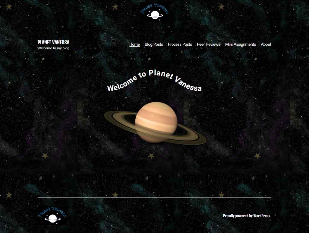
Lift-Off & Landing Page

It’s cold and lonely out in space. Away from our tiny blue marble, the vast recesses of nothingness overwhelm and stretch into the infinite. Soon the mind begins to play tricks on us. 

Are those far-off stars repeating themselves? As a matter of fact, yes! Looking closely at Planet Vanessa’s landing page, we see that the background image is tiled. 

The image of space she utilizes is 564 px wide and 1002 px tall. The tiling will vary depending on the screen’s resolution and whether visitors use desktops, laptops or mobile devices. 

 
Planet Vanessa Mobile Landing

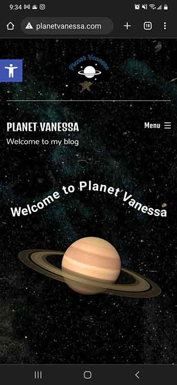
As you can see on my phone, we get one iteration of the tile.

On my desktop at 1920 x 1080, her background image iterates  ≈ 4 times horizontally. 

Repeating a background image is very pragmatic because it reduces load times. The computer only needs to interpret one much smaller image and duplicates it. 

Had she chosen a large HD image (1920×1080), this would have potentially increased her load times—potentially slowing down the user experience. I think that was a good decision on Vanessa’s part. Yet, there could be more attention to detail in choosing the perfect tile. A perfect tile gives the illusion of seamlessness. The trick is to obfuscate that line where one tile ends and another begins. This means we have to be conscious of the details of the picture. 

As we can see from this tile, a few places break the fantasy of deep endless space. We can see some prominent splashes of purple and blue to signify nebulae and a few gold stars. However, these nebulae don’t match up when placed side-by-side, and the stars are so unique compared to the other elements of the picture it creates multiple seams that the eye naturally follows. The result is that the background image perhaps stands out more than it should—a minor detail, to be sure, but something that stood out for me. 

Display Font & Logo. 


Vanessa’s logo is fun and playful. A line drawing of a Saturn-like planet upon a backdrop of stars. A black background and the name of her site are written above, transformed with a curve. 

Planet Vanessa Logo

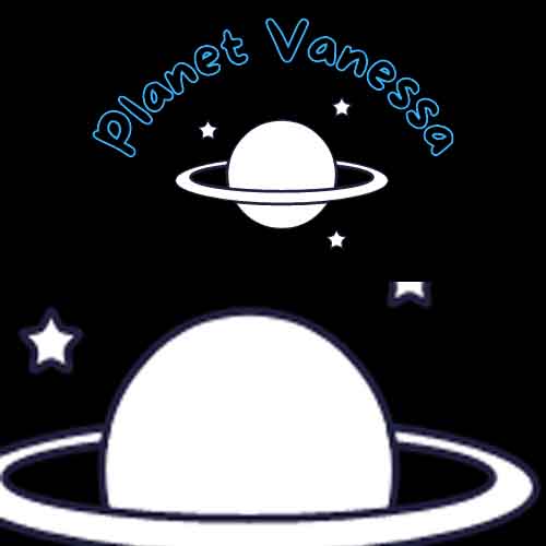
Looking closely, we see that the planet and star’s fill is white, while their stroke is blue-black. This stroke stands out against the black background of her logo, making me wonder about Vanessa’s thought process for this decision. It would be interesting to see the stroke match the background, creating a transparent effect in the intersecting lines of the rings and the planet. 

The font choice for her logo was interesting; she had chosen a display font from the comic family. This font features varying widths throughout the anatomy of the font, and fat rounded serifs give an overall bubbly feeling. She has chosen a transparent (or) black fill and a blue stroke. I like Vanessa’s type choice because it captures the mood she is expressing with her digital identity; however, the choice to make the fill transparent severely reduces the legibility of the text. 

The Golden rule of typography is that it must be legible. As it stands, there isn’t great enough contrast between the blue and the black; in addition, the stroke is too thin to stand out from its background. I recommend Vanessa play around with the typography and discover alternative design choices to increase the contrast between the type and its background. 

Planet Vanessa, featuring Planet Vannesa


The anatomy of her landing page is as follows: A <Header> containing Logo, <H1> text, a divider line, and her <Nav>. Following this is the <Body>, featuring some fun text on a curved baseline above an image of Saturn. Finally, the <Footer> is signified by another division line, the logo aligned to the left, and a shout-out to WordPress aligned right.

It would be interesting if the planet logo and image had more similarities. For example, in the picture, we’re looking at the planet from a different perspective which gives depth to the image, whereas we see the logo planet head-on, without a sense of depth. If they shared a sense of perspective, it would build cohesion between the different elements of your page. In addition, it would also be interesting to see how Vanessa could utilize the principle of similarity in her typography. 

I love the curved baseline of “Welcome to Vanessa Planet,” I love it even more that it’s a piece of CSS, not an image. But the dissimilarity between the four different fonts being utilized feels disharmonious. On the one hand, the logo paints a picture of something kinda fun and out-there, whereas the ‘welcome to’ and the <H1> text don’t seem to share that feeling. I think this could be easily fixed by choosing two fonts, maybe three, if she were very set on her logo typography. 

The easiest solution I would experiment with is eliminating the <H1> in the <header> altogether. I think this would be a strong move because the name of the site, “Planet Vanessa,” is well captured throughout the landing page, and since the <h1> is a completely different font from the logo, nav and welcome, removing this <H1> text would do several things. It would increase the cohesion of the typographic choices by limiting the amount used, eliminating redundant information, and making Vanessa’s <nav> more prominent, no longer having to share the line with the <H1> text.

Let’s look at the content.

Planet Vanessa Content example

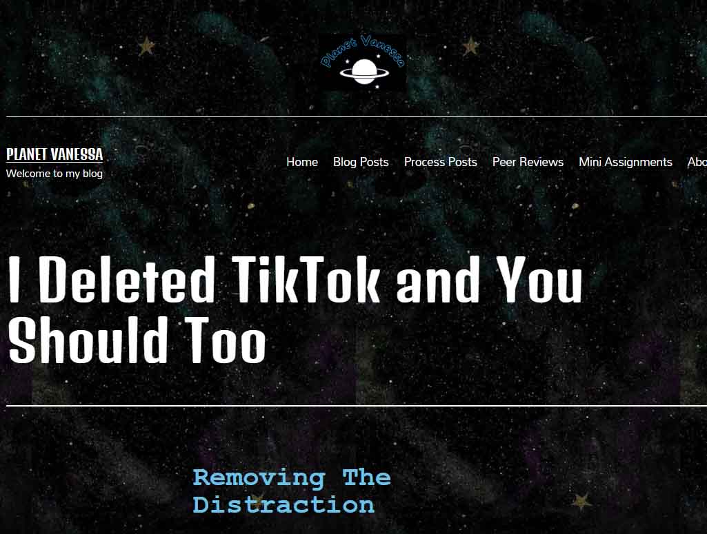
Vanessa utilizes a similar layout for her posts as I do on Burrito reProduction. It’s a single-column, aligned center. It’s simple, sweet—100% endorsement from my non-bias position! Planet Vanessa utilizes plenty of header tags to break her content into digestible pieces, which also increases the accessibility of the website. She also employs lots of photographs that raise the engagement in her content.

The content design on Planet Vanessa is very cohesive with one another, and it matches the landing page and about page. As my page layout is very similar, an observation that is as much for Vanessa as it is for myself, we find dynamic ways to utilize all the white space we leave on our pages. Since Vanessa’s site appears to be built with mobile phones in mind, this isn’t as much of an issue for her as it is for me. 

Final Thoughts.

Planet Vanessa has a strong sense of identity. It stands out from the run-of-the-mill blog spaces because of its design choices, giving the reader the impression that they have been invited into the depths of space to a planet unlike ours. A place that does not follow the standard conventions of simplistic, clean, or minimal design choices. It unapologetically expresses Vanessa Nipp through its space theme and bold typographic decisions, and the original logo all contribute to conveying the digital persona that Vanessa has cultivated.

Excellent work, Vanessa Nipp; I look forward to seeing what you do next with your site!

Process Post 7 (More about Design)

I had already devoted a great deal of my last process post to design. Still, I felt I didn’t capture the assignment to share some examples of websites that got my approval. In addition, I was supposed to talk about marketability next week! It seems I thoroughly confused myself! So I will take a step back and add a bit more about design and share some websites that I find pleasing, as well as show some that I do not care for. 

My love-hate relationship with minimalism

On the one hand, it is undeniable that minimalism deserves its place as a design aesthetic that continues to inspire all aspects of creative works. Websites, architecture, print and digital media, fashion, decor, music, fine arts, pretty much everything. And there are lots of good reasons to prefer a minimalist approach. For example, some people relish a ‘blank page’ approach to organizing their home, which can be important in a world overloaded with clutter, advertisements, people, cars, etc.

We can also make a moral argument that minimalist practices are good and ought to be pursued. Considering we live in a world of overconsumption, rife with gluttonous beliefs that express personal identity through material possession, it shouldn’t be difficult to thread the needle that minimalism offers a method of escape from our accelerated death drive of hoarding clutter.

So what’s the deal? What’s to hate? 

It’s because I think that most forms of minimalism are similar to the practice of ‘greenwashing.’ Greenwashing is usually a form of advertising or marketing spin to persuade the public that the organization’s products, aims and policies are environmentally friendly. But I am using it slightly differently. Instead of being limited to a process used by businesses, minimalism presents itself as a solution to real-world material problems without actually addressing the root of their problems. It’s a band-aid, addressing the symptom rather than the cause.

Too poor to own a house? Try living in a shipping container! I hate that minimalism is so often poverty in cosplay.


Furthermore, since minimalism is also a design trend, plenty of businesses have jumped on board with their website design, yet the outcome often creates cognitive dissonance. Why?

Minimalism is perceived as clean, lightweight, only what is needed, free from clutter, and utilitarian, but rarely does the ethos and philosophy of business correspond to these principles on any meaningful level. They believe in minimalism as a marketing strategy to maximize the consumption of their respective products. 

Let’s look at medium.com

Image of medium.com landing page.

What does this website tell us? It’s no bells, no whistles approach is ‘sleek,’ and its visual hierarchies are clearer for the audience to navigate without any hassle towards its product, which is its news stories.  Little nuggets of information in a world governed by the mantra that information is knowledge, and knowledge is power. For Medium, like all content mills, information is also currency—a worshipped and coveted form of power. 

Sure, it presents those nuggets in a minimalist manner, but then you realize there is an infinite amount of them, and to be sure, it doesn’t want you to take responsible little bites of its product. It wants you to consume its content voraciously. So there we go; we’re back to my objection. We choose minimalism as a function to maximize consumption—an inversion of the ethos of minimalism. And this is my major skepticism towards its popularity.

Yet, just because minimalism functions to obfuscate our relationship with consumption, does that justify an abandonment or wholesale rejection of minimalism? Should it be different?

O-V-E-R-L-O-A-D

My short answer is no. A sense of hierarchy is lost if a website is overloaded with visual elements. The eye feverishly darts from corner to corner in a vain attempt to make sense of the information, the structure, and the thesis. There is a physio-psychological limitation to our cognition, and we can’t make proper sense of overloaded, unorganized things. Therefore, some form of minimalism is not only preferred but necessary.

Case in point: This site.

image of landing page for arngren.com a danish website

UX/UI

I wish I knew more about these topics. It’s obvious that the difference between a good and bad form of minimalism is a matter of how we interact with it rather than what philosophy it proposes.

image of landing page for benjamin-nespoulous.com

I love this website because of its playful interactivity. The elements all have a bit of life to them. They move, expand, contract, become inverse in colouration, etc. It feels alive! Yet the site as a whole is so simple without being boring or cliche. It has a philosophy and functionality that incorporates minimalism without being minimalist. 


Let’s circle back.

Burrito Reproduction utilizes some notion of minimalism, so I couldn’t be so hypocritical as to condemn it completely. Part of the reason is that this course demonstrated that I’m woefully underskilled in coding. I thought I wasn’t so bad, but this whole WordPress experiment has shown me how far I have to travel. Nonetheless, I like the aesthetics of my site. I want to capture that same observation I made with NSPS. That being, it’s functionally minimal but unapologetic and individualistic about the typical conventions found in minimalism.

Moving forward, I will continue to remember the lessons learned from “How to Survive the Digital Apocalypse.” The old normative formats of repeated templates, uninspired content, and failure to express our unique subjectivity as designers, educators, and writers will ensure that narrow AIs will outsource us. We will survive by leaning into our subjectivity, which is exactly what I intend to do. 

How to Build an Isometric Grid in Adobe Illustrator

This week I’ve been practicing some Adobe Illustrator and making isometric graphics. I thought I’d share how to set up an Illustrator file so you can experiment with this style of perspective yourself!

What is Isometric?

Isometric means having equal dimensions. Its etymology is derived from the Greek words “isos” and “metron,” meaning equal measure.

Take a look at these here cubes!

Isometric cubes, featuring its congruencies.

As you can see, there are some interesting symmetrical features. For example, notice how in this cube, three axes intersect, all of which are of an equal degree from the intersection. Similarly, notice how two axes are rotated 30 degrees from the horizontal line imagined at 0 degrees. This intersection of lines at 30 degrees forms the basis of our grid. So let’s fire up Illustrator!

Process

After you’re loaded up, you need to make an artboard. For demonstration purposes, this artboard is 1000 x 1000 px.

isometric grid 1

Next, you will create your first 30-degree axis. You can create a line with the precise dimensions you require using the Line Segment Tool. The angle needed is 30 degrees, and its length… well… if you remember your trigonometry, you will know that a diagonal line (the hypotenuse) is 2x its opposite (the shortest of the three lines) in a 30-60-90 triangle.

So, therefore, for this line segment to reach the bottom of our artboard, it must be twice the length of its side. In my case, the line segment is 2000 px.

As you can see, the line segment must align with the top left point of the artboard.

isometric grid 2

Afterwards, you need to duplicate your line segment. You can hold alt/option+click and drag, or with the segment selected, copy and paste it.

What is important is the bottom of your copied line aligns with the bottom right point of your artboard.

isometric grid 3

With both lines selected, go to Object>Blend>Make. Then define your blend options by going to Object>Blend>Blend Options…

isometric grid 5

In the Blend Options, set the Spacing to Specific Steps. After, you must decide how many intervals you will have between each point.

This next part needs brainy time.

I set this axis to step 50 times between its two points. However, that does not mean 1000 px / 50 = 20 px/step. We need more trig to figure this out.

We know the Opposite side is 1000px, and the Hypotonuse is 2000 px. As we may recall from math class, the Adjacent side (the longer of the two non-diagonal lines) of a 30-60-90 triangle is Opposite√ 3.

In this case, 1000√ 3  ≈ 1732.05 px.

So, therefore, we know the distance between each interval is 34.64 


isometric grid 6

Next, we duplicate our line segments rotated 30 degrees in the opposite direction. But instead of repeating the process, we can transform our newly created array of lines.

Select the lines and right-click. Go to Transform>Reflect.

isometric grid 9

Ensure that your axis is set to vertical, and afterwards, click Copy to duplicate your selected lines into their newly reflected position.


isometric grid 10

It’s possible to create one more line segment and repeat the process. All you need to do is duplicate and rotate the third copy with an angle of 90 degrees

But honestly, you don’t need it to get started. These two intersecting lines are all you need to draw your own isometric graphics. Just remember to place your grid on a separate layer and lock it. Afterwards, grab your pen tool and have at ‘er! 


Here’s what I did during this tutorial. Most of these shapes are accessible through a Google Search

isometric grid 11

And one more without the grid.

isometric grid 12

There you have it!
Let me know if you found this helpful! Happy Designing!

Process Post 6 – Getting serious about Analytics

So for this week, I’ve been trying to brush up on my analytics and better understand how to generate more traffic for my site. Admittedly there is a lot to learn!

Of course, I have Site Kit, and of course, I’ve connected that to Google Analytics, but I wanted to take it a step further than that. I want to understand SEO better to make the most out of the data I’m collecting, which means learning a ton of new terminology-all with their strategies.

Social media

I hate social media, for the record. I’ve spent years and years disavowing it. Staying clear entirely. But now it seems like those days are done. I decided social media was the best way to start getting my link out there. But I need a reason to have, say, a Youtube account. Then it hit me. Why not migrate my recent video onto Youtube? Then I can just embed it onto my site! That is a win-win-win situation! First, I don’t have to take up the valuable space on this site hosting a video. Second is that I now have content for youtube, and the third is I have a network to cross-promote.

Okay, so I did it! Here’s the link to my new youtube channel!

I also did a Twitter thing… why in the name of God did I do that?? Recently, I was mentioned on Twitter for my talk at a journal conference, and I felt a bit of FOMO not being able to reply to thank them for the shout-out. Keeping in line with my goal to get serious about my promotions, I bit my tongue and signed up. Now I can promote new pages and at least squeeze a bit of analytics out of it.

So here I am on Twitter.

That’s it for Social media.

SEO

Another step I’m taking is to hone in on some SEO research. Last week, I decided I wouldn’t mind a side hustle as a copy or content writer. In addition, how cool would it be to generate money from this little publishing experiment? BurritoReProductions isn’t meant to be a content mill. Still, at the same time, it would be kinda cool to build a subdomain to showcase some content and copywriting to give me future opportunities. This week I’ll analyze the data and see which keywords and topics are naturally coming up as a launch point. I also plan to look at more trending topics and see if I can write a few samples in the vein of those topics.  We’ll see how it goes!

I also want to start cross-posting… I wonder who among my classmates would be interested in some cross-posting mutually beneficial marketing.

Design

I’m still struggling to find my own in the design side of things. I don’t know what I want it all to look like. I’ve tried many variations but keep returning to this green page. It’s my fallback! I’m trying to stay positive, though. I know that perfectionism kills progress. It may not be what I want, but it gives me a platform to work from. I will keep playing around, and hopefully, something will become of it. But I’m no longer as concerned about the design as earlier this semester.

I enjoyed reading the article “Design Machines: How To Survive the Digital Apocalypse.” Not only is it fantastically written, but its design is also exquisite. There was so much that I had intuitively felt was true but had not quite found the words to express for myself. That we exist in a copycat culture or that so much content online is crap—crap selling crap. Or something not necessarily addressed but of the same vein, that AI templates are quickly becoming the norm for content, only adding to the tensions raised in the article.

I’m unsure how to employ best what I learned from the article. I think it’s just food for thought. I’m tempted to say we need to act more authentic in our publishing spheres because if we become too complacent with that cookie-cutter style of content creation, we will be outsourced by automation. The one thing we have to offer that our machines can not is our humanity, warts and all.

The Pious Squirrel

A Lyrical Argument for Nihilistic Error Theory

I wrote this poem a while ago for an ethics class. It describes how Error theory, the believe that we are always in error when we make claims about morality, challenges the common ethical claim that God is the author of morality. While Divine Command Theory, DCT is highly refuted today, even among theosophers, its impression is still felt through religious practitioners.

Just a note: this isn’t my metaethical belief, rather it’s just a fun way to demonstrate metaethics. 

What do you think? Do you agree that there are no moral facts? What system of ethics do you prescribe?

0.

Dusk had arrived at the park by the sea. Once again, nature belonged to its forest inhabitants. The deer prefers leaves like the fox prefers meat; a chipmunk like myself prefers to contemplate. I emerged from my burrow and heard a curious sound of tiny paws digging through the ground. There I discovered a cousin of mine, a squirrel busying herself uncovering acorns to dine. I cleared my throat, “Excuse me, miss, but what are you doing? Those acorns you found belong to another. Is it not wrong to take from your brother?”

Without missing a beat, she refutes as a matter of fact, “Squirrels are not interested in matters like that. There are moral facts, it’s plain to me, but those are revealed by Great Oakley. She is all-wise and all-perfect and the author of all things true; more important is what she commands I do. If it was her will that squirrels don’t eat her crop, then what would be right is I ought to stop.”

Ah, Great Oakley, a squirrel’s deity, and this particular squirrel expressed piety. I scampered closer to make further inquiry.

1.

“It’s curious to ask who authors what’s right; I suspect that there’s more than your divine insight. Your position is clear and follows my query, your position I call Divine Command Theory.1 What is moral is what Oakley commands, and what is not, She forbids. Does that sound right?”

“Indeed it is.”

“Permit me a bit more. Does Oakley command because these actions are right, or are they moral because Oakley commands them? You can see the dilemma, I’m sure. If the former, then it appears that what is right exists outside Oakley’s heavenly sight. In such a case, She’s hardly all-wise, and there is at least one thing she did not comprise. If the latter horn is true, this is equally difficult. How does Oakly decide what’s permissible? It would appear quite arbitrary, for it would be these reasons, not Her command, that justify morality. How could this be if She exists so perfectly?”

The squirrel’s heart turned.

“How wise, my cousin of mine, I never paused to commit this to mind. It seems in both cases, this position fails. Now I am inclined to believe that there are simply no morals for me to retrieve. In lieu of any objective moral fact, I am free to fill my cheeks as a non-moral act!”

She resumed stuffing acorns into her cheeks.

2a.

I laughed and sat with her, for even a chipmunk can enjoy a snack, “From my own thoughts, I agree, but I don’t believe in Great Oakley. Our forest is absent of moral claims, and far worse is they justify our chains. My position of why I am so weary is what I shall call an Error Theory.2 This world lacks moral features, and thus these judgements can never be true. Try as we might, our judgements are frail, and these descriptions ultimately fail. So it follows, as you plainly see, there’s no such thing as morality. If such objectivity exists, it necessarily requires categorical reasons despite our desires. It’s pretty convenient that Oakley’s commands just so happen to follow your hungry plans! Your bulging cheeks are evidence to me that you spoke in error about morality.” As she munched, I continued.

2b.

            “Error theory focuses on what’s metaphysically amiss and reminds of the strangeness if values exist.3

Objective facts are things we can justify, and unlike rain, values do not fall from the sky. A squirrel must eat, obviously, so your desire to eat is based on objectivity. But where are these values you held so dear? If you look all around, I think you’ll agree that values are not the things to be found. The advantage is that Error Theory corresponds to what positively is true, and it perfectly describes your desire to chew! So now that you have freed yourself from Oakley’s commands, you discover a true fact instead of moral demands. Recall morality tends to enslave, and to uphold it gives your control away. Consider if Oakley demands you to refrain, then it seems Her law would justify great pain. If that was her command, it would be quite dire, then it would seem what’s moral is for you to expire!”4

My cousin seemed convinced, but as I turned away, it appeared she had something more to say.

3.

            “You gave me cause to accept what you say, but it seems to me morals aren’t easily explained away. Morality for digging out nuts may cause us suspicions, but how do we reconcile our greater intuitions? It seems that other circumstances are far from minuscule. Consider murder by a wolf; this action is impermissible. It causes great suffering; no one would abide by this action if done to themselves or their tribe. Where are these natural facts which describe our moral intuitions in matters like that?”

4.

I was impressed. I couldn’t hide. I turned to the squirrel for a final reply. “Consider suffering as a positivist description. It is, or it isn’t; it’s a simple prescription. Now consider a claim built on an ought. There’s something else present than the positivist brought. The ought adds a value, and if you recall, a value is not represented in the world at all! How do we use reason to justify the truth of such value claims? A bitter truth, more bitter than acorn rot, is that reason does not justify an ‘is’ to an ‘ought.’5 While we agree, we’d rather not be a victim of a wolf’s murderous spree. The explanation that the naturalists give is this great intuition is our desire to live.” With everything said, she thanked me, so I took my leave beneath the forest canopy.

Bibliography

  1. Shafer-Landau, Russ. “Morality and Religion.” The Fundamentals of Ethics, 4th ed., 67–68. New York: Oxford University Press, 2018.
  2. Shafer-Landau, Russ. “Moral Nihilism.” The Fundamentals of Ethics, 4th ed., 311–312. New York: Oxford University Press, 2018.
  3. Mackie, J.L. “ The Argument from Queerness.” Ethics: Inventing Right and Wrong, 38–40. 1977.
  4. Inspired by Nietzche’s critique of slave morality. Wolff, Jonathan, and Nietzsche, Friedrich. “Beyond Good and Evil.” Essay in Readings in Moral Philosophy, 32–38. New York: W.W. Norton et Company, 2018.
  5. Wolff, Jonathan, and David Hume. “Moral Distinction Not Derived from Reason.” Essay in Readings in Moral Philosophy, 17–21. New York: W.W. Norton et Company, 2018.