


seven keys to my brand identity
– ammarah siddiqui
The post seven keys to my brand identity appeared first on ammarah.
Remixing is my bread and butter as a designer. I learnt how to use photoshop while making photo compositions and love to utilize those skills to this day.
Here are three posters I have designed which utilize the concept of remix. All these posters feature their source images from the covers of 1950s golden age comic books. I have doctored the images, manipulated, transformed, recoloured, and gave them extensive typographic treatment.
All three images are a series of advertisements for my philosophy undergraduate journal: Jove’s Bodega.
I hope you enjoy!


I had already devoted a great deal of my last process post to design. Still, I felt I didn’t capture the assignment to share some examples of websites that got my approval. In addition, I was supposed to talk about marketability next week! It seems I thoroughly confused myself! So I will take a step back and add a bit more about design and share some websites that I find pleasing, as well as show some that I do not care for.
On the one hand, it is undeniable that minimalism deserves its place as a design aesthetic that continues to inspire all aspects of creative works. Websites, architecture, print and digital media, fashion, decor, music, fine arts, pretty much everything. And there are lots of good reasons to prefer a minimalist approach. For example, some people relish a ‘blank page’ approach to organizing their home, which can be important in a world overloaded with clutter, advertisements, people, cars, etc.
We can also make a moral argument that minimalist practices are good and ought to be pursued. Considering we live in a world of overconsumption, rife with gluttonous beliefs that express personal identity through material possession, it shouldn’t be difficult to thread the needle that minimalism offers a method of escape from our accelerated death drive of hoarding clutter.
It’s because I think that most forms of minimalism are similar to the practice of ‘greenwashing.’ Greenwashing is usually a form of advertising or marketing spin to persuade the public that the organization’s products, aims and policies are environmentally friendly. But I am using it slightly differently. Instead of being limited to a process used by businesses, minimalism presents itself as a solution to real-world material problems without actually addressing the root of their problems. It’s a band-aid, addressing the symptom rather than the cause.
Too poor to own a house? Try living in a shipping container! I hate that minimalism is so often poverty in cosplay.
Furthermore, since minimalism is also a design trend, plenty of businesses have jumped on board with their website design, yet the outcome often creates cognitive dissonance. Why?
Minimalism is perceived as clean, lightweight, only what is needed, free from clutter, and utilitarian, but rarely does the ethos and philosophy of business correspond to these principles on any meaningful level. They believe in minimalism as a marketing strategy to maximize the consumption of their respective products.

What does this website tell us? It’s no bells, no whistles approach is ‘sleek,’ and its visual hierarchies are clearer for the audience to navigate without any hassle towards its product, which is its news stories. Little nuggets of information in a world governed by the mantra that information is knowledge, and knowledge is power. For Medium, like all content mills, information is also currency—a worshipped and coveted form of power.
Sure, it presents those nuggets in a minimalist manner, but then you realize there is an infinite amount of them, and to be sure, it doesn’t want you to take responsible little bites of its product. It wants you to consume its content voraciously. So there we go; we’re back to my objection. We choose minimalism as a function to maximize consumption—an inversion of the ethos of minimalism. And this is my major skepticism towards its popularity.
Yet, just because minimalism functions to obfuscate our relationship with consumption, does that justify an abandonment or wholesale rejection of minimalism? Should it be different?
My short answer is no. A sense of hierarchy is lost if a website is overloaded with visual elements. The eye feverishly darts from corner to corner in a vain attempt to make sense of the information, the structure, and the thesis. There is a physio-psychological limitation to our cognition, and we can’t make proper sense of overloaded, unorganized things. Therefore, some form of minimalism is not only preferred but necessary.
Case in point: This site.

I wish I knew more about these topics. It’s obvious that the difference between a good and bad form of minimalism is a matter of how we interact with it rather than what philosophy it proposes.

I love this website because of its playful interactivity. The elements all have a bit of life to them. They move, expand, contract, become inverse in colouration, etc. It feels alive! Yet the site as a whole is so simple without being boring or cliche. It has a philosophy and functionality that incorporates minimalism without being minimalist.
Burrito Reproduction utilizes some notion of minimalism, so I couldn’t be so hypocritical as to condemn it completely. Part of the reason is that this course demonstrated that I’m woefully underskilled in coding. I thought I wasn’t so bad, but this whole WordPress experiment has shown me how far I have to travel. Nonetheless, I like the aesthetics of my site. I want to capture that same observation I made with NSPS. That being, it’s functionally minimal but unapologetic and individualistic about the typical conventions found in minimalism.
Moving forward, I will continue to remember the lessons learned from “How to Survive the Digital Apocalypse.” The old normative formats of repeated templates, uninspired content, and failure to express our unique subjectivity as designers, educators, and writers will ensure that narrow AIs will outsource us. We will survive by leaning into our subjectivity, which is exactly what I intend to do.
This week I’ve been practicing some Adobe Illustrator and making isometric graphics. I thought I’d share how to set up an Illustrator file so you can experiment with this style of perspective yourself!
Isometric means having equal dimensions. Its etymology is derived from the Greek words “isos” and “metron,” meaning equal measure.
Take a look at these here cubes!
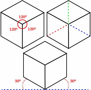
As you can see, there are some interesting symmetrical features. For example, notice how in this cube, three axes intersect, all of which are of an equal degree from the intersection. Similarly, notice how two axes are rotated 30 degrees from the horizontal line imagined at 0 degrees. This intersection of lines at 30 degrees forms the basis of our grid. So let’s fire up Illustrator!
After you’re loaded up, you need to make an artboard. For demonstration purposes, this artboard is 1000 x 1000 px.

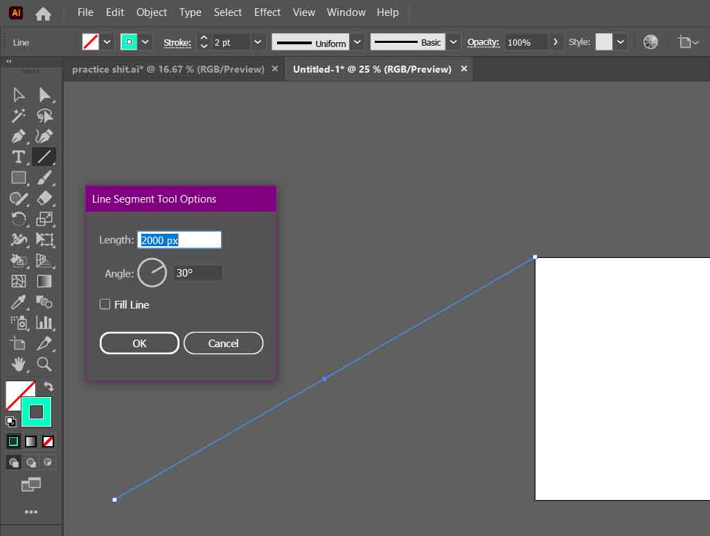
Next, you will create your first 30-degree axis. You can create a line with the precise dimensions you require using the Line Segment Tool. The angle needed is 30 degrees, and its length… well… if you remember your trigonometry, you will know that a diagonal line (the hypotenuse) is 2x its opposite (the shortest of the three lines) in a 30-60-90 triangle.
So, therefore, for this line segment to reach the bottom of our artboard, it must be twice the length of its side. In my case, the line segment is 2000 px.
As you can see, the line segment must align with the top left point of the artboard.
Afterwards, you need to duplicate your line segment. You can hold alt/option+click and drag, or with the segment selected, copy and paste it.
What is important is the bottom of your copied line aligns with the bottom right point of your artboard.

With both lines selected, go to Object>Blend>Make. Then define your blend options by going to Object>Blend>Blend Options…

In the Blend Options, set the Spacing to Specific Steps. After, you must decide how many intervals you will have between each point.
This next part needs brainy time.
I set this axis to step 50 times between its two points. However, that does not mean 1000 px / 50 = 20 px/step. We need more trig to figure this out.
We know the Opposite side is 1000px, and the Hypotonuse is 2000 px. As we may recall from math class, the Adjacent side (the longer of the two non-diagonal lines) of a 30-60-90 triangle is Opposite√ 3.
In this case, 1000√ 3 ≈ 1732.05 px.
So, therefore, we know the distance between each interval is ≈ 34.64

Next, we duplicate our line segments rotated 30 degrees in the opposite direction. But instead of repeating the process, we can transform our newly created array of lines.
Select the lines and right-click. Go to Transform>Reflect.

Ensure that your axis is set to vertical, and afterwards, click Copy to duplicate your selected lines into their newly reflected position.

It’s possible to create one more line segment and repeat the process. All you need to do is duplicate and rotate the third copy with an angle of 90 degrees.
But honestly, you don’t need it to get started. These two intersecting lines are all you need to draw your own isometric graphics. Just remember to place your grid on a separate layer and lock it. Afterwards, grab your pen tool and have at ‘er!
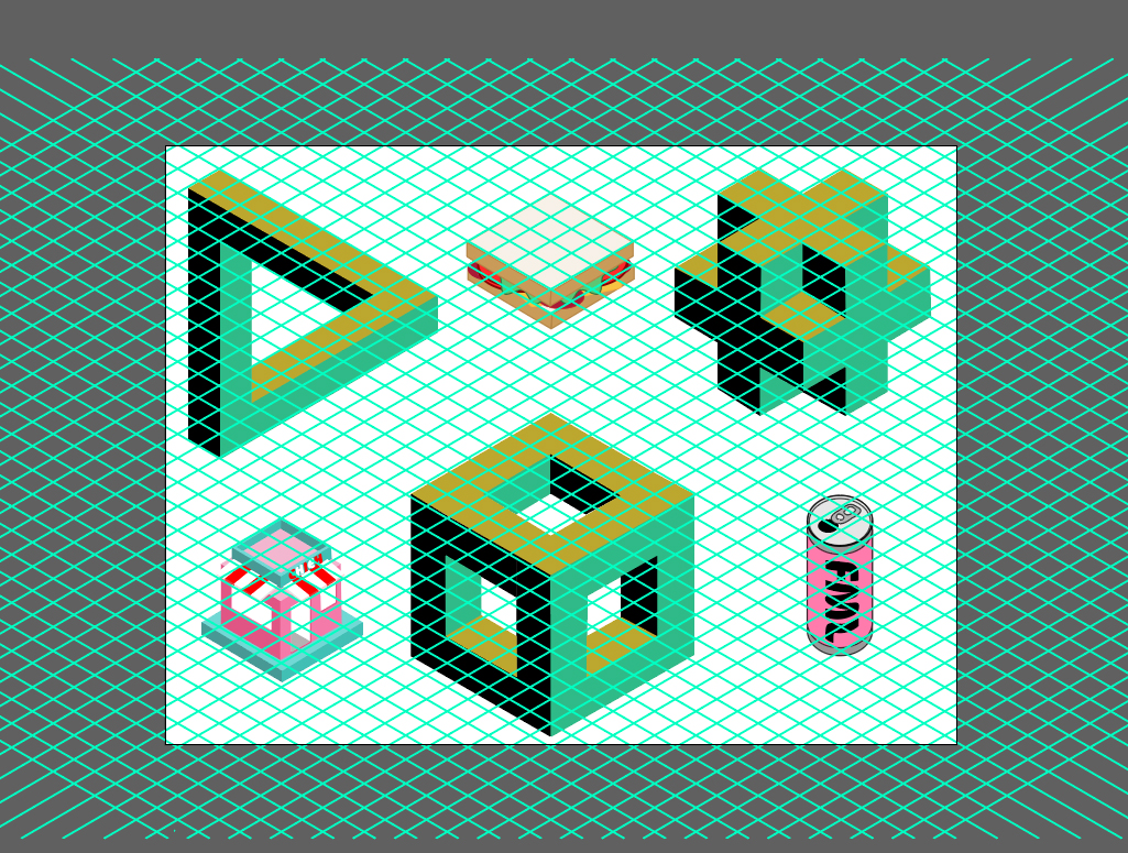
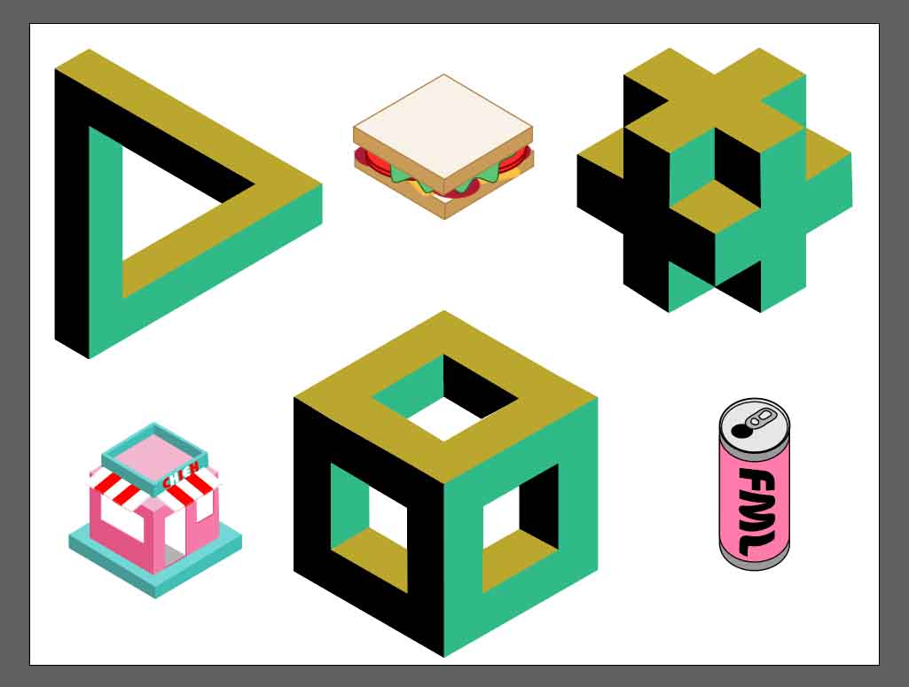
Here’s what I did during this tutorial. Most of these shapes are accessible through a Google Search
And one more without the grid.
There you have it!
Let me know if you found this helpful! Happy Designing!
So for this week, I’ve been trying to brush up on my analytics and better understand how to generate more traffic for my site. Admittedly there is a lot to learn!
Of course, I have Site Kit, and of course, I’ve connected that to Google Analytics, but I wanted to take it a step further than that. I want to understand SEO better to make the most out of the data I’m collecting, which means learning a ton of new terminology-all with their strategies.
I hate social media, for the record. I’ve spent years and years disavowing it. Staying clear entirely. But now it seems like those days are done. I decided social media was the best way to start getting my link out there. But I need a reason to have, say, a Youtube account. Then it hit me. Why not migrate my recent video onto Youtube? Then I can just embed it onto my site! That is a win-win-win situation! First, I don’t have to take up the valuable space on this site hosting a video. Second is that I now have content for youtube, and the third is I have a network to cross-promote.
Okay, so I did it! Here’s the link to my new youtube channel!
I also did a Twitter thing… why in the name of God did I do that?? Recently, I was mentioned on Twitter for my talk at a journal conference, and I felt a bit of FOMO not being able to reply to thank them for the shout-out. Keeping in line with my goal to get serious about my promotions, I bit my tongue and signed up. Now I can promote new pages and at least squeeze a bit of analytics out of it.
So here I am on Twitter.
That’s it for Social media.
Another step I’m taking is to hone in on some SEO research. Last week, I decided I wouldn’t mind a side hustle as a copy or content writer. In addition, how cool would it be to generate money from this little publishing experiment? BurritoReProductions isn’t meant to be a content mill. Still, at the same time, it would be kinda cool to build a subdomain to showcase some content and copywriting to give me future opportunities. This week I’ll analyze the data and see which keywords and topics are naturally coming up as a launch point. I also plan to look at more trending topics and see if I can write a few samples in the vein of those topics. We’ll see how it goes!
I also want to start cross-posting… I wonder who among my classmates would be interested in some cross-posting mutually beneficial marketing.
I’m still struggling to find my own in the design side of things. I don’t know what I want it all to look like. I’ve tried many variations but keep returning to this green page. It’s my fallback! I’m trying to stay positive, though. I know that perfectionism kills progress. It may not be what I want, but it gives me a platform to work from. I will keep playing around, and hopefully, something will become of it. But I’m no longer as concerned about the design as earlier this semester.
I enjoyed reading the article “Design Machines: How To Survive the Digital Apocalypse.” Not only is it fantastically written, but its design is also exquisite. There was so much that I had intuitively felt was true but had not quite found the words to express for myself. That we exist in a copycat culture or that so much content online is crap—crap selling crap. Or something not necessarily addressed but of the same vein, that AI templates are quickly becoming the norm for content, only adding to the tensions raised in the article.
I’m unsure how to employ best what I learned from the article. I think it’s just food for thought. I’m tempted to say we need to act more authentic in our publishing spheres because if we become too complacent with that cookie-cutter style of content creation, we will be outsourced by automation. The one thing we have to offer that our machines can not is our humanity, warts and all.
Today I wanted to share a book I bound last semester for a publishing class. I hope you enjoy it!
I love this blog!
A Blog for Life Livers is written by Hope Stewart, an adventurer and life liver, sharing her stories of childhood joy and new experiences. Hope writes beautifully about enjoying the life around you and being present in every moment. She uses pictures and poems to portray her feelings and emotions from each adventure, with occasional videos showing small moments that she wants to remember.
This is blog that leaves you feeling refreshed, optimistic, and in wonder. Check out a Blog for Life Livers here.
Organization
Hope’s homepage is set with pictures and bold fonts that capture the viewer on first glance. As you scroll through, you’ll see some images that capture the vibe of this website and set the tone for all of her blog posts. There is also a welcome message at the bottom of the page that invites you to consider your own life and how you might create new adventures.

So come in and stay awhile, as each page has been placed here for you: to draw inspiration for your next adventure, to help you conquer fear, to help you seize each day, and to learn to fully immerse yourself in moments both wild and calm.
The top menu is well organized and gives the viewer easy access to the media they are looking for. The media gallery highlights Hope’s videos and photos and immerse the viewer into an adventure of their own. Browsing through Hope’s media makes me feel as though I get to experience a little bit of her adventure as well!
Marketability
This blog presents many beautiful original images that capture the vision of Hope’s website. Creating prints or postcards of these images could be a great way to allow your audience to participate in the stories while supporting your writing! Post cards would be an especially unique product you could sell that represent the slow-ness of handwriting a letter and enjoying every moment.
Check out Hope’s media gallery here.

Another way to market your website could be to partner with tourism companies in encouraging more travelers to come visit their area. Your video of Hornby island captures moments that feel whimsical and magical and could definitely inspire more people to visit those places! One suggestion would be contacting small island communities like Bowen Island, Gibsons, or Lund and offering to make them a video showcasing the best part of their city! This could be a great way to travel, gain more content for your website and generate revenue.
This website is beautifully simple and refreshingly organized, so I would hesitate to incorporate ads that may hinder the viewer experience given that this blog is very experience driven. One possibility for ad revenue could be to partner with related companies to promote products that relate to your blog postings.
An example of this could be with the Mushroom Hunting Blog post. You could reach out to companies that offer classes or books on how to identify mushrooms and then collect revenue based on how may clicks from your blog lead to theirs.
A similar example could be with your Mindfulness and Yoga post. This post links to Yoga Youtubers and workout routines, which could potentially be business partners and generate revenue for your website!
Overall, this is a beautiful website that creates freshness and relief in a busy and confused world. Check out a Blog for Life Livers to enjoy nature, mindfulness, and stealing moments as presented by Hope Stewart.
Stealing moments helps you realize that you are the master of your own time and that you have more control over your own happiness than it may feel. It helps you look for little silver linings in the smallest of things and encourages gratitude and mindfulness.”
Repurposed
The About page is where people go to gain a better understanding of a website or blog. Basically, my about page is the first impression newcomers will get of my blog and me. Keeping this in mind, it’s important for this page to be captivating, professional, and beautiful. Looking at my current About page, I knew I wanted to make some changes – not only in the style, but also content. My current bio explained the basics, but was too short in length and was unengaging for my likes.
I tried editing my About page through Elementor, as it offered a whole lot more versatility and customization to the elements, especially in comparison to the blocks theme that I’ve been using. Because I didn’t have an exact idea of what I wanted the layout of my About page to look like, it took a lot of time and trial and error.
What I liked about my previous page was the definition of “klick”. I wanted to keep this, but redesign it to make it more appealing and cohesive with the style of the logo that I had created weeks prior.


I wanted this definition to be the first graphic on the page, as it would set the tone for the rest of the blog. Yes, I do know that click is typically spelled with a “C”, and yes, the “K” was on purpose. In one image, I hoped to capture the explanation and theme. Just like in dictionary definitions, I wanted to use “klick” in a sentence, so I used this first sentence – which was originally used in Joffre Lakes; however, I ended up changing it to something much more relevant to my blog:

I had the plan of creating three distinct clickable categories in columns below with brief descriptions of these different categories. I wanted this graphic to blend seamlessly with the categories below. Originally, I wanted to extend the grey a little further down, and add a white mountain in the middle to blend the grey from this graphic and the white from the following section. While I was doing this, I realized I was creating an arrow in the wrong direction. Instead of having a white arrow pointing up, which would have been the case had I kept the white mountain on the grey backdrop – I created a negative valley (as in lack of colour, not unhappy) to draw attention to the following section.


Each of these columns are responsive, meaning that it react to your curser. When the mouse hovers over the column, it becomes a darker shade, inciting you to click on it. These columns, images, and titles are linked to their respectful pages. For example, if I were to click the “local” column, it would send me to the landing page for the local category.

Next up was rewriting and redesigning my bio section. I chose colours that would match the image, along with a readable and professional font. My original About page lacked warmth and friendliness, so I tried to keep this in mind when redesigning and rewriting this next section:

All that was missing was connecting my social media account and contact information. I opted for simple responsive icons. The icon would increase slightly in size when hovering over it with your mouse, and for consistency, I chose to have the colours change to the blue and yellow of my logo:


When clicking the facebook icon, it would open my facebook page in a new tab with to make sure I’m not kicking them off my blog. Similarly, when clicking the mail icon, the user’s email would open up in a new tab, ready to send me an email.
So while I’m really happy with the design and content of my new About page, you might be left wondering why you still see my old About page, as opposed to this new and improved one. To my big disappointment, when I was troubleshooting this page for different screen sizes, I realized how illegible it is for mobile devices. Somehow, the graphics, icons, columns and images didn’t transfer well onto a smaller screen: not only was the layout lost, but some images disappeared and the content was just not easily readable.

This was especially frustrating, as I had spend days working on it this. While the layout did still work on tablets and desktop computers, over half of my audience accesses my blog on their mobile device, so keeping this up was out of the question. I rather have an elementary version of my about page rather than make this illegible gibberish live on my website. Unfortunately I don’t have the time to try and fix this before the end of the semester, but I plan to sort this out as soon as possible. If nothing else, I learned the importance of troubleshooting regularly throughout my progress to make sure its compatible with all devices.
Live Like Joao
Food, Places and Everything About My Life
*Above image taken from Live Like Joao’s Blog
Live like Joao offers a personable and candid approach to food blogging. When it comes to creating his new blog, Joao’s honesty is refreshing; while this may be a daunting new task, Joao invites his audience into his inner thoughts as he navigates the unfamiliar waters of WordPress. According to the screenshots from Amanda‘s first peer review, Joao has implemented a lot of her recommendations and suggestions. Already, Live Like Joao is starting to have synchronicity between the website’s appearance and the content. To properly unpack the different design elements in this blog, I will be focusing on two important design umbrellas: user experience (UX) and User Interface (UI).
Travis Gertz’s 2015 Design Machines: How to survive in the digital Apocalypse explains the UX design as how the website works, as opposed to how it looks. A hyper-simplified breakdown of the UX design category would include layout, interaction, information architecture, wireframing, prototyping, research, and testing. At first glance, Live Like Joao seems to work pretty cohesively and sensibly. There are subtle cues throughout the blog that indicate where I should look or click. For example, both the BLOG and POSIEL tab on the top righthand menu have a little downwards arrow to indicate a drop-down menu. These exemplify what Victor Kaptelinin describes as affordances in his article The Encyclopedia of Human-Computer Interaction.
The search function right above the categories list is a really helpful tool, especially when looking for a certain page or post that I particularly enjoyed, but was unable to retrace my steps. Since this blog is fairly new, I wasn’t lost in the content and it was easy to find my way back; however, once there are more entries and if Joao chooses to continue this blog post-PUB101, I suspect that this search function will become a really handy tool.
While there are affordances that create direction throughout the blog, I still seemed to have encountered some problems with Joao’s BLOG section. Firstly, I noticed that there is a category for “Blog” and “Blog Post”. This seems counter-intuitive, as these categories seem synonymous. Kaptelinin underlines that “Good designs are intuitive“; hence, I would always recommend going through the website fully – as a sort of informal audit – and paying extra attention to what is intuitive to you. What comes up when you click certain links? Does it take you where you would expect it to? This brings me to my second suggestions: make sure that the information is stored in the right place. For example, when I click the BLOG POST on the drop down menu, the only post that is available is the “Short Essay 1”.
In contrast to the former, UI Design encompasses how the website looks as opposed to how it works. Gertz explains that typography, colour, forms, illustration, photography, and detail can all be found within this realm.
Caution: Do not read when hungry!
This blog does a wonderful job at capturing mouth-watering cuisine. From a UI design perspective, there is a great use of white space and visual contrast with images. Blog Post 1 does a good job of separating chunks of text and using different fonts, especially by bolding the Ingredients title. The other blog posts could benefit by following the great example from that first blog. For example, my eyes are yearning for more contrast in the text in the Blog Post 3. There is a beautiful photo of gorgeous cuts of meats – perhaps I should have waited until after dinner to write this review – followed by the restaurant’s information and a short review. To better accompany the bold image, I would make the text larger and create a small text box containing the restaurant’s pertinent information. Currently, the review is the smallest group of text on the image: all these small modifications would allow for the sections of the page to be more proportionate to each other, and allow the important information to stand out.
The beautiful rustic table of food that act as the blog’s cover page sets the tone for a visually-enticing food blog. Keeping this in mind, I would recommend continuing with this theme by adding more images throughout the blog: as we are unable to taste this food with our taste buds, we do so with our eyes. Therefore, it is important to describe or visually show these through images and videos, as is done in the first blog post. If at all possible, ensure that photos and videos are the same size or are complimentary to the overall page layout to allow for synchronicity and fluidity.
Overall, I enjoyed joining Joao on his adventures through WordPress and discovering exciting new restaurants around the Lower Mainland through his reviews. I look forward to seeing the progress and reading more content from Joao. The recipes, reviews, and personable tone leaves me hungry for more!
Check out Live Like Joao here.

Adobe icons retrieved from freebiesupply.