Monthly Archives: March 2023

Is banning artificial intelligence truly the best course of action?

We are not even three months into 2023 and yet you could already call this the year of artificial intelligence. Although the idea of AI has been around for some time, the recent developments have been remarkable, particularly in terms of accessibility to the public. The advancements have been so fast that society has had a hard time deciding how to proceed. One of the more challenging dilemmas is AI’s implications on education and students. Many schools have called for a ban on the use of AI, but is this truly the best course of action? I contend that AI should not be banned in schools for several reasons. First, there are more effective ways to combat plagiarism and cheating. Second, AI can be a powerful tool for enhancing student learning. Finally, since AI will undoubtedly be an integral part of our future, it makes sense to begin implementing it now.

For years, many have criticized the grading system for evaluating student performance. In his academic journal, The Case Against Grades, Alfie Kohn outlines the many problems with the grading system. Kohn argues that grades decrease student interest in learning, encourage students to seek out easy tasks, and lead to a reduction in the quality of student thinking. Moreover, he contends that motivation to earn good grades is extrinsic, resulting in a focus on grades rather than on learning. Perhaps most concerning is Kohn’s claim that a grading-focused environment is linked to higher levels of plagiarism and cheating (Kohn, 2013). The biggest concern with AI in schools is its potential to be used to plagiarise and cheat, some schools have decided to ban its use because of this. However, “Mr. Sid Dobrin, chair of the English department at the University of Florida believes that banning AI won’t solve anything and that students are plagiarising assignments because they can be plagiarised…Some professors are redesigning their courses entirely, making changes that include more oral exams, group work, and handwritten assessments in lieu of typed ones”(Huang, 2023). Making these changes in how students are assessed removes opportunities for plagiarism and cheating while also creating a more engaging curriculum.

AI also has tremendous potential for enhancing student learning. In his academic journal, Artificial Intelligence Applications to Support K–12 Teachers and Teaching, Robert Murphy highlights the ways in which AI can benefit both teachers and students. Murphy mentions how AI can be used to create personalized curricula that adjust the difficulty of questions based on each student’s level of knowledge. This feature helps keep students engaged by providing a challenge that is neither too easy nor too difficult. Additionally, AI can be used to identify students who may be falling behind and provide them with additional resources to help them catch up. Finally, AI can be used to provide students with learning and attention challenges, such as ADHD, dyslexia, and dysgraphia, with an educational experience that is tailored to their needs (Murphy, 2019).

Lastly, since AI will inevitably be a part of our future, why wait to implement it? Although some people are skeptical of AI and not fully on board with its use, the technology is here to stay. Companies like Microsoft and Google are racing to develop more advanced AI, and countries are competing to develop more sophisticated AI technology. In his academic journal, Cai Cuihong says “The world is thus embarking upon, or perhaps could be said to have already started, a new cold war, this time driven by AI” (Cuihong, 2019). With so much emphasis being placed on AI research and development, the technology will develop fast and could have a big impact on our everyday lives. With that in mind, it makes the most sense to begin implementing it into our lives now.

While it is understandable that some schools have banned AI with it being a new technology and how it was quickly used unjustly, this is only a short-term solution and as time goes on it will get more and more difficult to detect it. Instead of trying to ban it, schools should embrace AI because there are better ways to combat these issues, such as changing assessments to include more oral exams, group work, and handwritten assignments. Additionally, it has tremendous potential for enhancing student learning, such as through personalized curricula and tailored support for students with learning challenges. Finally, since AI is here to stay and will only become more integrated into our lives, it makes sense to begin implementing it now rather than waiting.

References

Cuihong, C. (2019, October 1). The shaping of strategic stability by artificial intelligence. JSTOR. Retrieved March 12, 2023, from https://www.jstor.org/stable/resrep24532.16

Huang, K. (2023, January 21). Alarmed by Ai Chatbots, universities start revamping how they teach. Nexis Uni. Retrieved March 12, 2023, from https://www.todayonline.com/world/alarmed-ai-chatbots-universities-start-revamping-how-they-teach-2090501

Kohn, A. (2013, November 13). The case against grades. JSTOR. Retrieved March 12, 2023, from https://www.jstor.org/stable/42982088

Murphy, R. (2019, January 1). Artificial intelligence applications to support K-12 teachers and teaching. JSTOR. Retrieved March 12, 2023, from https://library.villanova.edu/Find/Record/2847893/Details 

It’s a bird! No, it’s a plane! Wait, no… it’s a glory???

During the reading break, I took a trip to Las Vegas. While flying over Nevada I was looking out of the window enjoying the sights of the mountains and desert lands near death valley. In all the flights I’ve taken over the years, I’ve never seen what I was seeing. As we flew above some light clouds I started seeing a rainbow appear, but not any rainbow, this one was circular. I couldn’t believe my eyes! I started to make out the shadow in the center and realized that it was the shadow of our plane in the center of this circular rainbow!

Picture taken of a glory from an airplane of the Nevada desert near Las Vegas
A picture I captured of a glory from the airplane window above the Nevada desert.

According to Paula Ferreira (2022), turns out that this is a rare optical phenomenon that is called a glory. Usually only seen in the right conditions and up high on a mountain or from an airplane. From a mountain, you usually see the observer’s head as the shadow. This phenomenon is caused by the sunlight interacting with water droplets (mist or clouds).

Glory encountered during a hike in An Teallach, Scotland Date: 2005-08 Author: AndiW
Glory encountered during a hike in An Teallach, Scotland https://en.wikipedia.org/wiki/Glory_(optical_phenomenon) Date: 2005-08 Author: AndiW

Or more scientifically speaking, glories appear because of wave interference of light internally refracted within small droplets. Much like how you played with prisms in science class in high school, that is how you get certain colours from white light bouncing off the water droplets. In other words, it’s complicated, but if you would like to learn more about them you can read about it here. I hope someday you get to discover one of your own while adventuring. It is quite amazing to witness.

References

Ferreira, P. (October 5, 2022). “The glory: the science behind a rare optical phenomenon” Retrieved from https://www.zmescience.com/science/physics/the-glory-the-science-behind-a-rare-optical-phenomenon/

Wikipedia (March 24, 2023). “Glory (optical phenomenon)” Retrieved from. https://en.wikipedia.org/wiki/Glory_(optical_phenomenon)

How to Lift with Proper Form

A common mistake lifters make in their fitness journey is not correcting their form. While it doesn’t necessarily have to be perfect, your form should be correct and proper to ensure optimal results and that you’re lifting safely.

Let’s break it down into some of the most common exercises people make mistakes on:

Conventional or Romanian Deadlift

Two types of deadlifts are engaging and fulfilling when done right. A conventional deadlift is a strong compound movement that helps with your overall leg strength and growth. Romanian deadlifts help target your glutes or hamstrings.

Common mistakes here include:

  • Not engaging your core
  •  Rounding your back
  •  Lifting with your back instead of your legs
  •  Lifting too heavy

These mistakes aren’t unheard of but should be quickly adjusted and fixed to avoid injury. You also want to achieve optimal results, and bad form will hold you back.

The key to a good deadlift is to squeeze your core, straighten your back, and roll back your shoulders. Maintain a good posture, and avoid relying on your back to get the weight up. For RDLs, there is no need to go all the way down, but rather as soon as you feel it in your hamstrings. Here’s an example of a conventional deadlift:

This YouTube video demonstrates good deadlifting form: 

Dumbbell Shoulder Press

This movement is efficient when done right, but here are some common errors:

  • Arms are at an incorrect angle
  •  Not lifting both arms at the same height and time
  •  Not using a full range of motion
  •  Touching the dumbbells at the top

A tip I found on TikTok was to press the dumbbells at a 45-degree angle for better engagement and safer lifting. This is up to interpretation, but I find holding the dumbbells at a 90-degree angle puts you at risk of injury, such as losing your posture and dropping the dumbbells (I have personally witnessed this happen).

Lifting both arms at the same time and height is important, and if you are unable to do that, chances are you need to lower the weight. In addition, make sure you’re pressing using a full range of motion, by pressing to the top and then lowering just above your shoulders. Another thing not to do is to tap the dumbbells together at the top.

This article explains the instructions for this exercise very well, and can also be applied to chest press in some ways.

Barbell Squat

I absolutely hate squats, but I’m implementing them into my routine again, so this is good to know.

Often people make the mistake of:

  • Going too heavy too soon
  • Not keeping a neutral spine
  • Butt wink
  • Not engaging core

A main tip is to start with the bar until you perfect the form, then add weights after.

This TikTok gives a few tips for a good squat, and demonstrates good form as well:

@megballard

i worked on these things for a while- dont expect to perfect it in one try. let me know if this helps! #squatform #squats #gymtok

♬ original sound – meg ballard

Takeaway

Lifting with good form is easier said than done. Some tips to apply across the board are to start with lower weight and engage your core. Ultimately, do your research, and practice until you get it right. It’s better to start slow than to risk injury. Until next time, contact me for more!

The post How to Lift with Proper Form first appeared on Lifting With Lita.

Mini Assignment #4 – Remix

For this mini assignment, I chose to make a video edit of all my Splatoon 3 clips I’ve taken since the game’s release last September (minus my embarrassing failures; if you really want to see them check my media tab on Twitter LOL).

I used music made by the synth-pop artist GUM, who you might know as Jay Watson of Tame Impala; his work overlays vocals and creates remixes with itself in really interesting ways! Another reason I chose this song in particular was for the lyrics near the end, which is a sample of Herbie Hancock where he talks about how “[a machine] doesn’t program itself…Yet”. I feel like this entire line of thinking was ahead of its time, especially as the limits of technology are now being pushed past what anyone was ever imagining back then.

☆.

Process Post #8: Remixing Creativity and AI

This week’s reading focused on trending resources that came to be since the ongoing evolution of technology. AI, artificial intelligence is the “simulation of human intelligence in machines that are programmed to think like humans and mimic their actions” (Frankenfield, 2022) according to Investopedia. Since the development of AI, programs like ChatGPT and DALL-E are now widely used in different aspects of education, personal interest, and work. With the topic of AI, one of the readings elaborated on the use of DALL-E. I found it a helpful article written by William Antonelli. The article even mentions how DALL-E has become so popular lately and how random requests generated from the AI site have been shared on social media (Antonelli, 2022).

Reflecting now, how society moves along with the evolution of computers and human intelligence has also brought us much closer in terms of community through the influence of social media and the internet. An example is this blog here, KeptCollexion. Striving my goal to reach an audience sharing similar interests to build a community is a step toward connecting with others through the internet.

I think that DALL-E is a fun tool to use to let your imaginations go wild, and can contribute to content for this blog. Displayed above are the results of typing “Kirby and Yoshi playing videogames and eating snacks.”

Reference:

Antonelli, W. (2022, June 14). How to use dall·e mini, the viral AI tool that can turn any prompt into a series of pictures. Business Insider. Retrieved March 11, 2023, from https://www.businessinsider.com/guides/tech/dall-e-mini

Dall·E. DALL·E. (n.d.). Retrieved March 11, 2023, from https://labs.openai.com/e/NqKZ4pci4MJ9MQUiqdiahlAW/DdYGYkkVt4SKdlPODnGrzcgw

Frankenfield, J. (2023, January 19). Artificial Intelligence: What it is and how it is used. Investopedia. Retrieved March 11, 2023, from https://www.investopedia.com/terms/a/artificial-intelligence-ai.asp

March Moodboard

Happy March!

I am beyond excited for the springtime, I’ve been looking forward to days where I can wear a tank top without my massive puffer jacket overtop.

I hope you like my moodboard for March:) Even making it felt like motivation for myself for what’s to come.

My Favourite Reminders

Sometimes I need mantras to help me get through hard times. I have compiled a list of my favourite ones and I share them with you now in the hope they will help you if you need them. Even if you do not yet believe some of them (yet), say them because fake it til you make it right?

  • It’s okay not to be okay.
  • We try our best, that is all we can do.
  • You are strong. It is not an opinion. It is a reality.
  • We learn, we grow
  • It is okay to rest.
  • Don’t gaslight yourself.
  • Whatever you are feeling is valid.
  • It is okay to take up space.
  • Your needs are not special
  • Just because you re struggling does not mean you are failing.
  • Focus on the step in front of you, not the whole staircase.
  • The fact that you are trying is proof that you are strong.
  • It is okay to give up sometimes.
  • Fuck this shit.
  • Fuck off. This is what I want. I will not let others hold me back.

Mini Assignment #4 – Make a Remix

“Purple Stain” imagery was created using DALL-E and the video clip was created using Canva

Purple Stain

Purple stain, purple stain

Purple stain, purple stain

Purple stain, purple stain

I only wanted to see you bathing in the purple stain


Purple Stain was created for educational purposes only. All original song lyrics before this terrible remix was inspired by Prince and his original song Purple Rain.

Peer Review #2

Peer Review # 2 This week I am reviewing “VP COLLECTIONS” by Victor. 

Direct Link: http://vpcardcollections.com/blog/evolving-skies-is-the-best-sword-and-shield-pokemon-set/

Theme and Customizations 

Upon first glance at the website, it looks visually appealing and exciting. It has plenty of contrast with the black and white styling. You can tell right away that the content will be about Pokemon in some manner with eye-catching Pokemon artwork on the home page. The website design is exciting and draws you in with lots of great pictures and an amazing about-me write-up of the author. I like that it introduces the author on the home page, where you find out about Victor’s passion for collecting cards. The theme choice looks very professional.

Site Structure and Layout

Kaptelinin, mentions “affordances” and explains that a good design is intuitive. This means website visitors should be able to know how to navigate a site using their intuition. I feel Victor’s site has been built using an intuitive design structure, which makes his site easy to navigate, it grabs the user’s attention, creates interest, and allows your eyes to wander to see what will come next. I love that the content of the website is easy to navigate. 

Usability and Accessibility

I noticed and appreciated right away that Victor included “One Click” an accessibility plug-in on his website. Homer Gaines mentions that 15% of the world’s population has a disability, which makes it important to consider accessibility in website design to be considerate to others that may experience visual limitations. This add-on enhances usability for Victor’s users. Victor keeps a consistent theme throughout his site and his sentences are easy to read.

Typography

In addition to the usability of websites, choosing a readable and appropriate typeface is important as well (Gertz, 2015). Victor uses a readable typeface that fits his theme. He uses contrast effectively which makes it easy to read and navigate. The bolded white categories and titles on the homepage are appealing against the dark artwork.


References

Gaines, H. [UXDX]. (2022, January 27). The four principles of accessibility [Video]. YouTube. https://www.youtube.com/watch?v=RUxx_sq2QdY

Gertz, T. (2015, July 10). How to sur­vive the dig­i­tal apocalypse. Louder Than Ten. https://louderthanten.com/coax/design-machines

Kaptelinin, V. (2014). Affordances. In M. Soegaard and R. F. Dam (Eds.), The Encyclopedia of Human-Computer Interaction, 2nd Ed. Interaction Design Foundation.

Peer Review #2 – Sammy Universe

This week I had the pleasure of reviewing Sammy’s website, which is suitably titled SammyUniverse. 

Immediately, when opening the home page, the banner had a picture of a planet with the blog tagline. I think the photo she chose ties in with the title of her blog since it is a planet in a “universe,” similar to the universe she created with the website. It is also similar to the header style discussed in the article “Design Machines. How to survive in the digital Apocalypse.” Travis Gertz details this commonly used home page format and attributes the widespread use to the fact that it simply works for many people and companies, creating a trend that can be seen on many other sites. 

After scrolling past the banner, there are some clear template blocks still containing placeholder texts. There are some headings which state that “Music, Film [and] Random Things” are going to be explored. There is also a block with a motivational quote, a few sentences, and a link box; however, the link does not direct the reader to any page. It’s unclear whether this block is a filler or something Sammy wrote but possibly forgot to link. Closer to the bottom, after more filler blocks, there are links to some recent posts and assignments and contact information. I do like the homepage, and the colours of the banner photo match the she chose, but I wish it were more concise and included content from or about the blog. The blog’s footer is a GIF of purple/blue clouds, which I thought was a nice creative touch. I liked that it was moving and matched the other colours of the website; it captures the readers’ attention. Sammy could use this to her advantage and include some social media links in the footer since I didn’t see any throughout the rest of her blog. 

The website’s typography is relatively simple. Around three sans-serif fonts are alternated between writing portions, but they fit the blog’s theme and are easy to read. One header on the Film page includes a combination of two fonts that I found visually appealing, especially with the inclusion of the bolded word. It allows the reader to understand what Sammy is trying to emphasize. 

It could be beneficial for Sammy to consider incorporating more contrasting font styles into her text to allow for variety. 

Sammy’s website has a few different cool aspects that come together to create a captivating user experience. 

Similar to the footer, other movements occur throughout the blog, such as appearing text and images that fall into place when the page is opened. These things grabbed my attention and made me want to keep reading. Next, I really enjoyed the use of images! From a reader’s perspective, there was a perfect balance of photos and text. The pictures were all relevant to the blog’s content and acted as a visual aid. It was especially crucial in the movie reviews and music recommendations, so the reader knows what is being discussed. The music and movies were also linked, which is important when discussing or recommending a piece of media, especially if you want the reader to view or listen for themselves. 

The website layout is unique from other blogs that I have seen. The music and film pages are sole pages and don’t include individual posts, making everything easy to find. The same can be said for the blog content, which is just one long page. On the Posiel page, all the content is separated by each week of class. I found this format to be interesting, but it took some work to navigate. While it was all categorized into Process Post, Weekly Content, and Mini Assignments, it isn’t easy to find what you are looking for if you do not have every week of course content memorized. It would likely be a good idea to title each week and the assignments; doing so would give context to the reader and make it easier for them to find what they need. 

In conclusion, Sammy Universe was a very captivating website that I enjoyed exploring. The theme was consistent throughout the site, and the colours and photos matched the theme or the content. Its general usability is good, but the Posiel page could be easier to navigate. Overall, this blog was fun to review, and I look forward to seeing what else Sammy has to add. Keep it up!

Why Women Kill!!

Tv show called why women kill it has three pictures of women

A couple of weeks ago, I stumbled across someone on Tik Tok, and they were talking about this show, and I watched about three of their Tik Toks, and I was hooked! I quickly found that Prime had this series and binged watch the whole season in two days. At first, I was confused because it kept going back and forth between three different eras. My favorite period would be the 60s with Beth Ann and her husband, Rob Stanton. I love her relationship with her neighbor Sheila; those two were my favorite. I cannot believe that Beth Ann became friends with Robert’s mistress and lives a double life for awhile while being a housewife, and when her husband is at work, Beth is out roaming with the mistress. Near the end of the series, I was so upset when Robert knew what happened to his daughter but still blamed his wife for the death of their child. Along, Robert knew that his mistress left the gate open, which is why his daughter could leave their yard. With all of Robert’s lies unfolding, she knew there was only one thing to do, which was to murder her husband “by accident.”

I also enjoyed the period when it was Simone and Karl. Everybody loved Simone and Karl until they found out that Karl was gay; everybody thought they could catch a disease when being in the presence of Karl. I found it hard to watch because I can’t believe that’s how they treated Gay men back in the day. Karl had his best friend, Simone, and even though he put her in a tricky situation by coming out as gay, Simone stood by his side the whole time.

Overall, I think this is a fantastic show, and if you haven’t watched it, you should check it out.

The post Why Women Kill!! appeared first on Kayla's Blog.

Peer Review #2

For this peer review, I was paired with Jack. You can access his website with this link that is provided ” jackdanielswhiskeyno7.com.” Jack has created a website where he can express his interests, such as photos of the city, nature, and some of the campus. He also posts about his interest in cooking. By the way, his cooking looks fantastic! Unfortunately, many people are in my PUB 101 class, and I haven’t been able to review this one yet. However, once I saw that I had to check his website out, I was pleased. I enjoy looking at what my classmates are doing to their websites.

Theme and Layout

As I started looking through Jack’s website, I thought he had it well organized, and all of his buttons on the top right-hand side took me to where it needed to go. However, while going through his site, I saw how his “Home” page flips through different photos that he has taken. This shows his authenticity because the pictures he provides have been taken by himself. In addition, the way he has his website is structured it is easy for others to use.

Customizations

When I came across the “through my eye” page, it brought me back to one of the required readings that our Professor provided in week 5. In the article “Digital gardens let you cultivate your little bit of the internet | MIT Technology Review,” in the first paragraph, Sarah Garner expresses that her website didn’t feel like her. Garner then came up with an idea to create a page that involved what she was interested in. Jack’s “through my eye page” reflects your “Digital Garden.”

Social Media Integration

As I go through your website, adding your social media pages to your website would be beneficial. I assume you have Instagram, and if I am correct, you probably post more photos of nature, the city, and the water. I would love to see more of your work, you take amazing pictures, and others would enjoy seeing more. But, on the other hand, I could only review so much because you don’t have much posted on your website. I am sure there is a valid reason why you are behind on the assignments we are required to do, but once you are all up to date on the mini assignments, process posts, and peer reviews, your website will come to life. I believe in you; you have done a great job so far! Keep up the excellent work. PS- You should open your own restaurant and display your photography skills.

The post Peer Review #2 appeared first on Kayla's Blog.

What in the world! -Process Post

While reading an article by Bridle, James, “Something is Wrong on the Internet,” Bridle says, “I’ve also been aware for some time of the increasingly symbiotic relationship between younger children and YouTube J.Bridle (2017).” I agree that this generation of children does spend an alarming amount of time on their devices. When I was younger, things were very different compared to nowadays. Although my parents limited my screen time while I was growing up, they preferred I play outside with my friends instead of sitting in front of a TV or computer screen. However, my mom allowed screen time when I was done with my chores, cleaned my room, and completed all my homework; once it was finished, I could surf the web for two hours until I had to start getting ready for bed. My parents were mainly concerned that we would lose our childhood to a phone and laptop screen.

As I started high school, my parents allowed me to have my phone in case an emergency arose. Although there were still some rules to having a phone, she would only pay for talk and text and turned the Wi-Fi off at 9:00 PM to ensure I slept enough for school. Now that I am an adult with my children, I understand why she had those rules. Nowadays, some horrific things are on YouTube, and I monitor what my daughter watches. Before I had any children, I remember YouTube kids were in the hot seat because some harmful content was being put on a kid’s app. This YouTube video details what was being put out on YouTube kids’ (99) YouTube Kids app and disturbing content – YouTube. Now that my daughter is two years old, I heavily monitor what she watches on YouTube. Even though I was vigilant about what she watched, she sat beside my spouse one day and started crying. As she passed her iPad to me, I looked at the video she was watching, and it was about a man finding a kitten on the side of the road inside a box. He grabbed the box with the kitten and placed it in the bank of his truck. The kitten ended up falling out of the box and was looking over the tailgate to look around, and the man went over a speed bump, which caused the kitten to fall out. Right behind the truck was another car driving behind him, and the car didn’t have enough time to stop, so it ran over the kitten, and the kitten died. This is a personal example, but it relates to “Something is wrong on the internet.”

The post What in the world! -Process Post appeared first on Kayla's Blog.

Lost in Translation

This is a poem I wrote a couple of months ago when I was really really struggling. It is inspired by all my struggles in Canada after I moved here, I felt like I was lost in translation. I was trying to have hope as I was crumbling to pieces. I did not have my diagnosis or my meds yet and I was drowning. But I was still trying.

I hope you like it

Poem by Sara Aristizabal C.

Peer Review 2: Traveling to Planet Vannesa

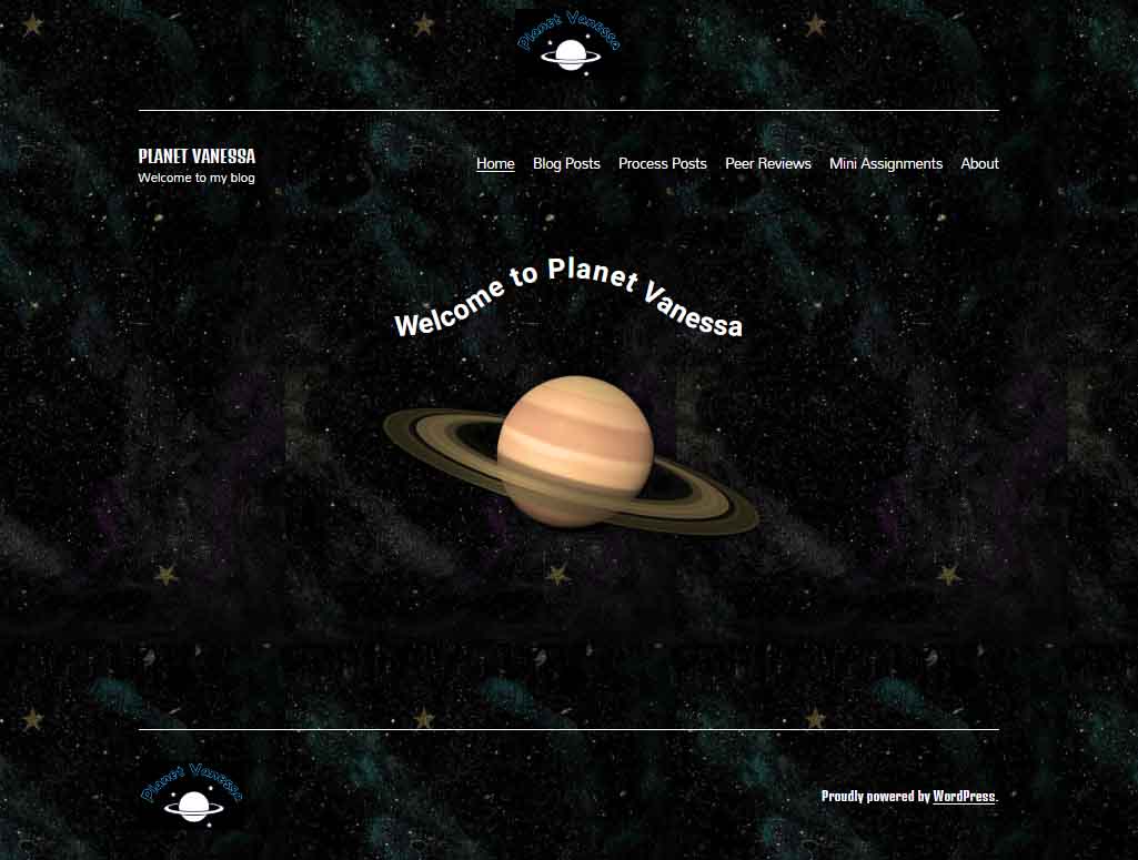
Planet Vanessa Landing Page

Today it is my great pleasure to introduce Vanessa Nipp, the webmaster, creative director and content creator, over at Planet Vanessa. Join me as I review her cyberinfrastructure with particular attention to design processes and how her design choices emphasize the cultivation of her digital self. I will also dig into her code via “inspect mode” (F12) to better understand what’s going on.  http://planetvanessa.com/

If you’ve never been to space before, I recommend packing a light snack because Planet Vanessa orbits a far-out system of Groove-ulon 6.

Lift-Off & Landing Page

It’s cold and lonely out in space. Away from our tiny blue marble, the vast recesses of nothingness overwhelm and stretch into the infinite. Soon the mind begins to play tricks on us. 

Are those far-off stars repeating themselves? As a matter of fact, yes! Looking closely at Planet Vanessa’s landing page, we see that the background image is tiled. 

The image of space she utilizes is 564 px wide and 1002 px tall. The tiling will vary depending on the screen’s resolution and whether visitors use desktops, laptops or mobile devices. 

 
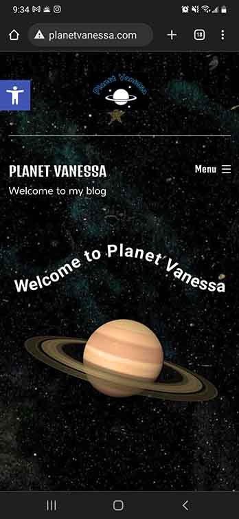
Planet Vanessa Mobile Landing

As you can see on my phone, we get one iteration of the tile.

On my desktop at 1920 x 1080, her background image iterates  ≈ 4 times horizontally. 

Repeating a background image is very pragmatic because it reduces load times. The computer only needs to interpret one much smaller image and duplicates it. 

Had she chosen a large HD image (1920×1080), this would have potentially increased her load times—potentially slowing down the user experience. I think that was a good decision on Vanessa’s part. Yet, there could be more attention to detail in choosing the perfect tile. A perfect tile gives the illusion of seamlessness. The trick is to obfuscate that line where one tile ends and another begins. This means we have to be conscious of the details of the picture. 

As we can see from this tile, a few places break the fantasy of deep endless space. We can see some prominent splashes of purple and blue to signify nebulae and a few gold stars. However, these nebulae don’t match up when placed side-by-side, and the stars are so unique compared to the other elements of the picture it creates multiple seams that the eye naturally follows. The result is that the background image perhaps stands out more than it should—a minor detail, to be sure, but something that stood out for me. 

Display Font & Logo. 


Vanessa’s logo is fun and playful. A line drawing of a Saturn-like planet upon a backdrop of stars. A black background and the name of her site are written above, transformed with a curve. 

Planet Vanessa Logo

Looking closely, we see that the planet and star’s fill is white, while their stroke is blue-black. This stroke stands out against the black background of her logo, making me wonder about Vanessa’s thought process for this decision. It would be interesting to see the stroke match the background, creating a transparent effect in the intersecting lines of the rings and the planet. 

The font choice for her logo was interesting; she had chosen a display font from the comic family. This font features varying widths throughout the anatomy of the font, and fat rounded serifs give an overall bubbly feeling. She has chosen a transparent (or) black fill and a blue stroke. I like Vanessa’s type choice because it captures the mood she is expressing with her digital identity; however, the choice to make the fill transparent severely reduces the legibility of the text. 

The Golden rule of typography is that it must be legible. As it stands, there isn’t great enough contrast between the blue and the black; in addition, the stroke is too thin to stand out from its background. I recommend Vanessa play around with the typography and discover alternative design choices to increase the contrast between the type and its background. 

Planet Vanessa, featuring Planet Vannesa


The anatomy of her landing page is as follows: A <Header> containing Logo, <H1> text, a divider line, and her <Nav>. Following this is the <Body>, featuring some fun text on a curved baseline above an image of Saturn. Finally, the <Footer> is signified by another division line, the logo aligned to the left, and a shout-out to WordPress aligned right.

It would be interesting if the planet logo and image had more similarities. For example, in the picture, we’re looking at the planet from a different perspective which gives depth to the image, whereas we see the logo planet head-on, without a sense of depth. If they shared a sense of perspective, it would build cohesion between the different elements of your page. In addition, it would also be interesting to see how Vanessa could utilize the principle of similarity in her typography. 

I love the curved baseline of “Welcome to Vanessa Planet,” I love it even more that it’s a piece of CSS, not an image. But the dissimilarity between the four different fonts being utilized feels disharmonious. On the one hand, the logo paints a picture of something kinda fun and out-there, whereas the ‘welcome to’ and the <H1> text don’t seem to share that feeling. I think this could be easily fixed by choosing two fonts, maybe three, if she were very set on her logo typography. 

The easiest solution I would experiment with is eliminating the <H1> in the <header> altogether. I think this would be a strong move because the name of the site, “Planet Vanessa,” is well captured throughout the landing page, and since the <h1> is a completely different font from the logo, nav and welcome, removing this <H1> text would do several things. It would increase the cohesion of the typographic choices by limiting the amount used, eliminating redundant information, and making Vanessa’s <nav> more prominent, no longer having to share the line with the <H1> text.

Let’s look at the content.

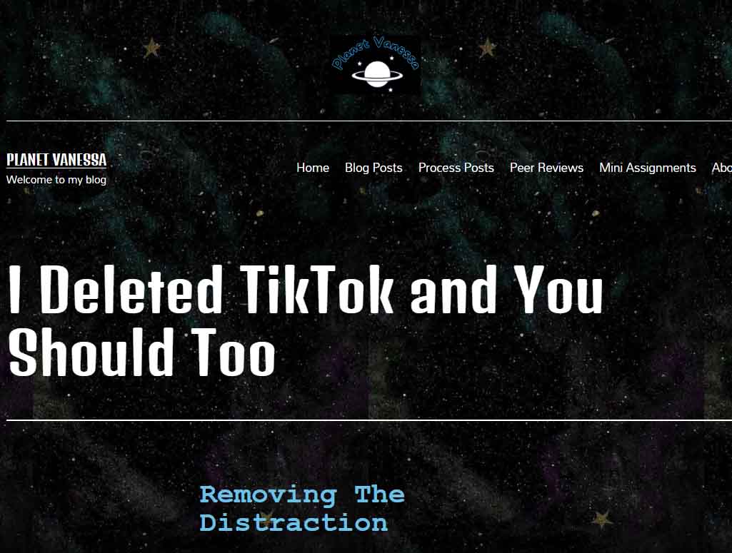
Planet Vanessa Content example

Vanessa utilizes a similar layout for her posts as I do on Burrito reProduction. It’s a single-column, aligned center. It’s simple, sweet—100% endorsement from my non-bias position! Planet Vanessa utilizes plenty of header tags to break her content into digestible pieces, which also increases the accessibility of the website. She also employs lots of photographs that raise the engagement in her content.

The content design on Planet Vanessa is very cohesive with one another, and it matches the landing page and about page. As my page layout is very similar, an observation that is as much for Vanessa as it is for myself, we find dynamic ways to utilize all the white space we leave on our pages. Since Vanessa’s site appears to be built with mobile phones in mind, this isn’t as much of an issue for her as it is for me. 

Final Thoughts.

Planet Vanessa has a strong sense of identity. It stands out from the run-of-the-mill blog spaces because of its design choices, giving the reader the impression that they have been invited into the depths of space to a planet unlike ours. A place that does not follow the standard conventions of simplistic, clean, or minimal design choices. It unapologetically expresses Vanessa Nipp through its space theme and bold typographic decisions, and the original logo all contribute to conveying the digital persona that Vanessa has cultivated.

Excellent work, Vanessa Nipp; I look forward to seeing what you do next with your site!

Process Post 7 (More about Design)

I had already devoted a great deal of my last process post to design. Still, I felt I didn’t capture the assignment to share some examples of websites that got my approval. In addition, I was supposed to talk about marketability next week! It seems I thoroughly confused myself! So I will take a step back and add a bit more about design and share some websites that I find pleasing, as well as show some that I do not care for. 

My love-hate relationship with minimalism

On the one hand, it is undeniable that minimalism deserves its place as a design aesthetic that continues to inspire all aspects of creative works. Websites, architecture, print and digital media, fashion, decor, music, fine arts, pretty much everything. And there are lots of good reasons to prefer a minimalist approach. For example, some people relish a ‘blank page’ approach to organizing their home, which can be important in a world overloaded with clutter, advertisements, people, cars, etc.

We can also make a moral argument that minimalist practices are good and ought to be pursued. Considering we live in a world of overconsumption, rife with gluttonous beliefs that express personal identity through material possession, it shouldn’t be difficult to thread the needle that minimalism offers a method of escape from our accelerated death drive of hoarding clutter.

So what’s the deal? What’s to hate? 

It’s because I think that most forms of minimalism are similar to the practice of ‘greenwashing.’ Greenwashing is usually a form of advertising or marketing spin to persuade the public that the organization’s products, aims and policies are environmentally friendly. But I am using it slightly differently. Instead of being limited to a process used by businesses, minimalism presents itself as a solution to real-world material problems without actually addressing the root of their problems. It’s a band-aid, addressing the symptom rather than the cause.

Too poor to own a house? Try living in a shipping container! I hate that minimalism is so often poverty in cosplay.


Furthermore, since minimalism is also a design trend, plenty of businesses have jumped on board with their website design, yet the outcome often creates cognitive dissonance. Why?

Minimalism is perceived as clean, lightweight, only what is needed, free from clutter, and utilitarian, but rarely does the ethos and philosophy of business correspond to these principles on any meaningful level. They believe in minimalism as a marketing strategy to maximize the consumption of their respective products. 

Let’s look at medium.com

Image of medium.com landing page.

What does this website tell us? It’s no bells, no whistles approach is ‘sleek,’ and its visual hierarchies are clearer for the audience to navigate without any hassle towards its product, which is its news stories.  Little nuggets of information in a world governed by the mantra that information is knowledge, and knowledge is power. For Medium, like all content mills, information is also currency—a worshipped and coveted form of power. 

Sure, it presents those nuggets in a minimalist manner, but then you realize there is an infinite amount of them, and to be sure, it doesn’t want you to take responsible little bites of its product. It wants you to consume its content voraciously. So there we go; we’re back to my objection. We choose minimalism as a function to maximize consumption—an inversion of the ethos of minimalism. And this is my major skepticism towards its popularity.

Yet, just because minimalism functions to obfuscate our relationship with consumption, does that justify an abandonment or wholesale rejection of minimalism? Should it be different?

O-V-E-R-L-O-A-D

My short answer is no. A sense of hierarchy is lost if a website is overloaded with visual elements. The eye feverishly darts from corner to corner in a vain attempt to make sense of the information, the structure, and the thesis. There is a physio-psychological limitation to our cognition, and we can’t make proper sense of overloaded, unorganized things. Therefore, some form of minimalism is not only preferred but necessary.

Case in point: This site.

image of landing page for arngren.com a danish website

UX/UI

I wish I knew more about these topics. It’s obvious that the difference between a good and bad form of minimalism is a matter of how we interact with it rather than what philosophy it proposes.

image of landing page for benjamin-nespoulous.com

I love this website because of its playful interactivity. The elements all have a bit of life to them. They move, expand, contract, become inverse in colouration, etc. It feels alive! Yet the site as a whole is so simple without being boring or cliche. It has a philosophy and functionality that incorporates minimalism without being minimalist. 


Let’s circle back.

Burrito Reproduction utilizes some notion of minimalism, so I couldn’t be so hypocritical as to condemn it completely. Part of the reason is that this course demonstrated that I’m woefully underskilled in coding. I thought I wasn’t so bad, but this whole WordPress experiment has shown me how far I have to travel. Nonetheless, I like the aesthetics of my site. I want to capture that same observation I made with NSPS. That being, it’s functionally minimal but unapologetic and individualistic about the typical conventions found in minimalism.

Moving forward, I will continue to remember the lessons learned from “How to Survive the Digital Apocalypse.” The old normative formats of repeated templates, uninspired content, and failure to express our unique subjectivity as designers, educators, and writers will ensure that narrow AIs will outsource us. We will survive by leaning into our subjectivity, which is exactly what I intend to do. 

Smut Is In The House

Am I allowed to post about my love for smut? I don’t know. Will I still do it? You bet your ass I will.

So hear me out, reading smut/spice (there is a difference but we are not going into that now because if I start I will not stop) is like drinking a cocktail made of love, happiness, magic (and a lot of sex). It is like the perfect cure for my anxiety and if you think I will not take it and run like hell, you are sadly mistaken. I spend half my days reading “literature” and then the rest of the time I am reading reverse harems and monster romances and alien romances and mafia romances and biker romances and a very wide and long and deep arrange of spicy romance books with blush inducing panty melting main characters (men, women and everything in between because we are queer over here). They fill the void inside me, they feed my helpless romantic, they make my expectations exceedingly high, they make me happy, they make me dream and they allow me not to go batshit crazy while trying to live in this world. I say it is a win win for everyone.

So in the spirit of all that is smutty and slutty and happy, here are some of my current and past reads that just give me life. No judging will be allowed and please don’t expect these to be high end books otherwise you will not enjoy them. I get that they are not for everyone either, but for those out there like me obsessed with smut and spice, welcome to the madhouse.

Please check trigger warnings for the books before starting.

Take care and have fun 😉

(Maybe I should do an individual review to really convince people to read these because some of the covers do not inspire confidence but they are good books, at least for my standards which may or may not be low)

How to Build an Isometric Grid in Adobe Illustrator

This week I’ve been practicing some Adobe Illustrator and making isometric graphics. I thought I’d share how to set up an Illustrator file so you can experiment with this style of perspective yourself!

What is Isometric?

Isometric means having equal dimensions. Its etymology is derived from the Greek words “isos” and “metron,” meaning equal measure.

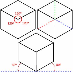
Take a look at these here cubes!

Isometric cubes, featuring its congruencies.

As you can see, there are some interesting symmetrical features. For example, notice how in this cube, three axes intersect, all of which are of an equal degree from the intersection. Similarly, notice how two axes are rotated 30 degrees from the horizontal line imagined at 0 degrees. This intersection of lines at 30 degrees forms the basis of our grid. So let’s fire up Illustrator!

Process

After you’re loaded up, you need to make an artboard. For demonstration purposes, this artboard is 1000 x 1000 px.

isometric grid 1

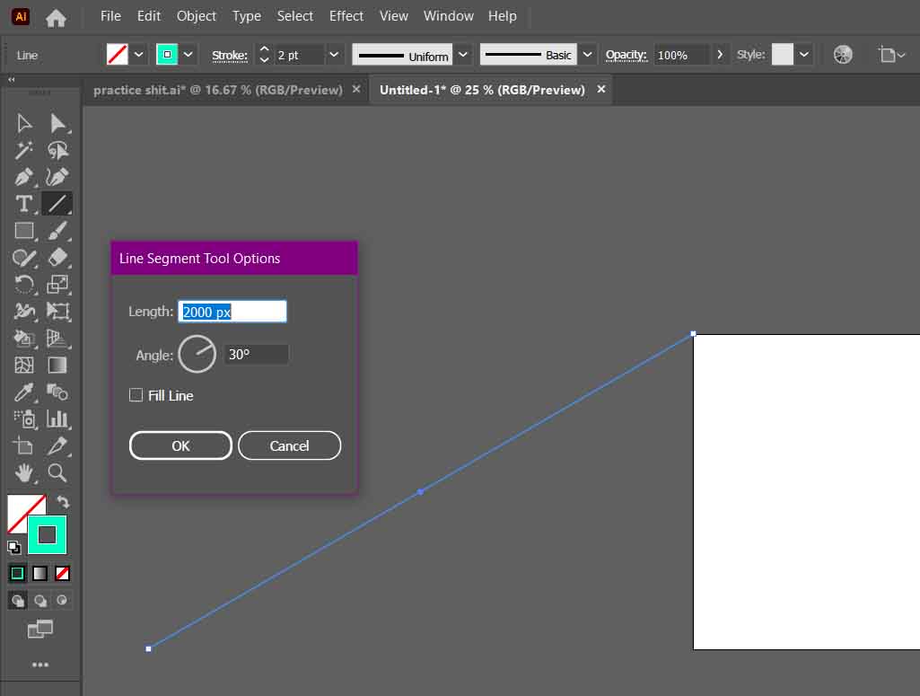
Next, you will create your first 30-degree axis. You can create a line with the precise dimensions you require using the Line Segment Tool. The angle needed is 30 degrees, and its length… well… if you remember your trigonometry, you will know that a diagonal line (the hypotenuse) is 2x its opposite (the shortest of the three lines) in a 30-60-90 triangle.

So, therefore, for this line segment to reach the bottom of our artboard, it must be twice the length of its side. In my case, the line segment is 2000 px.

As you can see, the line segment must align with the top left point of the artboard.

isometric grid 2

Afterwards, you need to duplicate your line segment. You can hold alt/option+click and drag, or with the segment selected, copy and paste it.

What is important is the bottom of your copied line aligns with the bottom right point of your artboard.

isometric grid 3

With both lines selected, go to Object>Blend>Make. Then define your blend options by going to Object>Blend>Blend Options…

isometric grid 5

In the Blend Options, set the Spacing to Specific Steps. After, you must decide how many intervals you will have between each point.

This next part needs brainy time.

I set this axis to step 50 times between its two points. However, that does not mean 1000 px / 50 = 20 px/step. We need more trig to figure this out.

We know the Opposite side is 1000px, and the Hypotonuse is 2000 px. As we may recall from math class, the Adjacent side (the longer of the two non-diagonal lines) of a 30-60-90 triangle is Opposite√ 3.

In this case, 1000√ 3  ≈ 1732.05 px.

So, therefore, we know the distance between each interval is ≈ 34.64 


isometric grid 6

Next, we duplicate our line segments rotated 30 degrees in the opposite direction. But instead of repeating the process, we can transform our newly created array of lines.

Select the lines and right-click. Go to Transform>Reflect.

isometric grid 9

Ensure that your axis is set to vertical, and afterwards, click Copy to duplicate your selected lines into their newly reflected position.


isometric grid 10

It’s possible to create one more line segment and repeat the process. All you need to do is duplicate and rotate the third copy with an angle of 90 degrees. 

But honestly, you don’t need it to get started. These two intersecting lines are all you need to draw your own isometric graphics. Just remember to place your grid on a separate layer and lock it. Afterwards, grab your pen tool and have at ‘er! 


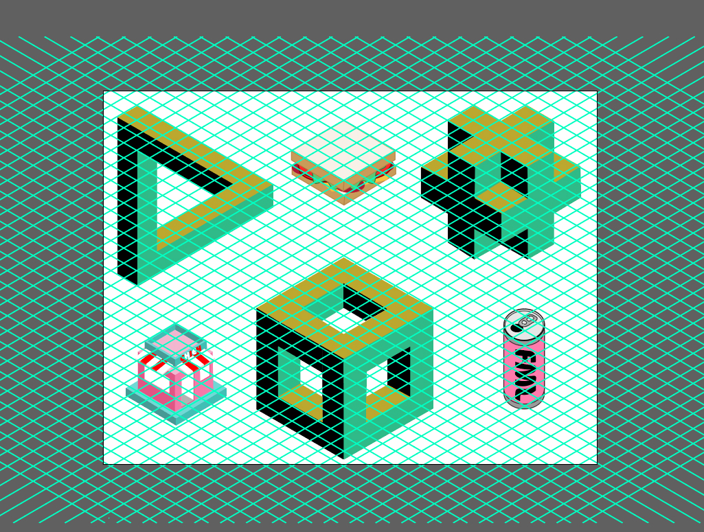
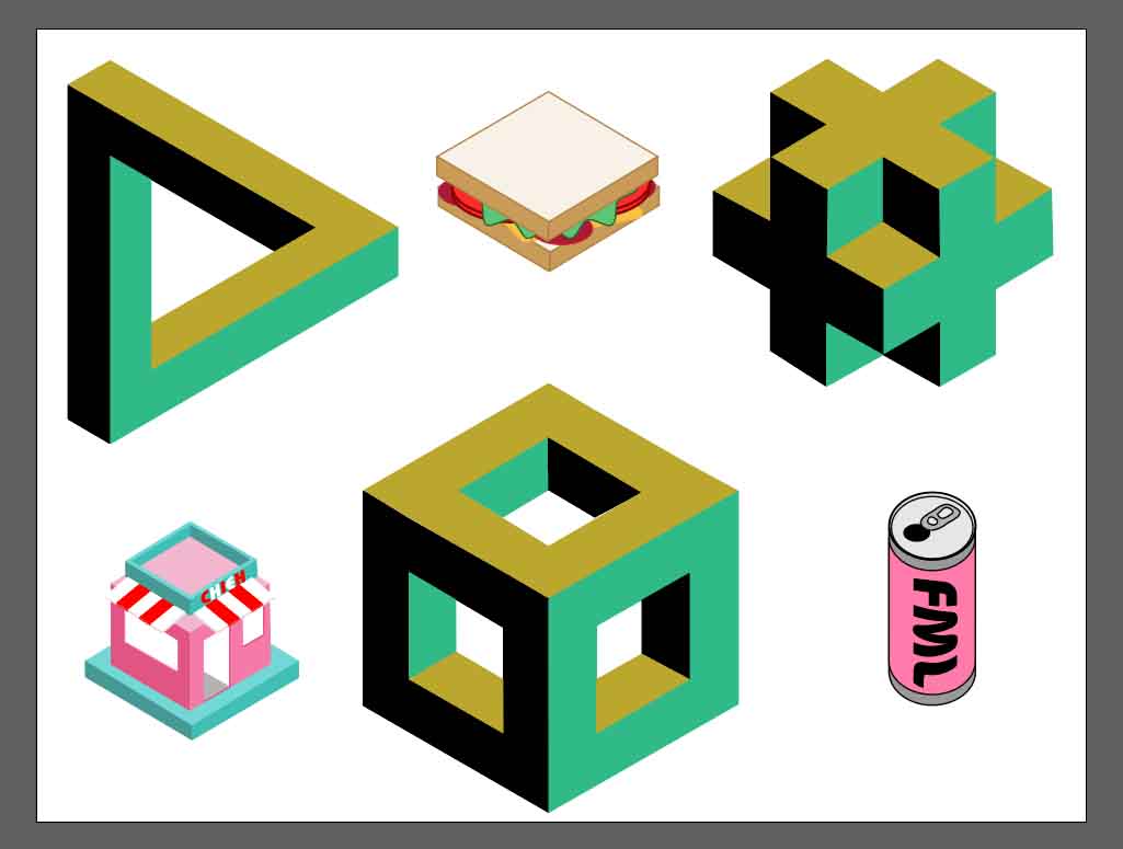
Here’s what I did during this tutorial. Most of these shapes are accessible through a Google Search

isometric grid 11

And one more without the grid.

isometric grid 12

There you have it!
Let me know if you found this helpful! Happy Designing!

Peer Review #2 : The Quaint Nook

The Quaint Nook

Aris' site "The Quaint Nook" homepage logo

Lorem ipsum dolor sit amet, consectetur adipiscing elit. Ut elit tellus, luctus nec ullamcorper mattis, pulvinar dapibus leo.