What in the world! -Process Post

While reading an article by Bridle, James, “Something is Wrong on the Internet,” Bridle says, “I’ve also been aware for some time of the increasingly symbiotic relationship between younger children and YouTube J.Bridle (2017).” I agree that this generation of children does spend an alarming amount of time on their devices. When I was younger, things were very different compared to nowadays. Although my parents limited my screen time while I was growing up, they preferred I play outside with my friends instead of sitting in front of a TV or computer screen. However, my mom allowed screen time when I was done with my chores, cleaned my room, and completed all my homework; once it was finished, I could surf the web for two hours until I had to start getting ready for bed. My parents were mainly concerned that we would lose our childhood to a phone and laptop screen.

As I started high school, my parents allowed me to have my phone in case an emergency arose. Although there were still some rules to having a phone, she would only pay for talk and text and turned the Wi-Fi off at 9:00 PM to ensure I slept enough for school. Now that I am an adult with my children, I understand why she had those rules. Nowadays, some horrific things are on YouTube, and I monitor what my daughter watches. Before I had any children, I remember YouTube kids were in the hot seat because some harmful content was being put on a kid’s app. This YouTube video details what was being put out on YouTube kids’ (99) YouTube Kids app and disturbing content – YouTube. Now that my daughter is two years old, I heavily monitor what she watches on YouTube. Even though I was vigilant about what she watched, she sat beside my spouse one day and started crying. As she passed her iPad to me, I looked at the video she was watching, and it was about a man finding a kitten on the side of the road inside a box. He grabbed the box with the kitten and placed it in the bank of his truck. The kitten ended up falling out of the box and was looking over the tailgate to look around, and the man went over a speed bump, which caused the kitten to fall out. Right behind the truck was another car driving behind him, and the car didn’t have enough time to stop, so it ran over the kitten, and the kitten died. This is a personal example, but it relates to “Something is wrong on the internet.”

The post What in the world! -Process Post appeared first on Kayla's Blog.

Lost in Translation

This is a poem I wrote a couple of months ago when I was really really struggling. It is inspired by all my struggles in Canada after I moved here, I felt like I was lost in translation. I was trying to have hope as I was crumbling to pieces. I did not have my diagnosis or my meds yet and I was drowning. But I was still trying.

I hope you like it

Poem by Sara Aristizabal C.

Peer Review 2: Traveling to Planet Vannesa

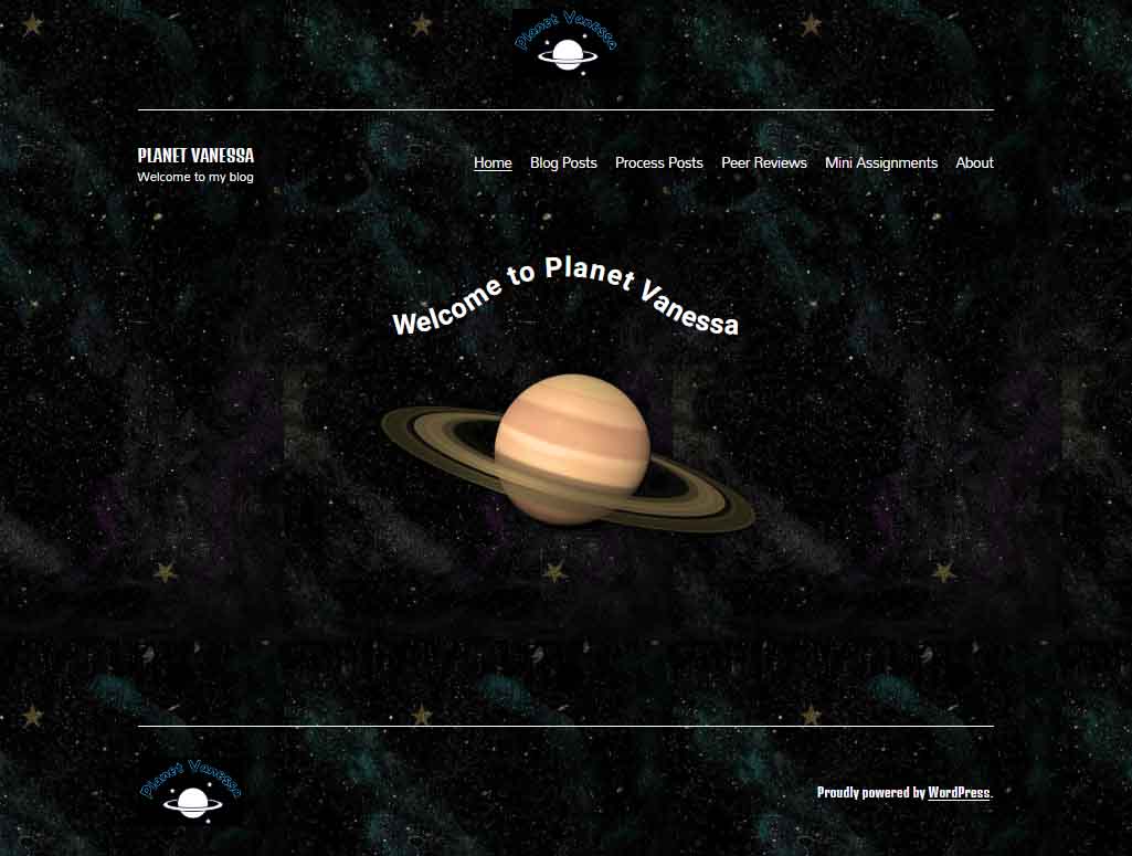
Planet Vanessa Landing Page

Today it is my great pleasure to introduce Vanessa Nipp, the webmaster, creative director and content creator, over at Planet Vanessa. Join me as I review her cyberinfrastructure with particular attention to design processes and how her design choices emphasize the cultivation of her digital self. I will also dig into her code via “inspect mode” (F12) to better understand what’s going on.  http://planetvanessa.com/

If you’ve never been to space before, I recommend packing a light snack because Planet Vanessa orbits a far-out system of Groove-ulon 6.

Lift-Off & Landing Page

It’s cold and lonely out in space. Away from our tiny blue marble, the vast recesses of nothingness overwhelm and stretch into the infinite. Soon the mind begins to play tricks on us. 

Are those far-off stars repeating themselves? As a matter of fact, yes! Looking closely at Planet Vanessa’s landing page, we see that the background image is tiled. 

The image of space she utilizes is 564 px wide and 1002 px tall. The tiling will vary depending on the screen’s resolution and whether visitors use desktops, laptops or mobile devices. 
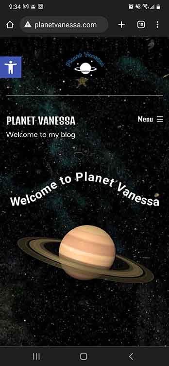
 
Planet Vanessa Mobile Landing

As you can see on my phone, we get one iteration of the tile.

On my desktop at 1920 x 1080, her background image iterates  ≈ 4 times horizontally. 

Repeating a background image is very pragmatic because it reduces load times. The computer only needs to interpret one much smaller image and duplicates it. 

Had she chosen a large HD image (1920×1080), this would have potentially increased her load times—potentially slowing down the user experience. I think that was a good decision on Vanessa’s part. Yet, there could be more attention to detail in choosing the perfect tile. A perfect tile gives the illusion of seamlessness. The trick is to obfuscate that line where one tile ends and another begins. This means we have to be conscious of the details of the picture. 

As we can see from this tile, a few places break the fantasy of deep endless space. We can see some prominent splashes of purple and blue to signify nebulae and a few gold stars. However, these nebulae don’t match up when placed side-by-side, and the stars are so unique compared to the other elements of the picture it creates multiple seams that the eye naturally follows. The result is that the background image perhaps stands out more than it should—a minor detail, to be sure, but something that stood out for me. 

Display Font & Logo. 


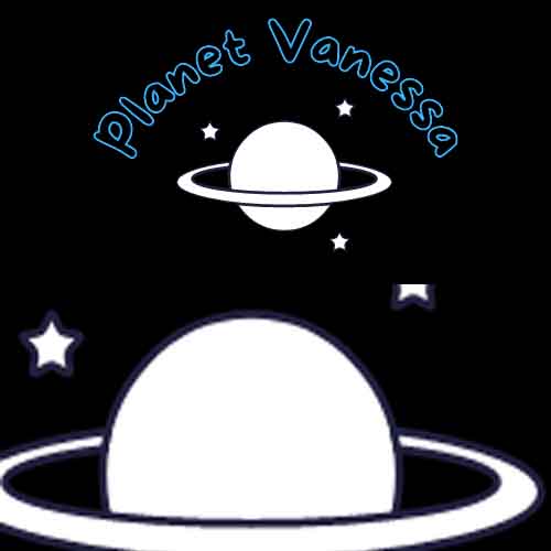
Vanessa’s logo is fun and playful. A line drawing of a Saturn-like planet upon a backdrop of stars. A black background and the name of her site are written above, transformed with a curve. 
Planet Vanessa Logo

Looking closely, we see that the planet and star’s fill is white, while their stroke is blue-black. This stroke stands out against the black background of her logo, making me wonder about Vanessa’s thought process for this decision. It would be interesting to see the stroke match the background, creating a transparent effect in the intersecting lines of the rings and the planet. 

The font choice for her logo was interesting; she had chosen a display font from the comic family. This font features varying widths throughout the anatomy of the font, and fat rounded serifs give an overall bubbly feeling. She has chosen a transparent (or) black fill and a blue stroke. I like Vanessa’s type choice because it captures the mood she is expressing with her digital identity; however, the choice to make the fill transparent severely reduces the legibility of the text. 

The Golden rule of typography is that it must be legible. As it stands, there isn’t great enough contrast between the blue and the black; in addition, the stroke is too thin to stand out from its background. I recommend Vanessa play around with the typography and discover alternative design choices to increase the contrast between the type and its background. 

Planet Vanessa, featuring Planet Vannesa


The anatomy of her landing page is as follows: A <Header> containing Logo, <H1> text, a divider line, and her <Nav>. Following this is the <Body>, featuring some fun text on a curved baseline above an image of Saturn. Finally, the <Footer> is signified by another division line, the logo aligned to the left, and a shout-out to WordPress aligned right.

It would be interesting if the planet logo and image had more similarities. For example, in the picture, we’re looking at the planet from a different perspective which gives depth to the image, whereas we see the logo planet head-on, without a sense of depth. If they shared a sense of perspective, it would build cohesion between the different elements of your page. In addition, it would also be interesting to see how Vanessa could utilize the principle of similarity in her typography. 

I love the curved baseline of “Welcome to Vanessa Planet,” I love it even more that it’s a piece of CSS, not an image. But the dissimilarity between the four different fonts being utilized feels disharmonious. On the one hand, the logo paints a picture of something kinda fun and out-there, whereas the ‘welcome to’ and the <H1> text don’t seem to share that feeling. I think this could be easily fixed by choosing two fonts, maybe three, if she were very set on her logo typography. 

The easiest solution I would experiment with is eliminating the <H1> in the <header> altogether. I think this would be a strong move because the name of the site, “Planet Vanessa,” is well captured throughout the landing page, and since the <h1> is a completely different font from the logo, nav and welcome, removing this <H1> text would do several things. It would increase the cohesion of the typographic choices by limiting the amount used, eliminating redundant information, and making Vanessa’s <nav> more prominent, no longer having to share the line with the <H1> text.

Let’s look at the content.
Planet Vanessa Content example

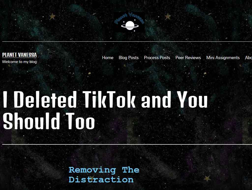
Vanessa utilizes a similar layout for her posts as I do on Burrito reProduction. It’s a single-column, aligned center. It’s simple, sweet—100% endorsement from my non-bias position! Planet Vanessa utilizes plenty of header tags to break her content into digestible pieces, which also increases the accessibility of the website. She also employs lots of photographs that raise the engagement in her content.

The content design on Planet Vanessa is very cohesive with one another, and it matches the landing page and about page. As my page layout is very similar, an observation that is as much for Vanessa as it is for myself, we find dynamic ways to utilize all the white space we leave on our pages. Since Vanessa’s site appears to be built with mobile phones in mind, this isn’t as much of an issue for her as it is for me. 

Final Thoughts.

Planet Vanessa has a strong sense of identity. It stands out from the run-of-the-mill blog spaces because of its design choices, giving the reader the impression that they have been invited into the depths of space to a planet unlike ours. A place that does not follow the standard conventions of simplistic, clean, or minimal design choices. It unapologetically expresses Vanessa Nipp through its space theme and bold typographic decisions, and the original logo all contribute to conveying the digital persona that Vanessa has cultivated.

Excellent work, Vanessa Nipp; I look forward to seeing what you do next with your site!

Process Post 7 (More about Design)

I had already devoted a great deal of my last process post to design. Still, I felt I didn’t capture the assignment to share some examples of websites that got my approval. In addition, I was supposed to talk about marketability next week! It seems I thoroughly confused myself! So I will take a step back and add a bit more about design and share some websites that I find pleasing, as well as show some that I do not care for. 

My love-hate relationship with minimalism

On the one hand, it is undeniable that minimalism deserves its place as a design aesthetic that continues to inspire all aspects of creative works. Websites, architecture, print and digital media, fashion, decor, music, fine arts, pretty much everything. And there are lots of good reasons to prefer a minimalist approach. For example, some people relish a ‘blank page’ approach to organizing their home, which can be important in a world overloaded with clutter, advertisements, people, cars, etc.

We can also make a moral argument that minimalist practices are good and ought to be pursued. Considering we live in a world of overconsumption, rife with gluttonous beliefs that express personal identity through material possession, it shouldn’t be difficult to thread the needle that minimalism offers a method of escape from our accelerated death drive of hoarding clutter.

So what’s the deal? What’s to hate? 

It’s because I think that most forms of minimalism are similar to the practice of ‘greenwashing.’ Greenwashing is usually a form of advertising or marketing spin to persuade the public that the organization’s products, aims and policies are environmentally friendly. But I am using it slightly differently. Instead of being limited to a process used by businesses, minimalism presents itself as a solution to real-world material problems without actually addressing the root of their problems. It’s a band-aid, addressing the symptom rather than the cause.

Too poor to own a house? Try living in a shipping container! I hate that minimalism is so often poverty in cosplay.


Furthermore, since minimalism is also a design trend, plenty of businesses have jumped on board with their website design, yet the outcome often creates cognitive dissonance. Why?

Minimalism is perceived as clean, lightweight, only what is needed, free from clutter, and utilitarian, but rarely does the ethos and philosophy of business correspond to these principles on any meaningful level. They believe in minimalism as a marketing strategy to maximize the consumption of their respective products. 

Let’s look at medium.com

Image of medium.com landing page.

What does this website tell us? It’s no bells, no whistles approach is ‘sleek,’ and its visual hierarchies are clearer for the audience to navigate without any hassle towards its product, which is its news stories.  Little nuggets of information in a world governed by the mantra that information is knowledge, and knowledge is power. For Medium, like all content mills, information is also currency—a worshipped and coveted form of power. 

Sure, it presents those nuggets in a minimalist manner, but then you realize there is an infinite amount of them, and to be sure, it doesn’t want you to take responsible little bites of its product. It wants you to consume its content voraciously. So there we go; we’re back to my objection. We choose minimalism as a function to maximize consumption—an inversion of the ethos of minimalism. And this is my major skepticism towards its popularity.

Yet, just because minimalism functions to obfuscate our relationship with consumption, does that justify an abandonment or wholesale rejection of minimalism? Should it be different?

O-V-E-R-L-O-A-D

My short answer is no. A sense of hierarchy is lost if a website is overloaded with visual elements. The eye feverishly darts from corner to corner in a vain attempt to make sense of the information, the structure, and the thesis. There is a physio-psychological limitation to our cognition, and we can’t make proper sense of overloaded, unorganized things. Therefore, some form of minimalism is not only preferred but necessary.

Case in point: This site.

image of landing page for arngren.com a danish website

UX/UI

I wish I knew more about these topics. It’s obvious that the difference between a good and bad form of minimalism is a matter of how we interact with it rather than what philosophy it proposes.

image of landing page for benjamin-nespoulous.com

I love this website because of its playful interactivity. The elements all have a bit of life to them. They move, expand, contract, become inverse in colouration, etc. It feels alive! Yet the site as a whole is so simple without being boring or cliche. It has a philosophy and functionality that incorporates minimalism without being minimalist. 


Let’s circle back.

Burrito Reproduction utilizes some notion of minimalism, so I couldn’t be so hypocritical as to condemn it completely. Part of the reason is that this course demonstrated that I’m woefully underskilled in coding. I thought I wasn’t so bad, but this whole WordPress experiment has shown me how far I have to travel. Nonetheless, I like the aesthetics of my site. I want to capture that same observation I made with NSPS. That being, it’s functionally minimal but unapologetic and individualistic about the typical conventions found in minimalism.

Moving forward, I will continue to remember the lessons learned from “How to Survive the Digital Apocalypse.” The old normative formats of repeated templates, uninspired content, and failure to express our unique subjectivity as designers, educators, and writers will ensure that narrow AIs will outsource us. We will survive by leaning into our subjectivity, which is exactly what I intend to do. 

Smut Is In The House

Am I allowed to post about my love for smut? I don’t know. Will I still do it? You bet your ass I will.

So hear me out, reading smut/spice (there is a difference but we are not going into that now because if I start I will not stop) is like drinking a cocktail made of love, happiness, magic (and a lot of sex). It is like the perfect cure for my anxiety and if you think I will not take it and run like hell, you are sadly mistaken. I spend half my days reading “literature” and then the rest of the time I am reading reverse harems and monster romances and alien romances and mafia romances and biker romances and a very wide and long and deep arrange of spicy romance books with blush inducing panty melting main characters (men, women and everything in between because we are queer over here). They fill the void inside me, they feed my helpless romantic, they make my expectations exceedingly high, they make me happy, they make me dream and they allow me not to go batshit crazy while trying to live in this world. I say it is a win win for everyone.

So in the spirit of all that is smutty and slutty and happy, here are some of my current and past reads that just give me life. No judging will be allowed and please don’t expect these to be high end books otherwise you will not enjoy them. I get that they are not for everyone either, but for those out there like me obsessed with smut and spice, welcome to the madhouse.

Please check trigger warnings for the books before starting.

Take care and have fun 😉

(Maybe I should do an individual review to really convince people to read these because some of the covers do not inspire confidence but they are good books, at least for my standards which may or may not be low)

How to Build an Isometric Grid in Adobe Illustrator

This week I’ve been practicing some Adobe Illustrator and making isometric graphics. I thought I’d share how to set up an Illustrator file so you can experiment with this style of perspective yourself!

What is Isometric?

Isometric means having equal dimensions. Its etymology is derived from the Greek words “isos” and “metron,” meaning equal measure.

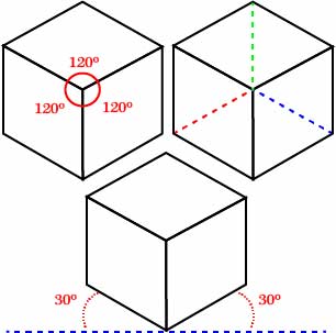
Take a look at these here cubes!

Isometric cubes, featuring its congruencies.

As you can see, there are some interesting symmetrical features. For example, notice how in this cube, three axes intersect, all of which are of an equal degree from the intersection. Similarly, notice how two axes are rotated 30 degrees from the horizontal line imagined at 0 degrees. This intersection of lines at 30 degrees forms the basis of our grid. So let’s fire up Illustrator!

Process

After you’re loaded up, you need to make an artboard. For demonstration purposes, this artboard is 1000 x 1000 px.

isometric grid 1

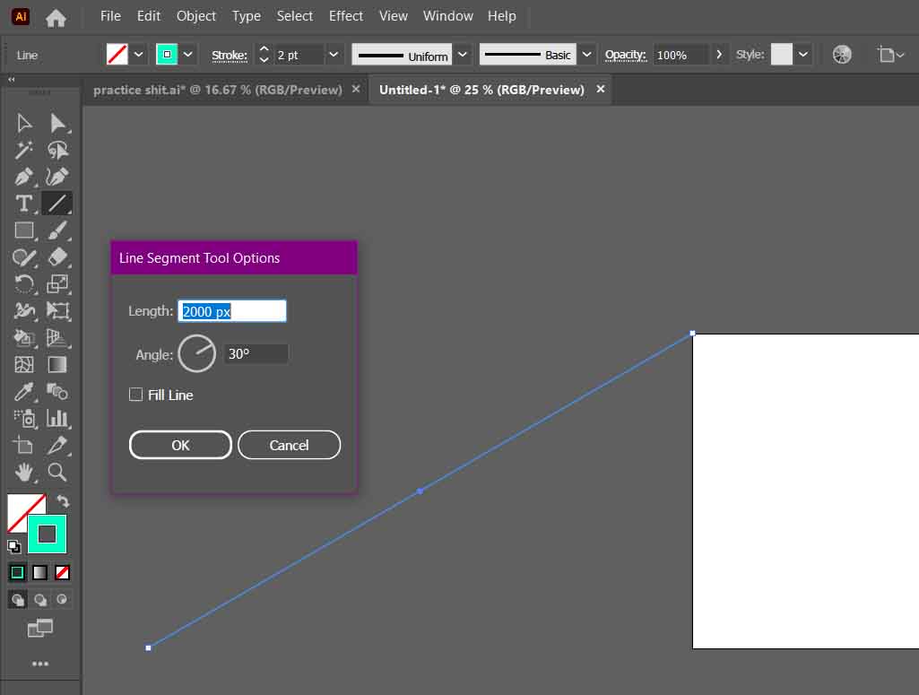
Next, you will create your first 30-degree axis. You can create a line with the precise dimensions you require using the Line Segment Tool. The angle needed is 30 degrees, and its length… well… if you remember your trigonometry, you will know that a diagonal line (the hypotenuse) is 2x its opposite (the shortest of the three lines) in a 30-60-90 triangle.

So, therefore, for this line segment to reach the bottom of our artboard, it must be twice the length of its side. In my case, the line segment is 2000 px.

As you can see, the line segment must align with the top left point of the artboard.

isometric grid 2

Afterwards, you need to duplicate your line segment. You can hold alt/option+click and drag, or with the segment selected, copy and paste it.

What is important is the bottom of your copied line aligns with the bottom right point of your artboard.

isometric grid 3

With both lines selected, go to Object>Blend>Make. Then define your blend options by going to Object>Blend>Blend Options…

isometric grid 5

In the Blend Options, set the Spacing to Specific Steps. After, you must decide how many intervals you will have between each point.

This next part needs brainy time.

I set this axis to step 50 times between its two points. However, that does not mean 1000 px / 50 = 20 px/step. We need more trig to figure this out.

We know the Opposite side is 1000px, and the Hypotonuse is 2000 px. As we may recall from math class, the Adjacent side (the longer of the two non-diagonal lines) of a 30-60-90 triangle is Opposite√ 3.

In this case, 1000√ 3  ≈ 1732.05 px.

So, therefore, we know the distance between each interval is ≈ 34.64 


isometric grid 6

Next, we duplicate our line segments rotated 30 degrees in the opposite direction. But instead of repeating the process, we can transform our newly created array of lines.

Select the lines and right-click. Go to Transform>Reflect.

isometric grid 9

Ensure that your axis is set to vertical, and afterwards, click Copy to duplicate your selected lines into their newly reflected position.


isometric grid 10

It’s possible to create one more line segment and repeat the process. All you need to do is duplicate and rotate the third copy with an angle of 90 degrees. 

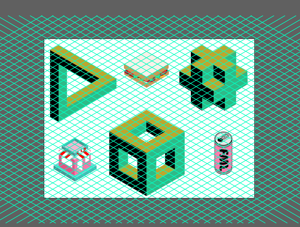
But honestly, you don’t need it to get started. These two intersecting lines are all you need to draw your own isometric graphics. Just remember to place your grid on a separate layer and lock it. Afterwards, grab your pen tool and have at ‘er! 


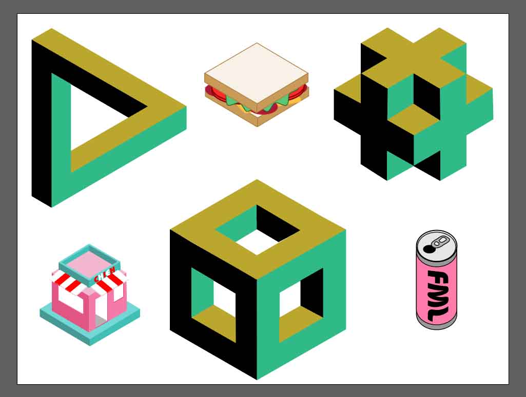
Here’s what I did during this tutorial. Most of these shapes are accessible through a Google Search

isometric grid 11

And one more without the grid.

isometric grid 12

There you have it!
Let me know if you found this helpful! Happy Designing!

Peer Review #2 : The Quaint Nook

The Quaint Nook

Aris' site "The Quaint Nook" homepage logo

Lorem ipsum dolor sit amet, consectetur adipiscing elit. Ut elit tellus, luctus nec ullamcorper mattis, pulvinar dapibus leo.

The Importance of Deloading

What’s the point of a deload week? Since I’m currently doing one right now, I’ll tell you:

What Does Deloading Mean?

A deload week allows your body to recover while exercising at a lower intensity.

What Does This Look Like?

According to Military Fitness, a deload week could include:

  • Reduce time
  • Lower the weight
  • Less sets or reps
  • Lower volume
  • Reduce intensity of workouts

This might look different for a lot of people. For instance, most of my workouts from this week ranged around 45 minutes. Some days I maintained a lower weight with the same amount of sets I usually do, or I did a max of 3 sets for some exercises. This is what works for me, but maybe something else works for others.

When Is It Time For a Deload?

It depends, but if you are working out consistently, various articles suggest to deload when you are feeling physically exhausted, experiencing plateaus, or you’re nearing the end of a fitness cycle.

This article gives a good timeline depending on how long you have been lifting. For someone like myself who has been lifting for a little over 2 years, I should be doing a deload week every 6-8 weeks. For new lifters, every 8-10 weeks is sufficient.

Why Do You Need to Deload?

In addition to the 1-3 rest days you may take during a normal week of lifting, your body needs to recover physically before you can go heavy again. A deload week is a great way to recover by doing lower-intensity workouts for a week.

Ultimately, you should do whatever works for you! Contact me if you wanna chat more about it!

The post The Importance of Deloading first appeared on Lifting With Lita.

Press release – I’ve added my current skincare favourites to my homepage!

a shelf full of skincare

As you may already know, I have a whole section on my blog dedicated to my skincare product favs at the moment. HOWEVER. I try so many new products on the regular and therefore I always have new favourites that I’m loving and using constantly. So I thought it would only be fitting to include a little image carousel with all of my current favourite skincare products at the moment! I’m super excited about this because I want you all to know my favs and to keep them top of mind if you want to try some new products or if you’re looking for better ones. This little list of mine will allow you to do so in a quick and easy way!

This is something I’ll also keep up to date constantly as well. And since I mentioned that I have new fav products pretty often, I’ll be adding and subtracting to this image carousel every week to keep it fresh and relevant <3 ALSO by clicking on an image, you’ll be able to see the product and to purchase it if you’re interested in trying it! I’m so happy and excited about this new addition to my website and I’m looking forward to hearing your guys’ feedback about it as well!

Chat soon,

xx Marilyn

Peer review #2

TMYLIFE home page banner

The website I had the opportunity to review for my second peer review is TMYLIFE by Nicole Tam! Nicole’s website is a blog created to write about her day-to-day life while sharing her personal thoughts on various topics and interests. Most of her blog posts are based on challenges or things she’s doing or going through, which I really love. Her blog feels super relatable, comfortable, and open because of the tone and language she uses in her posts. Being around the same age as Nicole and going through similar situations and challenges in life and reading through her posts make me feel that I’m not alone. Her blog definitely gives off big sister or best friend energy and I think because of that her website has the potential to be liked by many people similar to me! A lot of people nowadays want to be consuming content online that feels relatable, and I think Nicole’s blog definitely gives that feeling. 

Nicole’s first peer review mainly highlighted and complimented the aesthetic, style, and design of her blog, and I think that she’s done a great job at continuing to thrive in this area of her brand. I really love the different headings she has been posting within, “A Day in a Life” and “T Time!”, and I love the style of her blog posts and the format she’s been following in each of her posts. However, one suggestion I have is to create a PUB 201 category as well for all PUB 201 related posts. As a viewer, I’m not sure where I can find these posts and I think having a dedicated category for that content would be really helpful. Another suggestion I have is to add some of the content she has in her “About” section to her home page. Being on the TMYLIFE home page as a viewer, I wonder what about the purpose, value, and reason of the website so I think having a blurb to highlight the individual or personal aspect of the website would be helpful! Also, adding the mission statement to the home page somehow would be beneficial for the audience to keep them wanting more. 

In terms of social media channels and posting, I can see that Nicole has her Instagram and Pinterest linked which I think makes sense for the purpose of her website! I think it would also be great to make the social icons a bit bigger for her audience to recognize and know that she has social media platforms that they can follow her on for more content! Overall, I really love Nicole’s blog and aesthetic, and I think she has a lot of potential to expand her website more on social media and to gain a larger audience. 

Peer Review #2

I will be reviewing Maria’s website, Life with Mar, which is a blog focusing on her adventure diaries. I can tell from her mission statement that her purpose is to tell her stories and encourage others to try new things, which is very motivating. This quote, “Fall in love with the process of becoming the very best version of yourself”, highlights the main purpose of her website.

Looking at Mauve’s concepts of brand, identity, and logo, Maria’s website addresses all three. Her brand is her storytelling of her adventure diaries, whereas her identity and logo are represented through her design and colour layout of the website. I like that she uses a consistent colour palette for her website, something I have been trying to apply to my website as well.

Taking a deep dive into her website, Maria has 5 menu items at the top of the page, with a footer menu at the bottom, and her logo and title centred at the top of the page. A couple of things to note are that the Home page button and Find Me page do not work and come up as errors when clicked on. Overall, I like the simplicity and aesthetics of her website, as it is visually appealing and easy to navigate as a user.

In terms of content, the 5 C’s of content marketing can be applied to Maria’s website. She calibrates her content and makes her goal clear to her audience. She creates engaging content, and she curates her content to be fairly consistent across the board. I would suggest she try to circulate and convert her content by expanding her brand across social media channels. For her type of content, I would recommend she try launching an Instagram or TikTok account. Ideally, this would help her convert her audience by inviting website traffic. At the end of each post, she uses Twitter and Facebook as call-to-actions for her users, by encouraging them to repost the post somewhere on social media.

I would strongly recommend that Maria takes a deeper dive into her storytelling, and perhaps make a post that details why she chose this focus for her brand. Sherrett’s article on storytelling explains that telling a company story will appeal to viewers and draw them in.

Overall, I like Maria’s website! As a user, I am drawn to personable content, and I think she represents that on her website. I will keep reading her content in the future!

Check out her website here: https://lifewithmar.blog/

Links

https://www.boxcarmarketing.com/storytelling-for-business-do-you-have-a-story-to-tell/

The post Peer Review #2 first appeared on Lifting With Lita.

CAL (Center for Accessible Learning) vs My Dad

I was talking to my parents the other day about getting enrolled with CAL and how that extra support will be really helpful for my university journey, it will help me (try) to function as a human and a student without going into a depressive episode because of my anxiety. And today, I was talking to my mom and she mentioned how my dad was concerned about this being bad for me because it would highlight my issues and somehow reinforce them and make them worse … dramatic pause for effect … And okay, I get it but no.

I had to really laugh about it because it was a little too clear to me how my parents did not understand what I was going through even if they tried to understand. And I love my parents but their concerns are misplaced. Highlighting my problem will make it worse? I do not need a reminder of “my problem”, I live with it every day. And I have been working on not phrasing it as “my problem” or “a problem” or even “it”. This is part of me now, so it is me now and trust me, I do not need a reminder at all.

Having help will not make it worse, it will make it better (hopefully) and if I ever do need a reminder, well, at night when I close my eyes to sleep and I suddenly feel like my eyes are moving and twitching without my control it reminds me that my anxiety is doing things in my brain; and when I need at least 3 days to recover from my anxiety flair up because I miss a deadline I think that is reminder enough; or when I suddenly need 14 hours of sleep, in a day, to have enough energy for the next day I think I will remember that my brain is not “normal”; or when I can’t go to sleep for hours because my brain just won’t shut up. The point is, I know what I have to deal with and I am learning to deal with it, but I need the extra help sometimes and that is okay, it will not re-enforce my anxiety disorder, it will just help me deal with life a little better. And I actually sometimes do need the reminder that getting extra help is okay, that this new normal is okay, that I have the support of the people that love me even if they don’t always understand what I am going through, those are the reminders I need.

So, I appreciate the concern dad, but help will HELP and I need help sometimes. I got the reminders covered.

With love,

Your princesa

Process Post 6 – Getting serious about Analytics

So for this week, I’ve been trying to brush up on my analytics and better understand how to generate more traffic for my site. Admittedly there is a lot to learn!

Of course, I have Site Kit, and of course, I’ve connected that to Google Analytics, but I wanted to take it a step further than that. I want to understand SEO better to make the most out of the data I’m collecting, which means learning a ton of new terminology-all with their strategies.

Social media

I hate social media, for the record. I’ve spent years and years disavowing it. Staying clear entirely. But now it seems like those days are done. I decided social media was the best way to start getting my link out there. But I need a reason to have, say, a Youtube account. Then it hit me. Why not migrate my recent video onto Youtube? Then I can just embed it onto my site! That is a win-win-win situation! First, I don’t have to take up the valuable space on this site hosting a video. Second is that I now have content for youtube, and the third is I have a network to cross-promote.

Okay, so I did it! Here’s the link to my new youtube channel!

I also did a Twitter thing… why in the name of God did I do that?? Recently, I was mentioned on Twitter for my talk at a journal conference, and I felt a bit of FOMO not being able to reply to thank them for the shout-out. Keeping in line with my goal to get serious about my promotions, I bit my tongue and signed up. Now I can promote new pages and at least squeeze a bit of analytics out of it.

So here I am on Twitter.

That’s it for Social media.

SEO

Another step I’m taking is to hone in on some SEO research. Last week, I decided I wouldn’t mind a side hustle as a copy or content writer. In addition, how cool would it be to generate money from this little publishing experiment? BurritoReProductions isn’t meant to be a content mill. Still, at the same time, it would be kinda cool to build a subdomain to showcase some content and copywriting to give me future opportunities. This week I’ll analyze the data and see which keywords and topics are naturally coming up as a launch point. I also plan to look at more trending topics and see if I can write a few samples in the vein of those topics.  We’ll see how it goes!

I also want to start cross-posting… I wonder who among my classmates would be interested in some cross-posting mutually beneficial marketing.

Design

I’m still struggling to find my own in the design side of things. I don’t know what I want it all to look like. I’ve tried many variations but keep returning to this green page. It’s my fallback! I’m trying to stay positive, though. I know that perfectionism kills progress. It may not be what I want, but it gives me a platform to work from. I will keep playing around, and hopefully, something will become of it. But I’m no longer as concerned about the design as earlier this semester.

I enjoyed reading the article “Design Machines: How To Survive the Digital Apocalypse.” Not only is it fantastically written, but its design is also exquisite. There was so much that I had intuitively felt was true but had not quite found the words to express for myself. That we exist in a copycat culture or that so much content online is crap—crap selling crap. Or something not necessarily addressed but of the same vein, that AI templates are quickly becoming the norm for content, only adding to the tensions raised in the article.

I’m unsure how to employ best what I learned from the article. I think it’s just food for thought. I’m tempted to say we need to act more authentic in our publishing spheres because if we become too complacent with that cookie-cutter style of content creation, we will be outsourced by automation. The one thing we have to offer that our machines can not is our humanity, warts and all.

A Little More About Me

It’s been about a month since I’ve started my content creation journey with this blog, my Instagram, and my TikTok all under my “Life With Ainah” brand.

With that said, I thought I’d take the time to share a bit more about myself. I posted this on Instagram a couple of days ago and wanted it to have a space on my website as well.

“

hi friend! i’m ainah. 👋🏼 by day, i’m a communications student, content manager, freelance designer, & aspiring content creator. 💻 but these are all labels and positions that anyone can associate with me on a surface level basis.

to dive a little deeper, i’m a follower of Jesus. i have and continue to struggle with anxiety and comparison — so having a platform to talk about beauty and intentional living doesn’t just run skin-deep around here.

more than just sharing my fave make-up products, i hope to bring light to how knowing my worth in Christ has brought me a confidence that no product could ever grant me. and more than journaling prompts and routines, i hope to share how the peace of Jesus has equipped me to live a wildly intentional life even when worry plagues me.

i also love coffee and cafes and the people in my life — so you’ll be bound to see some reels of places i visit, my memories, and recommendations here.

thanks for being here 🕊 i’m always down to make new friends and connections here on instagram — so please feel free to reach out if you want to talk!”

With care & joy,

Ainah

Clean Beauty Products I Want To Try

After learning about how the chemicals in my skincare and make-up can negatively affect my hormones, I decided to gradually switch to beauty and skin products that are formulated with clean ingredients about two years ago.

Today, I thought I’d share some clean beauty products I have my eye on. Who knows, maybe I’ll be adding some of these into my Sephora cart soon!

  1. MERIT Beauty | Brow 1980 Voluminizing Pomade in the shade “Soft Black”
  2. ILIA Beauty | Balmy Gloss Tinted Lip Oil in the shade “Only You”
  3. Saie | Glowy Super Gel in the shade “Sunglow”
  4. Tower 28 | SunnyDays Lightweight Foundation

I love the aesthetics of the packaging that all these products have and have heard lots of good things about these items. I’ll definitely share when I get to try these out!

With care & joy,

Ainah

Deadlines Will Be The Death Of Me

The other day I had to hand in a big assignment and I was so happy because I loved the topic and I was doing incredibly well. I was writing at a good pace, I did not feel like the world was on my shoulders, I actually thought I could finish it on time, oh how naive of me (I really should be kinder to myself but I am mad and hurt and disappointed so kindness will have to wait a little longer). I could not finish the assignment on time because I was not strong enough yet to put boundaries and stick to them. My friend pressured me to hang out and I found myself agreeing when I did not want to. It messed up my whole momentum and I tripped and slipped and badabum I was late. And because I was mad at myself for not saying no and putting other people before me; disappointed that I could not just push myself further and finish on time; and deadlines are always anxiety traps, I just kept going down the rabbit-habit hole and long behold 3 days had gone by and I still was barely able to get out of bed.

Fortunately, my prof was really nice and let me hand in the assignment late, but the disappointment is something I am getting used to by now and I do not like it. Sometimes it feels like I have become this completely new person that cannot handle life and it makes me crazy. My meds are working and I was making progress but then it was deadline time and I was suddenly dead with half an essay done. And of course, instead of being able to crank it, I just shut down. For four days.

Bottom line is, I still don’t know how to be a student and a functioning human being. But I am working on it. My official Moto is “We learn. We grow”. And I do not want to be falsely optimistic, but sometimes I just have to cling to that hope like it’s my lifeline otherwise I would not have the energy to keep trying and I need to keep trying, I want to keep trying.

What really helped me start to move on from that little blip was art, I bought a ton of polymer clay (which of course made my wallet mad and made me feel slightly guilty) and got together with a friend to make some earrings. That was pure happiness, exactly what I needed. My roommate’s cat was also really helpful when he wasn’t trying to poop on my bed or step on my clay (and I say that with my heart filled with love because I love that cat).

Process Post 2: Personal Cyberinfrastructures

What is a personal cyberinfrastructure, and why should you care? What is your current cyberinfrastructure, how do you use it, and how does it use you? What do we take for granted in how the Internet works? What can we imagine differently? We will work on vision boards. By now, you will have completed your vision board. How did you work through the process? Did you use Venn diagrams? Were you able to narrow down your focus? Please post about the process.

Process Post Prompt*: Write a blog post about the installation and setup work you did this week: your decisions, your rationales; make sure you link out to at least a couple of other resources. How does what you’ve created so far relate to the vision board you made last week?


I had a lot of trouble setting up my blog. For some reason people could never access the blog and it was a slow process of fixing the issue. On top of that I messed up along the way and had to start all over again which had me falling behind. But, even if this seemed annoying at the moment, it ended up being a blessing in disguise. Initially the idea I had for my blog was to talk about my mental health journey and hopefully create a platform where people could relate to me and I could relate to others. But the more I thought about it, the more I felt like I was missing something. And because I had to create my blog, delete it and create it again, that allowed me the space to really think about what I wanted from this space and what I wanted others to take from it. In the end I though why not connect art and mental health? they go great together and I am really passionate about art, this way I not only reach people who want to read about mental health but also people who are interested in art.

Once I had the idea to combine mental health with art I figured the tagline “For those out there struggling, let this be a place where art heals us” would be perfect. It suddenly came to me and it was just what I was looking for because it encompassed what I wanted this space to be. I wanted to create a place that would function as a sort of journal about my life and my struggles but also have people interact if they wanted to. And I wanted to include art because as my struggles with mental heath grow, my passion for art grows too and sometimes I feel like I cannot separate the two.

Because mental health can be triggering to talk about, I knew I had to include a resources page in case someone found themselves in need of more help than the one peers could provide. And I also wanted to have a community space where we had some ground rules about respect and kindness but where we could still connect with each other. I have never managed a space before, never managed comments and I am very nervous about people going crazy and being disrespectful and how to deal with those situations that arise on the internet because of the anonymity it allows. I guess I will face that as I go because I don’t really expect a lot of people to visit my page anyways.

I though really hard about whether I wanted to make this page anonymous or not. It felt almost too uncomfortable to be so transparent about my struggles and be open about my identity. I was not sure where to put the boundaries so that I would not feel like I did myself a disservice later on. I am still a little on the fence about anonymity. I think I could be more transparent if I did not have my face and name on the page but other times I think having that restriction on myself is good because I do not what to share too much. In class we thought about the question: Are we able to present ourselves however we want, or are we being controlled by who we think my be watching our personal cyberinfrastructures? And I as I think about the kind of platform I am creating and the kind of audience it might have I definitely find myself constantly thinking about the audience. They dictate half of my decisions about what to post when it comes to posting something personal. I have to be really mindful of whether this is something I want to share to the world or if I will regret that decision later. I especially focus on questioning whether I would have issues with my family or friends reading my posts and if the answer is yes then maybe I should not share what I want to. I would not say my audience controls my decisions on what I post but they definitely come into play when I am filtering topics for my posts, but in the end, because this blog is very personal, I am the one who decides what I want to put out there.