Above & Byonkers — a splendid name — is a stylish blog. As promised in her branding canvas, thus far, Bianca has promoted local resources in the Vancouver area that are book-related. Upon first impression, I was excited about the different reads that Bianca had posted about on her page. Bianca seems to make a concerted effort to feature diverse authors and bookstores, as in the case with her post about Moon of the Crusted Snow and the newly opened Vancouver Black Library in February. She states in her branding canvas that she is interested in her page’s capacity to educate and provide free resources, targeting “bookworms that are looking for resources.”
In that sense, I think Bianca has done well by highlighting, for example, the free workshops that people can attend in the Vancouver Public Library. When she reviews books, she is emphatic and intriguing. Reading her Moon of the Crusted Snow post, for example, Bianca writes, “Rice forces the reader to confront the dark truths of starvation and lack of resources. Moon of the Crusted Snow is a dark but eloquent and necessary read.” Bianca uses evocative language that teases at the major themes of the books that she reads. Her reviews seem largely spoiler-free, which could be a plus for people just looking for books to check out. However, I would personally like to see her review some of the books’ powerful moments, or even some of their weaker moments. I think this would make her reviews more personable. I really liked when Bianca related reading Moon of the Crusted Snow to meeting the author, for example. It makes the review feel more unique to her experiences, and since this is from her perspective, that’s really good to see. One way to add some depth is adding particularly interesting quotes or chapters. It could be added as a pullquote, which would draw readers’ eyes in, and then Bianca would have the opportunity to discuss the quote’s significance if she wishes!
Designwise, Above & Byonkers is intended to attract a community. I think Bianca has done great in engaging with the writer/reader community. Her latest blog post, an interview with the owner of Iron Dog Books, is a great example of this. Hilary is a big name in Vancouver’s reading community in particular, and I loved hearing about her experiences. Bianca asked great questions for people like her audience, targeting people who are interested in entering the publishing industry. I also enjoyed that the bright white font is large and easy to read against the dark background.
I think the black and hot pink theme is really attractive and fun, but doesn’t necessarily communicate what the blog is. Although the latest posts are prominently displayed on the top, the reader only has the small icon in the browser to visually indicate what kind of blog they are on. I believe some warmer colours (like maybe if the pink were a burgundy, or if the pink were paired with a less contrasting shade of colour) or some icons of books on the homepage would help better convey that this is a reading/writing blog. I do like that this theme includes a reading length, though, it reminds me of the writing website Medium.
A (little bit scuffed) screenshot of Bianca’s post next to the Medium writing post
Overall, I adore Bianca’s content so far. I think it’s really good to have a reading/writing website that uniquely focuses on resources people can find in Vancouver. I think that the website has potential to attract reading groups and communities, and as seen with Bianca’s interview with Hilary, opportunities to speak with authors and other writing professionals. Bianca could definitely receive sponsors one day to review books, or even book subscription packages. I am excited to see where her blog goes.
I’ve been scrolling through my phone a lot lately. It’s hard not to — like many people around me, I’ve been up all night looking at updates on the Russia-Ukraine war. Immediately, I felt compelled to immediately share any resources I found. But I stopped myself to take a breather: I hadn’t even checked if the resources were truly helpful, or scams. I didn’t know if all I was doing was spreading fear for a very scary situation. And more importantly, absorbing these news made me too agitated to actually do some research.
This instinct to keep taking in horrible news has been recently coined as, ”doomscrolling.” Merriam Webster defines doomscrolling as this:
(Photo: Merriam Webster)
For the last two years, I got into the habit because I was on my phone more. With restrictions preventing me from seeing my friends, it suddenly felt like my technology was simultaneously a social hub and news outlet. I could separate the two before, but now I had to go on my phone to contact my friends. I was on my phone and computer more than ever, and there was never a break in bad news.
As the Black Lives Matter movement escalated, stories of COVID-19 tragedies, news about anti-Asian hate crime surrounded me, I felt the need to spread info about these news on my social media platforms. I’d share these infographics I found on Instagram about the situation, and add them to a highlight reel so they felt more permanent.
There is a numbing effect to accessing all of these tragedies instantaneously, and for me, spreading how important it is that everyone care about it makes it feel as important as it should be. Worse, I felt like I had to prove I was sympathetic. I couldn’t reach out to friends. The news was exhausting. Doomscrolling made my only outlet to contact my friends during harsh COVID-19 restrictions a burden. Any new notification, including a notification from a friend, felt like an extra thing to check.
If that resonates with you, I want to tell you that you’re not a bad person for wanting a break. Social media is good for a lot of things — it keeps us immersed in everything from civilian footage to tips on how to make a good tarniquet. But there is harm in absorbing all of it immediately, and being expected to react immediately. No one can make sound decisions immediately. It’s unfair to expect it from yourself.
I understand perfectly well the feeling that spreading this information feels like the most useful thing to do. I’ve felt like prioritizing my mental health seemed so shallow in the face of something so horrible. But what I’ve learned is taking more time to absorb these news to form a reaction will help me make more informed decisions on what to share. That will be more helpful than fearfully sharing everything I deem trustworthy in three seconds.
Hopefully I can share some resources here, too. Please take care, everyone.
Today, I’m exploring Chii’s Sweet Home. Right away, the sweet header, soft colour scheme, and this enticing image really speaks to me that this website is a comforting place. It’s downright dreamy to look at.
How dare Chiiharu entice me with anime foods!
The image, by the way, is from Studio Ghibli film From Up on the Poppy Hill. What a good aesthetic to use! Most people associate Studio Ghibli animations with comfort and beautiful animations, and for the subtitle of the blog, “Cooking and Chill. Home-cooked recipes, inspired by Asian cuisine with a touch of Western-style,” that suits it quite well!
Chii’s sweet homepage
The picture of ramen on the top of the homepage looks delicious, too. But initially, I thought it was a recipe or a photo she took, so that’s what I looked for. But I think it’s just a photo used to sell the impression that the average reader will find Asian cuisine here. It looks like this header photo rotates once in a while, too, but with the muted colours, it always blends in with the blog.
I’m a bit confused by the side bar because the text, “About This Blog” makes me expect that there will be a short description of what the blog is about. I feel like a short blurb about who Chii is here would do, since there’s a subtitle underneath the title and an about page in the menu.
Content
Peeking at Jana’s peer review of Chii’s website, Jana notes that Chii has done an excellent job visually of communicating that there are comforting recipes to be found here, and some real heart in Chii’s inspirations to cook. One challenge Jana issues is for Chii to insert more of her personal memories or stories into her posts. She remarks that her “cross-cultural experience” could be the foundation for Chii’s branding and how she writes. In other words, tapping more into Chii’s relationships with Vietnamese and Western cuisine could help blog posts be more personable.
In general, I think Chii is also leaning into the theme of a college student cooking alone finding cheap and healthy recipes, too. In her second essay, she writes, “I notice that a lot of people are having a hard time finding fun things to do while spending their days in isolation. And because we all stay at home, cooking becomes a crucial part of our life.” This personally spoke to me. Having accessible recipes that could also draw people to Asian recipes is really heartwarming. Like Jana, I think future posts should thread this feeling of Chii talking about her feelings about the recipes that she’s making. I’d like to see not just an explanation of what food she’s making, but more about why she made it and how she feels about it.
When I read her egg white recipe post, for example, I kind of felt like I wanted to learn more about those macaroons! And maybe hear a little about how Chii came up with this recipe: did she just think egg whites, onions, and proteins went well together? Did she like it? Just two sentences explaining those details can add more personality to Chii’s recipes that I think would really help it skyrocket!
Also, her more recent recipes are centered on healthy foods. Is there a reason? I know personally that making healthy foods can feel difficult because it might be too expensive, so that’s something Chii can talk about when she’s introducing those specific recipes.
I also see a really good opportunity to start making Youtube or Tiktok videos making the recipes, and linking the full recipe in the description of the videos. In the blog posts, I would personally suggest putting a video link after the recipe so that people can see Chii make the recipe herself, and so people don’t have to scroll too far to get to the recipe. I also suggest a video link rather than embedding a video in WordPress outright because it might take longer for the post to load for the average user.
Still, if Chii would like ad revenue from her blog posts, it could be a good strategy to write a story about the recipe she’s making before having the recipe available so that users have to scroll past ads. But that may annoy other users, too, so these are some considerations Chii would have to make.
Chii’s latest blog post
With all of this being said, I think Chii’s latest post on the signature noodles in Vietnam is really interesting! This isn’t a recipe post, but it does give a really cool overview of Vietnamese cuisine. I found my mouth watering as she explained these recipes. I liked that in some dishes, she inserts her memories of the dish and how she experienced them. For example, she writes, “I would like to tell you a couple of abstract meanings for this dish,” about Bun Thang. She explains the difference between what Hanoians call the soup and how her grandparents referred to the soup, with the former referring to the ingredients and the latter just meaning soup.
I thought to myself that “thang” is similar to how my Hakka parents pronounce a healing kind of soup rather than a regular soup. So it’s cool to make that connection. And I think having those moments where readers can feel Chii’s sincerity in day-to-day posts is really powerful. Sentences like how Chii would return home to eat all of the chicken pho her mom would make her is something that I think would speak to Chii’s audience: fellow students away from home that really miss their parents’ cooking. Maybe she could include recipes that her mom made. Or, if her mother is like mine, joke about how her mom doesn’t really have a strict recipe with what she makes. Having personal details like that in every post really solidifies, content-wise, the lovely branding that Chii has already established visually.
Conclusion
Overall, I find Chii’s Sweet Home to be a really comforting website. It’s visually very cozy, and the suggested recipes are approachable, too. My biggest comment is for Chii to find ways to insert herself into the recipes of her website.
Chii’s second essay for PUBL 101 really spoke to me. She says that writing can sometimes feel like a weakness for her. Reading this, and Chii’s about page, I think Chii expresses herself really well emotionally. I would like to see her talk a bit more about herself when she cooks a recipe. When I see Chii talk about her memories, or what it’s like to be a student living in a different country trying to make meals affordable, that’s when I relate to her the most. She could ask herself questions like:
What does this food remind me of?
Are there any memories I have about making this food that I can share?
Answering these questions in one or two sentences a post will really bring back the feeling of cozy home cooking that I get from reading through Chii’s blog. I think Chii already does a good job of explaining the flavours and textures of the food, but having these personal connections would help set Chii’s recipes apart.
I would also ask Chii to credit where her photos are from directly under the photo itself. When using images that aren’t yours, it’s ideal to check whether they are under Creative Commons licenses. One way Chii can do this is to do a Google Image search, and under “Tools,” click “Usage Rights,” then “Creative Commons licenses.”
An example of a Google Image search where Tools -> Usage Rights have been selected for reference.
Besides this, Chii also shows clear interest in developing videos for her recipes! This would be a wonderful addition to her website. To make the process less intimidating and less tiring, Chii could just set up a video camera and record herself making the recipe step-by-step with music in the background. She may need a friend to help her record, but overall, having something to watch would help bring the content to life.
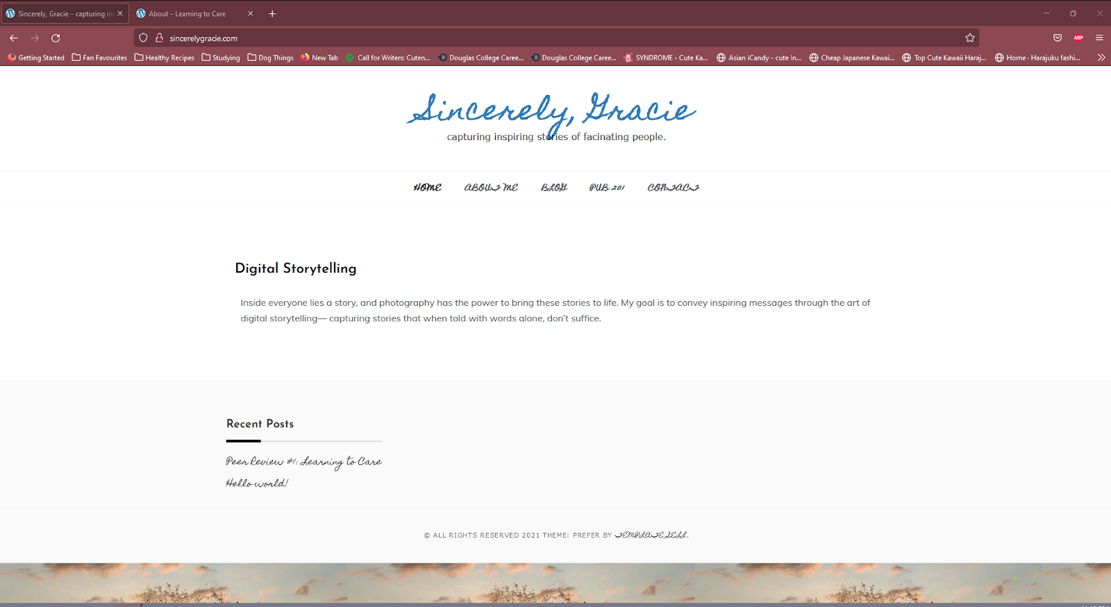
I am reviewing Gracie’s website, Sincerely, Gracie. The description on the front page implies that Gracie intends to create a photography website with a large dose of sincerity. She says, “My goal is to convey inspiring messages through the art of digital storytelling — capturing stories that when told with words alone, don’t suffice.” It’s a really lovely sentiment. The first impression I get reading this is that it reminds me of the Humans of New York (HONY) project, a photo project capturing the fascinating stories of the citizens of New York. I am really interested in what Gracie will do on this website because I adore reading people’s stories.
Home Website
Gracie’s menu is easy to navigate – separated into her home page, here About page, her blog, and her PUBL 201 content. Her primary content will likely be displayed on her home page. I will primarily be focusing on her Home Page and her About Me page, which is where her content is displayed so far.
For Gracie’s content, I’m imagining some large portraits, and accompanying interviews or excerpts about her chosen person’s life. If that’s what Gracie intends to do, I think a theme that’s more photocentric would really capture the eye. The first thing the reader should see on full display are these pictures, with accompanying captions so that readers can click onto those posts to read more about the person chosen for the post.
(Photo taken from the front page of HONY for reference. Photographs are on readily displayed. HONY has posted their interviewee in a row of photographs and captions. There are twelve posts and photos for this individual as you scroll on the website.)
This is the current theme chosen for Gracie’s website, which would really suit a personal blog if that’s what Gracie is going for. The cursive blue font of the website title against the white background feels really calming to look at — it looks like handwriting, which makes the website feel comforting. However, the cursive for the menu buttons are a bit difficult to read. “Blog” and “Contact” in particular are lost because the size of the font squishes some of the letters in the menu. I would consider using a different font for the menu, maybe something like the Google Font Pacifico or Lobster, as those are bolded fonts that are cursive that read a bit more easily.
There’s also a really nice cloud background image used for the bottom as a banner, but I’m not actually able to see the full image unless I full screen my window. I would just adjust the theme a bit so that it’s visible, because it really is a lovely picture! I’m curious about whether it’s a photo taken by Gracie.
This is the image on the desktop window when I open the website.
This is how the image looks like when I press F11 on my keyboard to display the photo on full screen.
This is so cute! I love the film camera in Gracie’s photo here. It captures Gracie’s personality in a cozy yellow sweater, and the font chosen for her greeting is comforting. So far, I really like how clean the blog looks.
Gracie talks about her personal life here, and I think this is a great factor in any website that claims sincerity, even if it focuses on other people. I love the fun facts at the bottom. It makes Gracie feel relatable and personable to me as a reader – she talks about her star sign, her taste in Taylor Swift, her favourite Starbucks drinks. Gracie talks extensively about her swim team experience, and I’m excited to see whether she will be talking to swimmers in her content or more about her competitive lifestyle.
Overall, I am excited to see more from Gracie. Her website so far feels personable, which fits the sincerity that she is aiming for. My overall thoughts are that maybe her theme could let her photography shine more — something that looks more like a canvas. Gracie’s website is easy to navigate, and I’m excited to see more from her.


