I am reviewing Gracie’s website, Sincerely, Gracie. The description on the front page implies that Gracie intends to create a photography website with a large dose of sincerity. She says, “My goal is to convey inspiring messages through the art of digital storytelling — capturing stories that when told with words alone, don’t suffice.” It’s a really lovely sentiment. The first impression I get reading this is that it reminds me of the Humans of New York (HONY) project, a photo project capturing the fascinating stories of the citizens of New York. I am really interested in what Gracie will do on this website because I adore reading people’s stories.
Home Website
Gracie’s menu is easy to navigate – separated into her home page, here About page, her blog, and her PUBL 201 content. Her primary content will likely be displayed on her home page. I will primarily be focusing on her Home Page and her About Me page, which is where her content is displayed so far.
For Gracie’s content, I’m imagining some large portraits, and accompanying interviews or excerpts about her chosen person’s life. If that’s what Gracie intends to do, I think a theme that’s more photocentric would really capture the eye. The first thing the reader should see on full display are these pictures, with accompanying captions so that readers can click onto those posts to read more about the person chosen for the post.

(Photo taken from the front page of HONY for reference. Photographs are on readily displayed. HONY has posted their interviewee in a row of photographs and captions. There are twelve posts and photos for this individual as you scroll on the website.)

This is the current theme chosen for Gracie’s website, which would really suit a personal blog if that’s what Gracie is going for. The cursive blue font of the website title against the white background feels really calming to look at — it looks like handwriting, which makes the website feel comforting. However, the cursive for the menu buttons are a bit difficult to read. “Blog” and “Contact” in particular are lost because the size of the font squishes some of the letters in the menu. I would consider using a different font for the menu, maybe something like the Google Font Pacifico or Lobster, as those are bolded fonts that are cursive that read a bit more easily.
There’s also a really nice cloud background image used for the bottom as a banner, but I’m not actually able to see the full image unless I full screen my window. I would just adjust the theme a bit so that it’s visible, because it really is a lovely picture! I’m curious about whether it’s a photo taken by Gracie.
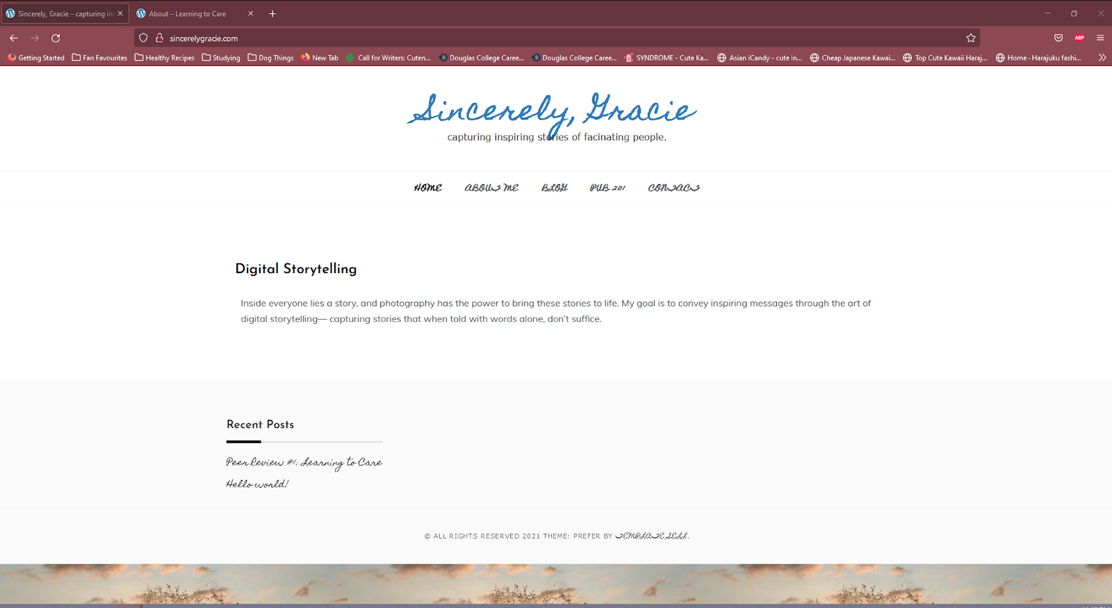
This is the image on the desktop window when I open the website.

This is how the image looks like when I press F11 on my keyboard to display the photo on full screen.
This is so cute! I love the film camera in Gracie’s photo here. It captures Gracie’s personality in a cozy yellow sweater, and the font chosen for her greeting is comforting. So far, I really like how clean the blog looks.
Gracie talks about her personal life here, and I think this is a great factor in any website that claims sincerity, even if it focuses on other people. I love the fun facts at the bottom. It makes Gracie feel relatable and personable to me as a reader – she talks about her star sign, her taste in Taylor Swift, her favourite Starbucks drinks. Gracie talks extensively about her swim team experience, and I’m excited to see whether she will be talking to swimmers in her content or more about her competitive lifestyle.
Overall, I am excited to see more from Gracie. Her website so far feels personable, which fits the sincerity that she is aiming for. My overall thoughts are that maybe her theme could let her photography shine more — something that looks more like a canvas. Gracie’s website is easy to navigate, and I’m excited to see more from her.
Best of luck to you too, Gracie!