The Morning Run
Background music credits: Smoke by Beast
The Morning Run
Background music credits: Smoke by Beast
Process Post 5- Mini Assignments, Peer Review and Accessibility I particularly enjoyed this week’s reading, named “Digital Gardens” as it…
I particularly enjoyed this week’s reading, named “Digital Gardens” as it relates to what we are doing as a class. This blog talks about how people are making their own, personalized websites to post their content and all of it is under the same Internet. Even though it is gaining popularity now, it dates back to 1998 Mark Bernstein introduced the idea of the “hypertext garden,” arguing for spaces on the internet that let a person wade into the unknown. “Gardens … lie between farmland and wilderness,” he wrote.
Philosophical readings aside, I added yet another accessibility tool to my website, A TRANSLATOR! This is pretty cool. This idea came to me during tutorial when I overheard students talking in different mother tongues, and I thought to myself, “it would be sweet if they went to my website and could read posts in their own language.” This would promote inclusivity and add a personal touch to the website. This feature makes my website accessible to more people from different parts of the world.
This tool is on the upper right portion of my website so it does not feel cluttered, nor does it block any content.
We have been working on our mini-assignments and the third one is due soon. I have a few ideas for it, so stay tuned! Our first peer review was due this week, so you can check it out here. I reviewed The Weekly Grain of Malt by Stephanie Malt.
Samsung Galaxy S23 Ultra – A Technological Marvel The Samsung Galaxy S23 Ultra is a tour de force in the…
The Samsung Galaxy S23 Ultra is a tour de force in the smartphone world, a harmonious blend of Samsung’s technological prowess, design acumen, and commitment to delivering the ultimate user experience. This detailed review delves into why the Galaxy S23 Ultra stands out as a remarkable choice for an Android phone and is also a phone I wanted to buy.
1. Design:
The Galaxy S23 Ultra boasts a design that seamlessly blends form and function. The device’s glass and metal construction exudes an aura of sophistication and feels incredibly premium in hand. The slim profile and ergonomically curved edges make it comfortable to hold and operate. It’s a device that turns heads with its timeless elegance.
2. Display:
The S23 Ultra features a 6.8-inch Dynamic AMOLED 2X display with Quad HD+ resolution and a 120Hz refresh rate. This results in a visual spectacle characterized by vibrant colors, inky blacks, and ultra-smooth animations. HDR10+ certification ensures the device is ideal for consuming high-quality multimedia content, be it streaming movies, browsing the web, or playing games.
3. Performance:
Equipped with the latest Snapdragon or Exynos chipset (depending on the region), and paired with 12 gb RAM, the Galaxy S23 Ultra offers unrivaled performance. It handles multitasking, gaming, and resource-intensive applications with effortless ease. Samsung’s One UI, which sits atop Android, ensures a seamless and highly customizable user experience.
4. Camera System:
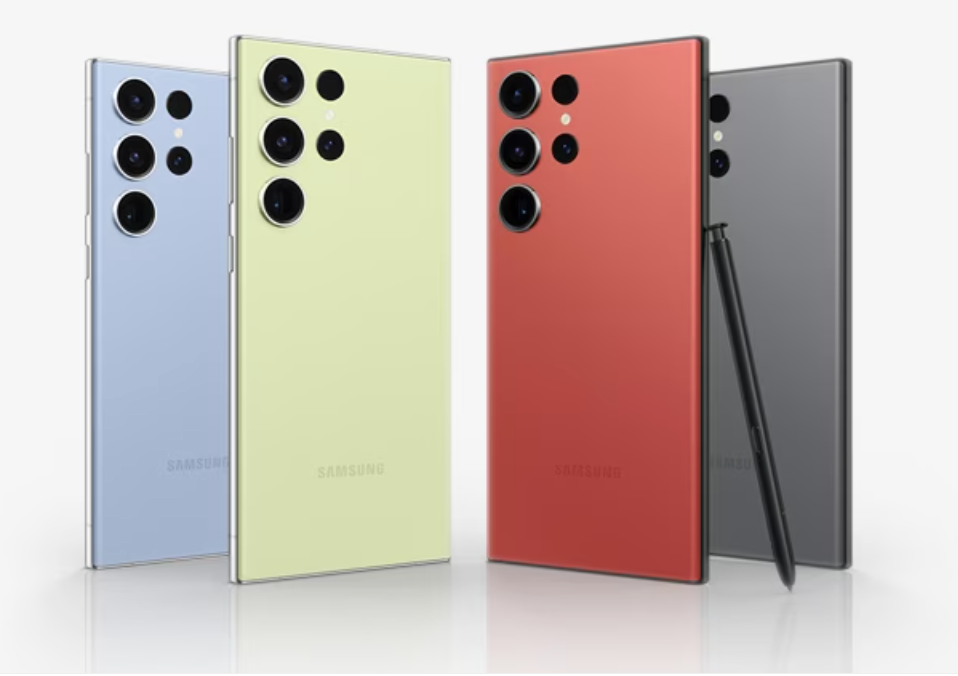
The camera system is where the S23 Ultra truly shines. It is internationally known to take ultra zoomed in images and had gone viral for taking super close ups of the moon as well. A versatile quad-camera setup, including a remarkable 108-megapixel main sensor, a periscope telephoto lens for jaw-dropping optical zoom capabilities, and ultra-wide and macro lenses, redefines mobile photography. The camera performance is nothing short of spectacular, delivering shots replete with intricate details, vibrant colors, and outstanding low-light capabilities. Innovative features like 100x Space Zoom provide creative possibilities, while the laser autofocus guarantees swift and precise focusing.
![User Guide] 'No Need for Heavy Cameras,' A Day in San Francisco With the Galaxy S23 Ultra – Samsung Global Newsroom](https://img.global.news.samsung.com/global/wp-content/uploads/2023/02/Unpacked_Galaxy_S23_Camera_main1.jpg)
5. Battery Life:
The Galaxy S23 Ultra packs a robust battery that comfortably powers through a full day of heavy usage. Efficient power management, wireless charging, and fast charging capabilities ensure you spend more time enjoying your device and less time tethered to an outlet.
6. 5G Connectivity:
The device is primed for the future with 5G connectivity. This ensures that you’re ready to embrace the latest network speeds and capabilities, guaranteeing a fast and immersive online experience.
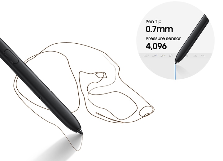
7. S Pen Integration:
For users who appreciate the convenience of a stylus, the S Pen integration is a game-changer. It offers a fluid and natural writing and drawing experience on the device’s expansive screen, making it an indispensable tool for productivity, creativity, and precise note-taking.
8. Software:
Samsung’s One UI is a user-centric and feature-rich Android interface that promises a seamless and delightful software experience. Regular updates and security patches underscore Samsung’s commitment to keeping your device up-to-date and secure.
9. Build and Durability:
The Galaxy S23 Ultra is no slouch in terms of durability, boasting an IP68 rating for water and dust resistance. It’s built to withstand the rigors of daily use and provide an extra layer of protection to your investment.
In conclusion, the Samsung Galaxy S23 Ultra is not just another smartphone; it is the epitome of what a high-end mobile device should be. It excels in design, performance, camera capabilities, battery life, and software experience. If you’re searching for the absolute best that Android has to offer and refuse to compromise on any aspect of your smartphone experience, the Galaxy S23 Ultra is the unrivaled champion. Its innovative features, cutting-edge technology, and luxurious design make it a true flagship device that deserves a place in the pocket of discerning tech enthusiasts.
Read more:
I found this week’s reading, “Digital gardens let you cultivate your own little bit of the internet,” quite interesting. The author explained that the nature of the internet has changed over time, allowing people more creative freedom over their online real estate. The author uses the term “digital gardens” to…
I found this week’s reading, “Digital gardens let you cultivate your own little bit of the internet,” quite interesting. The author explained that the nature of the internet has changed over time, allowing people more creative freedom over their online real estate. The author uses the term “digital gardens” to explain that blogs and personal sites can really be whatever we want them to be. They don’t have to be these formal pages that follow the same template week after week.
I felt quite inspired by this article. Since starting this blog, I have struggled to find my voice. I have so many ideas, but this blog is the first time I have had this much creative control over anything, and stringing all my ideas together has been difficult. This article helped me realize that I shouldn’t be afraid to take more risks with my content and try out new types of posts. The written posts are still going to be the bulk of the blog, but I am going to experiment with video posts and photos to share with my audience.
I want to create a blog that is useful for others, but I also want to use this space to express myself and share my passion creatively.
When I decided to make my blog about fitness, I knew I wanted it to cater to an audience I have been a part of. More specifically, I wanted to create a space for people just getting started in the fitness world, because it can be so intimidating. When I…
When I decided to make my blog about fitness, I knew I wanted it to cater to an audience I have been a part of. More specifically, I wanted to create a space for people just getting started in the fitness world, because it can be so intimidating. When I was first learning about fitness, I found the most valuable information came from fitness professionals and influencers who made their content accessible for all skill levels, so that is what I have tried to do with this blog so far.
There is almost too much information available on the internet about fitness, so to separate myself from the masses, I blog about the absolute basics. I want Fueling Your Twenties to act as a blueprint that anyone can access and apply to their own journey. I focus on using simple language and keep my posts as short as they can be to make them more accessible and easy to digest.
Truthfully, I picture my audience being largely female. This influenced my choice of theme because I wanted to ensure that it looked feminine. Additionally, I made the whole site pink, because as a female myself, everything looks better in pink.
Introducing Rajat’s Phone & Tech Blog https://rannyspub.com This week I’ll be reviewing my classmate Rajat’s website and what sort of online persona he’s created. The website is titled “Know your Phones” with a short description stating it will be about the latest news and updates on phones. Right off the bat, the banner is a photo of several phones and I could immediately tell that this site will be featuring…
Introducing Rajat’s Phone & Tech Blog
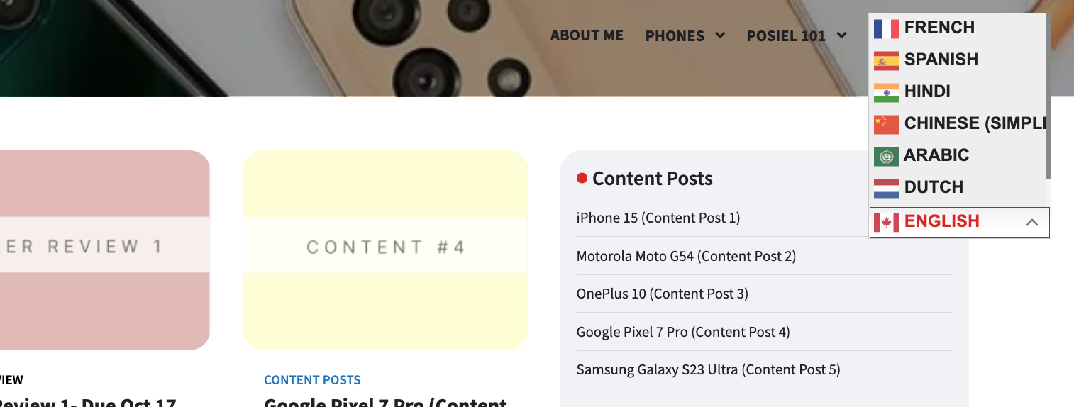
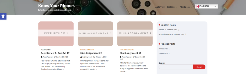
This week I’ll be reviewing my classmate Rajat’s website and what sort of online persona he’s created. The website is titled “Know your Phones” with a short description stating it will be about the latest news and updates on phones. Right off the bat, the banner is a photo of several phones and I could immediately tell that this site will be featuring segments of content on information regarding phones. The main page includes all his pub101 posts along with his content posts and it is all easily found on the one page but if you wanted to reach a topic faster, the categories on the right side help with that.
It can be seen that the online persona he has created is a very mature and direct to the point as he updates users on phone news. I enjoy the fact that he ties in his own experience and taste on phone designs and specifications when writing because it feels more personal rather than the a post solely basing facts. He also includes photos of the discussed phones and their features which are nice visuals to have when covering reviews. Within each post he shows his interest in technology and the overall website is very fitting for his tech-savvy persona. With the two content posts so far, he’s crafted his own space in writing informational technological news to users such as I, that barely dive into such topics often that are short, simple to read, and informative.
Design
His site is operable in which you can use your keyboard’s arrow keys to scroll up or down the page. He also customized the text aesthetics to style the colour changing when hovered over the title of a link (black to red). The use of different colours for process posts, content, and mini assignments goes well with the theme of his site and it makes it easier to distinguish what each post will be.
Accessibility
One of the very first things I noticed while on the home page is the ‘Accessibility Tools’ widget that is bright and can be easily seen to accommodate any user’s preference to their liking. That tool is very handy for anybody as they can increase/decrease text, change the contrast colours, and change the font readability. I also noticed the language drop bar menu on the far right of his menu. A unique tool for users whose first language is not English. One thing to note about this tool is that when hovering over a language, the text disappears and becomes all white. I wonder if that can be fixed or if that is the way it is.
Minor Critiques
There was inspiration for the shuffle button to be used for sifting through random posts for someone to view but I do not see that option for PC users. I am able to view a shuffle button on mobile and I wonder if that was intentional or if it can be applied to both PC and mobile. For your menu, when clicking on ‘Phones’ and ‘Posiel 101,’ there is no content displayed meaning that the posts have not been categorized to the main title itself so do double check that! To also add, within categories itself, the word ‘category’ appears before the ‘process post’ title and that can be taken out too for a simpler look.
Through Rajat’s website, I was able to get more insight on the newly released iPhone 15 but also learn more about phones other than Apple. His critique and writing style is well done and the personal bits within the text brings the readers coming back for more. If you want to know about the hottest phones on the market, check out Rajat’s website here https://rannyspub.com.
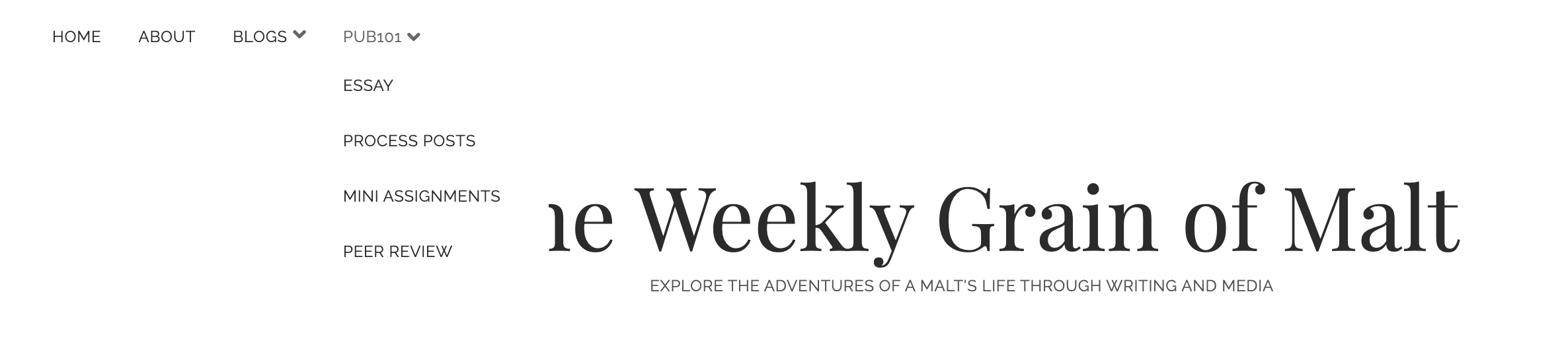
Peer Review 1 Name- Stephanie Malt URL- https://maltigrains.com/ For this peer review, I will be reviewing Stephanie’s website. I have…
Name- Stephanie Malt
As the requirements wanted, the website has easy-to-navigate POSIEL/PUB 101 menus in the header. There are proper subheadings for all assignments and all links work as illustrated. I found her website very easy to use and all the posts and assignments were easy to navigate.
Posts on this website were informally written, which makes it engaging and easy to follow. Stephanie used a combination of written posts, images and podcasts as her weekly content posts, which I found to be very cool. There were times I found that there could be a better use of grammar, but this could also be a personal choice in order to make the posts set their informal tone. I listened to her 35-minute podcast and I found it to be very well done. The teacher had told us that podcasts/video making as content posts should be done only if we have a history of making them, and I feel Stephanie has successfully proven to deliver a well-finished product.
The dates on the process and content posts show that they were worked upon and published in groups on the same day. Even though this is not a problem, WordPress offers an option to change the date of publishing, so my suggestion would be that Stephanie changes the dates in order to show these posts were published on different weekly dates.
The content posts are well-written and engaging, and the only suggestion I have is to probably tag them as “content” posts rather than blogs.
(PS- This is a personal suggestion and I would check with the TA or teacher if tagging “content posts” as “blogs” is also acceptable)
I like the overall design of the page and there is a simplistic yet consistent theme throughout. The landing page of the website shows all the posts with their respective featured images and a little excerpt of the post. This layout increases the accessibility of the website and gives the user a snippet of each post which they can continue reading upon clicking on the post. The website is also very accessible on phone and no feature is left behind even when viewing on a smaller screen.
Overall, I find the blog very interesting and interactive. Both the theme and content with the course, and adding the Spotify widgets add look as well as interactivity. I will definitely return to this website and am looking forward to seeing what Stephanie does with it. Good luck.
My classmate Karamveer’s site “Blockchain: The New Internet” is a blog dedicated to discussing the evolution of blockchain technology. Immediately, I was impressed by the design of the site. The site is sleek, organized, and easy to navigate. I tend to associate darker colours with topics like business and finance,…
My classmate Karamveer’s site “Blockchain: The New Internet” is a blog dedicated to discussing the evolution of blockchain technology. Immediately, I was impressed by the design of the site. The site is sleek, organized, and easy to navigate. I tend to associate darker colours with topics like business and finance, so I found the black and blue tones used across the site to be quite aesthetically pleasing.
Before starting this review, I read all the content on the website. The process post from week 2 stood out to me because I saw some clear connections to Gardner Campbell’s work. Campbell (2009) explains that by giving students a digital space in which they can create freely, they would learn and practice a wide range of skills that can be applied to other avenues of life. In addition, having a digital space, or personal cyberinfrastructure, allows students to express their passions and interests in diverse ways (Campbell, 2009). In his week 2 process post, Karamveer shared that he works as a software engineer outside of school, so he was able to use his skills from that field to develop his website. He also mentioned that blockchain technology is something he is passionate about, so blogging about it was an easy choice. I found it really cool that in just a few weeks of class, there are already such clear links between how we run our sites and the material we are learning about in class.
I spent some time trying to figure out who the intended audience is. There is some background information about blockchain technology in the “about us” section, but I found that the actual blog content went a bit over my head, as someone who has no background knowledge on the topic. As mentioned by Hollenbaugh, (2021), content creators tend to imagine an audience, and create their content with that audience in mind. From my perspective, it seems as though Karamveer has imagined an audience that is equally as passionate and knowledgeable about blockchain technology as he is. If he wanted to widen his audience a bit, Karamveer could make a “blockchain technology basics” post, or something of that nature, for people with little to no knowledge of the topic.
Overall, Karamveer has created an online self that demonstrates a passion for blockchain technology, as well as educating others about the topic. Karamveer’s interest in web design is also made clear through the sleek and simple layout of the site.
References
Campbell, G. (2009). A Personal Cyberinfrastructure. EDUCAUSE Review, 44(5), 58.
Hollenbaugh, E. E. (2021). Self-Presentation in Social Media: Review and Research Opportunities. Review of Communication Research, 9, 80–98.
Any bodies and Every bodies The audience the I have been imaging that would come across my page is young adults, late teens, and individuals in their twenties. That would be my guess for the people engaging in my content but if people in their 30s and older are interested in my content then by all means. It’s hard to pinpoint an age group when my interests can be anyone’s…
Any bodies and Every bodies
The audience the I have been imaging that would come across my page is young adults, late teens, and individuals in their twenties. That would be my guess for the people engaging in my content but if people in their 30s and older are interested in my content then by all means. It’s hard to pinpoint an age group when my interests can be anyone’s interest as well. If someone in their early teens likes to collect Smiskis too, then awesome!
I imagine my audience to be people that would have some similar tastes whether it be travelling, gaming, raving, collecting items, or into podcasts. I would like my audience to be educated and aware of different likes and hobbies of others and maybe it could spark their interest. I plan to do a featured EDM artists to show the different styles and versatility of the EDM genre. For future podcasts I want to include a gaming corner segment to talk about anything of everything of games, the communities, twitch streamers, etc. With all that said, the design of my website is set to be simple but eye-catching with the featured images mostly taken by myself. I made it so that it would fit the likes of a younger audience but also young adults who enjoy simplicity.
Overall, I want my site to be for any body and for every body. When writing my posts I want to keep it casual but also formal when talking about certain topics. I want this to site to be a mature but funny page that people wouldn’t mind coming back to.
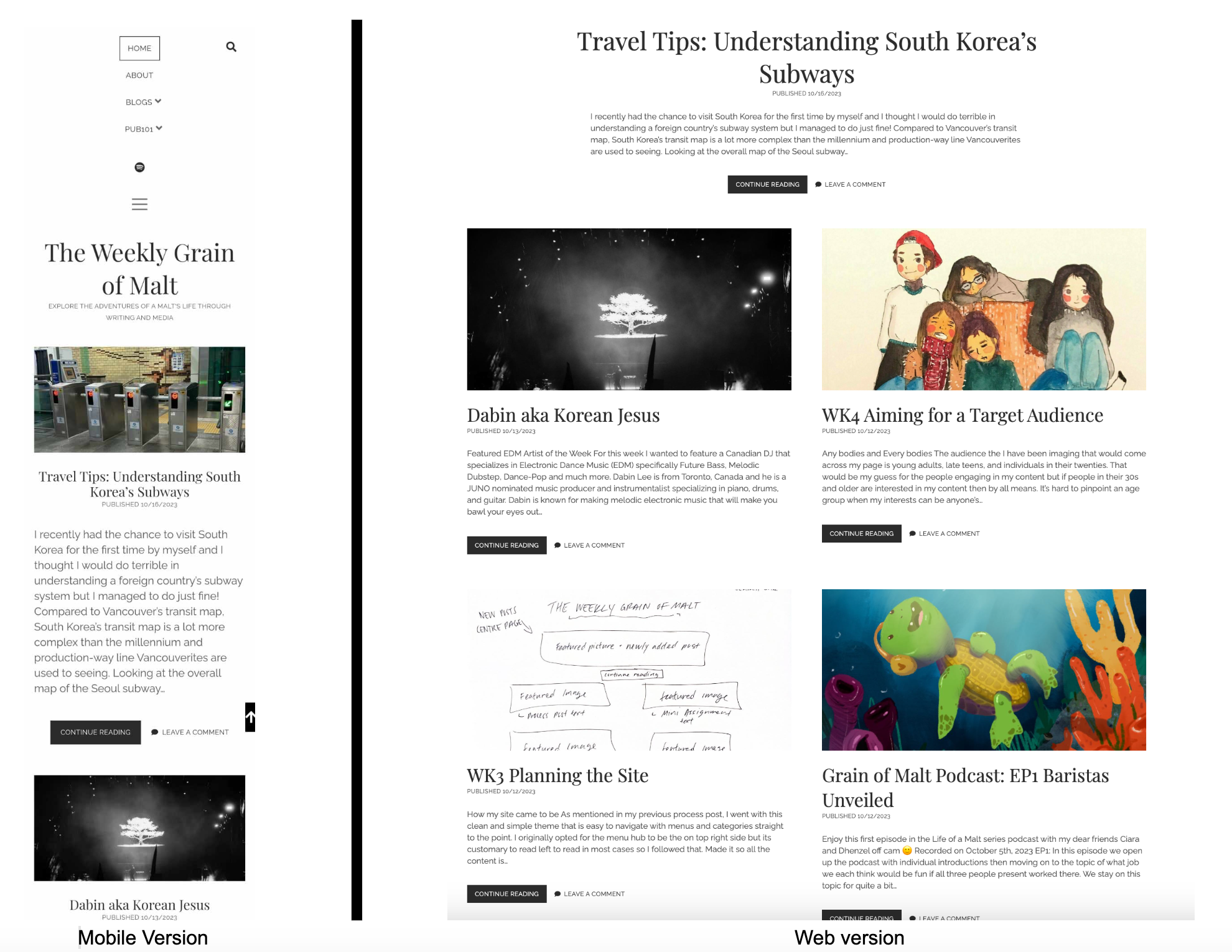
How my site came to be As mentioned in my previous process post, I went with this clean and simple theme that is easy to navigate with menus and categories straight to the point. I originally opted for the menu hub to be the on top right side but its customary to read left to read in most cases so I followed that. Made it so all the content is…
How my site came to be
As mentioned in my previous process post, I went with this clean and simple theme that is easy to navigate with menus and categories straight to the point. I originally opted for the menu hub to be the on top right side but its customary to read left to read in most cases so I followed that. Made it so all the content is on the top left and if people want to search for something specific then they can do so on the top right.
My PUB101 content will live under that exact title along the menu bar with specific categories. Weekly content that is posted will appear in the middle of the home page with a big title typically accustomed with featured image.

The image above directly represents my website layout with a new post featured in the middle, previous content directly below, and an easy to navigate category menu on the top left. Having two posts together doesn’t give a too cluttered feel of the website and that is something I want to avoid. By having featured images it also gives my site a pop of colour while also showcasing my personality with every post.