Posts
Peer Review 1- Due Oct 17
Peer Review 1 Name- Stephanie Malt URL- https://maltigrains.com/ For this peer review, I will be reviewing Stephanie’s website. I have…
Peer Review 1
Name- Stephanie Malt
For this peer review, I will be reviewing Stephanie’s website. I have been visiting this website for a week and I see that it is frequently updated, follows a consistent theme in all the posts and I really enjoyed the content I see on there. On the About page, Stephanie explains the meaning of the website’s name and I liked the puns she made of her last name. This page is concise and clear and gives us the perfect introduction we need to herself and the website. This website is about her daily life where she has podcasts, SMISKI stories and unboxings, game reviews, and much more.
Menus
As the requirements wanted, the website has easy-to-navigate POSIEL/PUB 101 menus in the header. There are proper subheadings for all assignments and all links work as illustrated. I found her website very easy to use and all the posts and assignments were easy to navigate.
Content and Process Posts
Posts on this website were informally written, which makes it engaging and easy to follow. Stephanie used a combination of written posts, images and podcasts as her weekly content posts, which I found to be very cool. There were times I found that there could be a better use of grammar, but this could also be a personal choice in order to make the posts set their informal tone. I listened to her 35-minute podcast and I found it to be very well done. The teacher had told us that podcasts/video making as content posts should be done only if we have a history of making them, and I feel Stephanie has successfully proven to deliver a well-finished product.
The dates on the process and content posts show that they were worked upon and published in groups on the same day. Even though this is not a problem, WordPress offers an option to change the date of publishing, so my suggestion would be that Stephanie changes the dates in order to show these posts were published on different weekly dates.
The content posts are well-written and engaging, and the only suggestion I have is to probably tag them as “content” posts rather than blogs.
(PS- This is a personal suggestion and I would check with the TA or teacher if tagging “content posts” as “blogs” is also acceptable)
Design
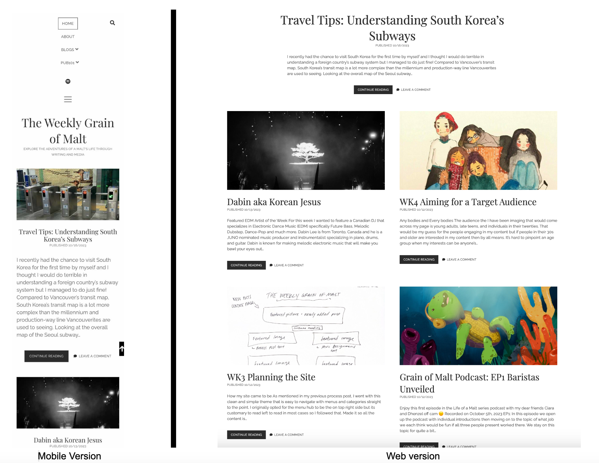
I like the overall design of the page and there is a simplistic yet consistent theme throughout. The landing page of the website shows all the posts with their respective featured images and a little excerpt of the post. This layout increases the accessibility of the website and gives the user a snippet of each post which they can continue reading upon clicking on the post. The website is also very accessible on phone and no feature is left behind even when viewing on a smaller screen.
Overall, I find the blog very interesting and interactive. Both the theme and content with the course, and adding the Spotify widgets add look as well as interactivity. I will definitely return to this website and am looking forward to seeing what Stephanie does with it. Good luck.
Process Post Prompt #3
What audience have you been imagining so far? How has that imagined audience informed your design and editorial decisions? Defining Your Imagined Audience When I first started this blog, I had a vision of my audience: passionate aquascaping hobbyists and beginners eager to explore the beauty of underwater landscapes. These are individuals who appreciate the …
Peer Review 1
My classmate Karamveer’s site “Blockchain: The New Internet” is a blog dedicated to discussing the evolution of blockchain technology. Immediately, I was impressed by the design of the site. The site is sleek, organized, and easy to navigate. I tend to associate darker colours with topics like business and finance,…
My classmate Karamveer’s site “Blockchain: The New Internet” is a blog dedicated to discussing the evolution of blockchain technology. Immediately, I was impressed by the design of the site. The site is sleek, organized, and easy to navigate. I tend to associate darker colours with topics like business and finance, so I found the black and blue tones used across the site to be quite aesthetically pleasing.
Before starting this review, I read all the content on the website. The process post from week 2 stood out to me because I saw some clear connections to Gardner Campbell’s work. Campbell (2009) explains that by giving students a digital space in which they can create freely, they would learn and practice a wide range of skills that can be applied to other avenues of life. In addition, having a digital space, or personal cyberinfrastructure, allows students to express their passions and interests in diverse ways (Campbell, 2009). In his week 2 process post, Karamveer shared that he works as a software engineer outside of school, so he was able to use his skills from that field to develop his website. He also mentioned that blockchain technology is something he is passionate about, so blogging about it was an easy choice. I found it really cool that in just a few weeks of class, there are already such clear links between how we run our sites and the material we are learning about in class.
I spent some time trying to figure out who the intended audience is. There is some background information about blockchain technology in the “about us” section, but I found that the actual blog content went a bit over my head, as someone who has no background knowledge on the topic. As mentioned by Hollenbaugh, (2021), content creators tend to imagine an audience, and create their content with that audience in mind. From my perspective, it seems as though Karamveer has imagined an audience that is equally as passionate and knowledgeable about blockchain technology as he is. If he wanted to widen his audience a bit, Karamveer could make a “blockchain technology basics” post, or something of that nature, for people with little to no knowledge of the topic.
Overall, Karamveer has created an online self that demonstrates a passion for blockchain technology, as well as educating others about the topic. Karamveer’s interest in web design is also made clear through the sleek and simple layout of the site.
References
Campbell, G. (2009). A Personal Cyberinfrastructure. EDUCAUSE Review, 44(5), 58.
Hollenbaugh, E. E. (2021). Self-Presentation in Social Media: Review and Research Opportunities. Review of Communication Research, 9, 80–98.
WK4 Aiming for a Target Audience
Any bodies and Every bodies The audience the I have been imaging that would come across my page is young adults, late teens, and individuals in their twenties. That would be my guess for the people engaging in my content but if people in their 30s and older are interested in my content then by all means. It’s hard to pinpoint an age group when my interests can be anyone’s…
Any bodies and Every bodies
The audience the I have been imaging that would come across my page is young adults, late teens, and individuals in their twenties. That would be my guess for the people engaging in my content but if people in their 30s and older are interested in my content then by all means. It’s hard to pinpoint an age group when my interests can be anyone’s interest as well. If someone in their early teens likes to collect Smiskis too, then awesome!
I imagine my audience to be people that would have some similar tastes whether it be travelling, gaming, raving, collecting items, or into podcasts. I would like my audience to be educated and aware of different likes and hobbies of others and maybe it could spark their interest. I plan to do a featured EDM artists to show the different styles and versatility of the EDM genre. For future podcasts I want to include a gaming corner segment to talk about anything of everything of games, the communities, twitch streamers, etc. With all that said, the design of my website is set to be simple but eye-catching with the featured images mostly taken by myself. I made it so that it would fit the likes of a younger audience but also young adults who enjoy simplicity.
Overall, I want my site to be for any body and for every body. When writing my posts I want to keep it casual but also formal when talking about certain topics. I want this to site to be a mature but funny page that people wouldn’t mind coming back to.
WK3 Planning the Site
How my site came to be As mentioned in my previous process post, I went with this clean and simple theme that is easy to navigate with menus and categories straight to the point. I originally opted for the menu hub to be the on top right side but its customary to read left to read in most cases so I followed that. Made it so all the content is…
How my site came to be
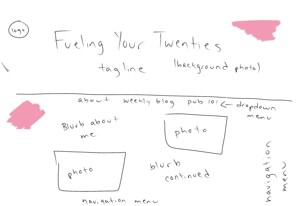
As mentioned in my previous process post, I went with this clean and simple theme that is easy to navigate with menus and categories straight to the point. I originally opted for the menu hub to be the on top right side but its customary to read left to read in most cases so I followed that. Made it so all the content is on the top left and if people want to search for something specific then they can do so on the top right.
My PUB101 content will live under that exact title along the menu bar with specific categories. Weekly content that is posted will appear in the middle of the home page with a big title typically accustomed with featured image.

The image above directly represents my website layout with a new post featured in the middle, previous content directly below, and an easy to navigate category menu on the top left. Having two posts together doesn’t give a too cluttered feel of the website and that is something I want to avoid. By having featured images it also gives my site a pop of colour while also showcasing my personality with every post.
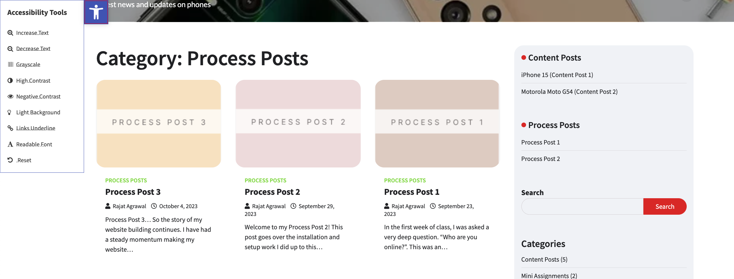
Google Pixel 7 Pro (Content Post 4)
Google Pixel 7 Pro Review – A Pixel of Perfection Out of all the phones I have reviewed so far,…
Google Pixel 7 Pro Review – A Pixel of Perfection
Out of all the phones I have reviewed so far, the Google Pixel 7 Pro is the epitome of a pure Android experience. It has arrived, and it continues to exemplify Google’s commitment to providing a pure Android experience with an exceptional camera, all wrapped in a sleek, premium design. As a proud Pixel user, I was eagerly awaiting the next installment, and the Pixel 7 Pro did not disappoint.
Design-wise, the Pixel 7 Pro features a refined design that strikes a balance between simplicity and sophistication. The sleek aluminum frame, combined with the textured glass back, not only looks premium but also feels great in hand! I feel that Google has paid extra attention to detail with a subtly raised camera bump and added a well-placed fingerprint sensor on the back. It’s a design that’s both timeless and functional!
Starting off with the display, the 6.7-inch AMOLED display is a visual delight. The Quad HD+ resolution, along with a 120Hz refresh rate, ensures crisp and smooth visuals. HDR content shines on this screen, with deep blacks and vibrant colours. It’s equally suited for scrolling through social media, streaming your favourite shows, or gaming. I have played a few games on this phone and it was one of the best gaming experiences I’ve had on a phone.
![]()
The performance of this phone is unmatched. The Pixel 7 Pro comes equipped with the latest Snapdragon chipset and plenty of RAM, which delivers a blazing-fast performance. Apps open instantly, multitasking is a breeze, and it handles demanding games with ease. The stock Android experience is buttery smooth and free from bloatware. As always, Google’s commitment to timely updates ensures you’re never left behind. The materials this phone is made of are also sustainably sourced and Google has concentrated on using aluminum which can be fully recycled after its useful life (compared to plastic which is put to waste).
The camera system on the Pixel 7 Pro is where it truly shines. The primary sensor, complemented by an ultra-wide lens, captures photos with astonishing detail, accurate colours, and fantastic dynamic range. Google’s image processing software continues to set the bar for smartphone photography. New Night Sight and Astrophotography modes excel in low-light conditions. The front camera is equally impressive, delivering stunning selfies.

You might think that all these features have a heavy toll on the battery life. But in reality, the Pixel 7 Pro’s battery life is reliable, and easily gets through a full day with moderate usage. Google’s Adaptive Battery AI feature ensures that power-hungry apps are efficiently managed. Fast charging and wireless charging capabilities mean you’re never far from a quick top-up!
Lastly, with 5G support, the Pixel 7 Pro takes advantage of lightning-fast data speeds, making it future-proof and ready for the next generation of mobile connectivity. Google’s software experience remains unparalleled. The Pixel 7 Pro runs on stock Android, ensuring a clean, uncluttered interface with a focus on user experience. The phone ships with the latest Android version, and you can expect prompt updates and security patches for years to come.
In conclusion, the Google Pixel 7 Pro is a testament to Google’s vision of what a smartphone should be. It marries top-tier hardware with a pure Android experience and a camera system that continues to set the standard for mobile photography. While the competition is fierce, the Pixel 7 Pro’s unique blend of design, performance, and software makes it a standout choice for Android enthusiasts and photography lovers. If you value a clean, well-supported Android experience and are passionate about capturing moments with your smartphone, the Pixel 7 Pro is a pixel-perfect choice.
Read More- https://www.gsmarena.com/google_pixel_7_pro-11908.php
Buy here- https://shorturl.at/dgK59
My Vision for Fueling Your Twenties
I have been struggling to make my visions for my site come to life. I am happy with my content so far, but I am struggling with the design element. I have watched tutorial, after tutorial, after tutorial about WordPress and Elementor, but I still find myself wanting to throw…
I have been struggling to make my visions for my site come to life. I am happy with my content so far, but I am struggling with the design element. I have watched tutorial, after tutorial, after tutorial about WordPress and Elementor, but I still find myself wanting to throw my laptop across the room every time I try to make a change. I spent hours this week trying to figure out how to incorporate my “about” section onto a page, rather than having it up as a post within a category. I was finally able to get the site set up in a way that I liked, but I had to pick a new theme, which meant that I had to redo everything. After spending a good chunk of time creating pages on Elementor and playing around with the new theme, my site is getting close to what I originally envisioned. Below you can find my original design idea.
Tracking Progress
I track my progress in a few different ways because I have several goals that I am working towards at the same time. I am going to break down how I track my progress toward my aesthetic goals, my performance goals, and my nutrition goals. I did not start my…
I track my progress in a few different ways because I have several goals that I am working towards at the same time. I am going to break down how I track my progress toward my aesthetic goals, my performance goals, and my nutrition goals.
I did not start my fitness journey with any aesthetic goals, but as time has gone on, I have set out to lose weight to look and feel healthier and stronger. There are a few ways that I track my progress toward this goal. First, I weigh myself every morning to ensure that I am moving in the right direction. It is normal to see some fluctuation from day to day, so it is not the only way I track progress, but it is a good tool to use to identify and understand the trends in my weight loss. In addition, I take a lot of photos. It can be really hard to see any changes in the mirror because we are our own worst critics, so photos are a great way to compare the changes that have occurred over a longer period of time. I have also noticed changes in the way my clothes fit, which can be a great indicator of progress if you are not comfortable weighing yourself or taking photos.
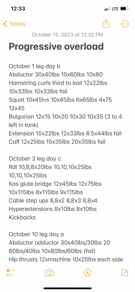
In the gym, my goal has always been to get stronger. I have recently started to track my progress every week by writing down the amount of weight and reps that I do for each exercise, and then I try to increase that a little bit every week. I included a screenshot of my notes app to demonstrate what this looks like.
When it comes to nutrition, I use an app to track my daily food intake to ensure that I am eating the right amount of food, as well as the right types of food. I am going to dedicate a post to nutrition in the coming weeks, so stay tuned for more details about how I set and track my nutrition goals!
Process Post 4
Process Post 4- Audience, Accessibility and Adventure What audience have you been imagining thus far? How has that imagined audience…
Process Post 4- Audience, Accessibility and Adventure
What audience have you been imagining thus far? How has that imagined audience informed your design and editorial decisions?
The first reading this week from Michael Warner, titled. “Publics and Counterpublics”, talked about what the word “public” means, how it has different meanings and how it can be further interpreted by different people. The idea of a public is a cultural form, a kind of practical fiction, present in the modern world in a way that is very different from other or earlier societies. Like the idea of rights, or nations, or markets, it can now seem universal.
The next reading from Forbes was about how our undigitized past may be getting lost as people are always just online and think all their answers can be found just from a click of a button. It talks about museums, and written books that have not yet been digitalized due to copyrights or some reason. The writer says that a lot of information is being lost, especially from the 20th century as people don’t go out and seek information.
Moving on to my journey with website building, we talked about the target audience in class and who my posts are solely meant for/ who they indirectly target. With the world being exposed to new technology and devices every day, I would say that my phone blogs are meant for people who are looking to buy a new phone, who are keen on knowing the new devices in the market and people who share the same passion as me.
Continuing with my exploration of website building, our discussions in class extended to the crucial aspect of accessibility. It became apparent that ensuring that my website is user-friendly and accessible to all individuals, regardless of their abilities, is paramount. This involves implementing features like alt text for images and providing text-to-speech options for those with visual impairments.
For accessibility reasons, I have added quick links to the sidebar of my website and also an accessibility widget (shown in the screenshot below).
Now, diving into the world of adventure in website design, I realized that creating an engaging and visually stimulating platform can be just as important as the content itself. This adventure involves experimenting with various design elements, colour schemes, and interactive features to captivate and retain the attention of my target audience.
In my journey of website building, I aim to strike a balance between catering to the specific needs and interests of my target audience, ensuring accessibility for all, and embarking on the adventure of design creativity to make my website stand out in the ever-evolving digital landscape.
Activewear: The Pieces I Love
I truly believe that if you look good, you feel good, or at least that’s what I tell myself when I’m trying to justify buying more activewear. What you like and don’t like in activewear is really going to come down to personal preference, but here are a few of…
I truly believe that if you look good, you feel good, or at least that’s what I tell myself when I’m trying to justify buying more activewear. What you like and don’t like in activewear is really going to come down to personal preference, but here are a few of my favourite activewear brands and their standout pieces!
I only recently discovered Amazon activewear, but I wish I had found it sooner. A lot of the pieces you can find on Amazon are relatively inexpensive, similar quality to the leading activewear brands, and on top of that they are super cute and trendy. I find that the key to finding good pieces on Amazon is to read the reviews. I won’t buy anything from Amazon unless the reviews are almost all positive. There are two brands from Amazon that I really love, Aurola and Yeoreo. The Aurola Dream and Yeoreo Tiedye shorts are comfortable, compressive, and squat-proof, and they come in so many cute colours. Recently, I’ve gotten into super strappy sports bras and the Yeoreo Criss Cross Back and Aurola Venus are my favourites.
When I feel like splurging, Gymshark is my go-to. They are definitely in the higher price range, but their quality shines through. Their items hold up well in the wash, the materials they use feel really sturdy, and their product design is super minimal, so they are great for mixing and matching. My top three favourite Gymshark items are the Bandeau Sports Bra, the Minimal Sports Bra, and the Everyday Seamless Shorts.
While I find that Lululemon isn’t my favourite for weightlifting, it is my favourite brand for athleisure, and for other physical activity that I do outside of the gym. I really love the Wonder Train Tights, the Align bra, and the Align Shorts.